Quantitative assessment of visual designs for communicating patient-reported outcomes in breast cancer care to patients
Lea Doppelbauer, Anna Maria Hage, Maria Margarete Karsten, Pimrapat Gebert, Anna Tatzber, Laura Hatzler, Jasper Brands, Rosanne Andriessen, Therese Pross

TL;DR
This study tested new visual designs for presenting patient-reported outcomes in breast cancer care and found that patients found them clear, useful, and helpful for communication with doctors.
Contribution
The study introduces co-designed visualizations for PRO data that are validated by patient feedback as effective and emotionally appropriate.
Findings
Patients found the new visualizations clear, emotionally appropriate, and useful.
The visualizations supported self-reflection and improved patient-provider communication.
The results provide a foundation for developing interactive digital tools for routine care.
Abstract
Patient-reported outcomes (PROs) are increasingly recognized as valuable data to enhance communication and support shared decision-making in cancer care. Despite evidence of their positive effects, few concrete approaches exist for the design and presentation of PRO visualizations. Even in high-incidence cancers such as breast cancer, limited knowledge is available on how patients perceive and interpret graphical displays of PRO results. This study evaluated different visualization formats of PRO data, that had been co-designed with patients and healthcare providers within the PRO B study, a large randomized controlled trial investigating alert-based PRO monitoring in patients with metastatic breast cancer. After completion of the PRO B study, patients from both intervention and control group received a paper-based questionnaire together with their individual PRO data report featuring…
Genes, proteins, chemicals, diseases, species, mutations and cell lines named across the full text — each resolved to its canonical identifier and authoritative record.
Click any figure to enlarge with its caption.
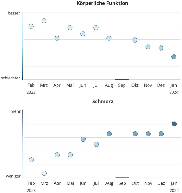 Figure 1
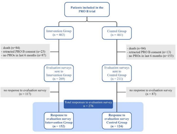 Figure 2
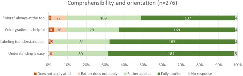 Figure 3
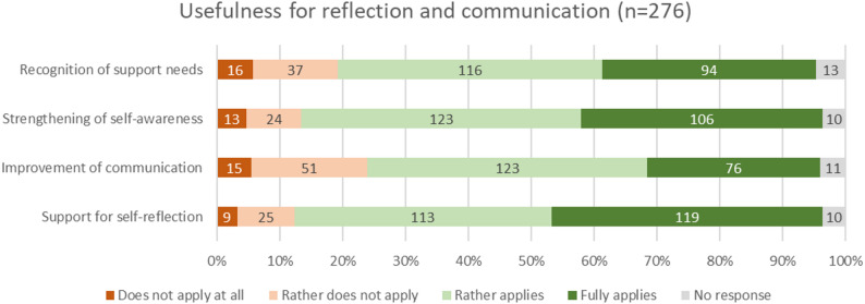 Figure 4
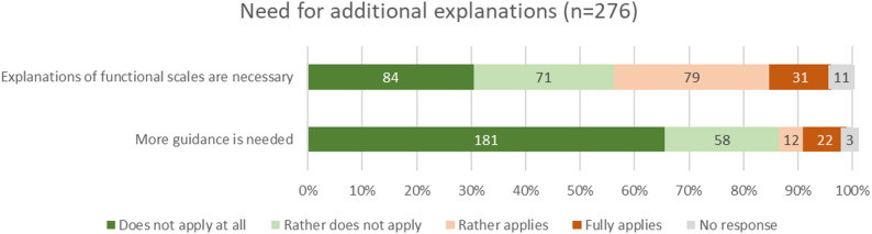 Figure 5
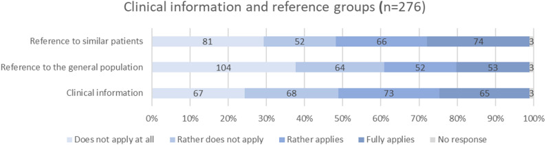 Figure 6
- —Charité - Universitätsmedizin Berlin (3093)
Peer Reviews
No public reviews on file for this paper yet. If you reviewed it on a platform where reviews are public (OpenReview, ICLR, NeurIPS, ICML), you can paste yours below so the community can read it here.
Videos
No videos yet. Explain this paper in a talk, walkthrough, or lecture? Add one.
Taxonomy
TopicsPatient-Provider Communication in Healthcare · Cancer survivorship and care · Empathy and Medical Education
Background
Patient-reported outcomes (PROs i.e. the information directly reported by patients about their health status) are collected using patient-reported outcome measures (PROMs) and are a cornerstone of modern oncology, offering structured insights into patients’ symptoms, functional status, and quality of life. When integrated into routine clinical care, PRO data can improve symptom management, enhance communication between patients and providers, and even contribute to improved survival and reduced hospitalizations [1–3]. However, the effectiveness of PRO-based monitoring systems in practice hinges not only on routinely collected data [4, 5], but also on how this information is communicated and understood by its intended users – patients and healthcare providers alike [5].
Due to a lack of empirically supported methods for displaying PRO data, they are often presented through raw scores or complex tables that are difficult to interpret, particularly for patients with lower health literacy [6–9]. However, to support shared decision-making and improve usability, PRO data must be presented in a format that is both intuitive and visually accessible for all users [10].
Recent work within the multicentric, randomized PRO B study [11], which evaluated an alert-based symptom monitoring system for patients with metastatic breast cancer, highlighted the need for more intuitive and emotionally sensitive visualization of PRO data. Thus, in a preceding qualitative sub-study of the PRO B trial, new visualization concepts for PRO data were developed using healthcare service design principles and participatory design, iteratively refining graphical visualizations through interviews with patients and providers [12]. In qualitative interviews, aspects like preferences regarding visual elements (e.g., color schemes, labeling, alert design), perceived interpretability, emotional impact, and the possible benefit of PRO visualizations in breast cancer treatment were addressed. These efforts aimed to enhance clarity, usability, and emotional appropriateness of PRO data displays, particularly in the context of long-term disease monitoring.
While qualitative feedback suggested strong acceptance and perceived value of the proposed visualization concepts, the generalizability and broader applicability of these findings remained to be tested. Furthermore, systematic evaluation of user preferences, perceived usefulness, and potential for routine implementation requires robust quantitative data from a larger, more diverse sample of users.
To address this gap, the present study aimed to evaluate the user-centered PRO visualizations developed during the PRO B study using a standardized quantitative survey administered to patients and healthcare professionals at the end of the PRO B study. Specifically, we assessed the comprehensibility of the designed visualizations, the need for additional information and content in the visualizations and their practical utility in clinical care. In doing so, this study provides an empirical foundation for future implementation of optimized PRO visualizations in oncology and offers concrete guidance for the design of patient-centered health data displays.
Methods
The PRO B trial
This sub-study was embedded in the PRO B trial, a multicenter randomized controlled study evaluating the impact of alert-based PRO monitoring in patients with metastatic breast cancer across 52 German breast cancer centers [11, 13]. Conducted between May 2021 and February 2024, PRO B enrolled 924 patients randomized to an intervention or control group. In addition to routine care, intervention group participants completed weekly PRO-based symptom assessments via smartphone app. PRO scores were accessible in real time to the patients’ care teams through a web-based reporting platform that included a basic version of PRO visualization, preceding the advanced formats evaluated in this study. If scores worsened, the system automatically generated an email alert prompting the care team to contact the patient within 48 h to assess health status and provide support as needed. Patients could not view their own PRO results and were unaware if their responses had triggered an alert. Control group participants completed PRO surveys every three months without alert-based monitoring.
Study design and setting
Embedded in the PRO B trial, a qualitative design project was conducted to develop and co-design new visualization prototypes of PRO data with patients and healthcare providers, by considering existing literature on health data visualization. The details of this sub-study are described in a companion manuscript [12]. Final design decisions are described in 2.5 and Table 1. The present study is a quantitative follow-up to this qualitative concept study, aimed to systematically assess the acceptance, comprehensibility and interpretability, as well as usability of these new design concept for PRO data through a structured survey among patients participating in the PRO B study. Ethical approval was obtained.
Survey development
The survey was designed collaboratively by the PRO B study team (including clinical experts, researchers and a study nurse), two patient advocates, members of the German Cancer Society (Deutsche Krebsgesellschaft, DKG) as well as the healthcare service design team involved in the preceding qualitative design project. It was based on key findings from literature review and qualitative interviews of the design project and included Likert-scale items assessing specific visualization features (e.g., labeling, color schemes, alert representation, reference data) as well as global questions on perceived clarity, usefulness, and emotional response. The survey was part of a larger questionnaire evaluating the PRO B study in general, including sociodemographic questions and items capturing participants’ experience with PRO monitoring. A pilot version of the survey was pretested for clarity and face validity with a small group of patients (n = 5) and healthcare professionals (n = 3) not involved in the earlier design study. Minor wording adjustments were made based on their feedback.
Participants and survey distribution
At the end of the PRO B study, participants received a paper-based survey along with a personalized monitoring report displaying their PRO scores from the previous 12 months, visually designed according to the findings of the preceding design concept project. This ensured that the survey responses directly reflected the evaluation of the newly designed visual elements and their potential implications for PRO reporting. In May 2024, surveys and reports were distributed to all patients of the main trial who did not fulfill the following exclusion criteria: death, retracted informed consent during the PRO B trial, no answered PRO questionnaires during the last 6 months. Consequently, all eligible patients had previously completed regular PRO assessments during the PRO B study, weekly in the intervention group and every three months in the control group, with these differing assessment intervals reflected in the visualizations.
Since the coordinating study center only had access to pseudonymized IDs of study participants, surveys and reports were sent to the respective study sites first, which maintained the identifying information. From there, the reports were distributed to the individual patients. The survey (Online Resource 1) and example PRO reports (intervention group: Online Resource 2, control group: Online Resource 3) are provided online.
Design decisions from preceding qualitative design concept study
In collaboration with healthcare service design experts and following a co-design approach with patients and clinical staff from the PRO B study, we developed a visualization concept aimed at being clear, consistent, and emotionally appropriate [12]. The development process was informed by user-centered design principles and incorporated elements from both Experience-Based Co-Design (EBCD) and Design Thinking. Through iterative feedback cycles, visual formats were refined to ensure contextual relevance, usability, and emotional acceptability [14, 15]. Scoring of the EORTC QLQ-C30 followed the official guidelines provided by the EORTC manual, using linear transformation of raw scores to 0–100 scales for all domains [16]. Higher scores represent better functioning on functional scales and greater symptom burden on symptom scales. The final design decisions are summarized in Table 1; an example is given in Fig. 1.
Table 1. Design decisions for visualizing PRO data from co-design study with patients and providersDesign CategoryDesign decisionChart typeWe selected a dot chart, as it allows individual data points to be displayed precisely while keeping the visual layout simple.Time is placed on the x-axis to match user expectations.ColorA single-color blue gradient on the y-axis was chosen over a red–green scale to avoid value judgments, negative emotional associations, and difficulties for users with color vision deficiencies or when printing in greyscale.Darker tones indicate more negative values, lighter tones more positive ones, aligning with common mental models; blue was preferred for its neutral and calming associations (see Franconeri et al. [17]).LabelsAll labels are horizontal (8–11 pt), with abbreviated month names and annual markers placed next to the first month of each year.For quality-of-life and functioning graphs, the y-axis extremes are labeled “besser” (better) at the top and “schlechter” (worse) at the bottom.For symptom graphs, “mehr” (more) is placed at the top and “weniger” (less) at the bottom, reflecting intuitive associations with symptom intensity.A vertical color bar on the y-axis reinforces the color gradient meaning, while symbols were avoided to prevent misinterpretation.Grid linesFor orientation, we included only horizontal grid lines, dividing the graph into five equal areas, while omitting vertical lines to reduce clutter.Reference dataReference data are displayed as a subtle background area without a mean line, as the latter could be misleading or cause frustration.Missing dataMissing data points are marked in a way that ensures visibility without drawing undue attention.Alert representationAlerts are shown by marking the data point itself in red, keeping its shape consistent to preserve visual balance.Item orderThe order of all elements follows the EORTC-QLQ-C30 scoring manual.
Fig. 1. Final design of the PRO visualizations; “Körperliche Funktion” = physical functioning, “besser” = better, “schlechter” = worse; “Schmerz” = pain, “mehr” = more, “weniger” = less, month abbreviations are listed on the x-axis
Analysis
The cutoff date for receiving evaluation questionnaires was September 26th, 2024. Paper-based answered survey returns were digitized by a student assistant and quality checked by two researchers. Quantitative data were then analyzed descriptively using SPSS Statistics for Mac (Version 30.0.0.0, IBM Corp.) by TP. For the analysis of groups, categorical variables were compared using Pearson’s Chi-squared test. Numeric variables were analyzed using two-sided independent-samples t-tests. In case of non-normally distributed data and survey results based on Likert scales, the Mann-Whitney U test was applied. No formal power calculation was required, as the survey was offered to the entire PRO B study population meeting inclusion criteria at study completion. Figures were produced with MS Office Excel and Miro (Consort Chart).
Results
In total, 480 evaluation surveys were sent out to 211 patients in control group and 269 patients in the intervention group. Study participants who died (n = 168; intervention group: n = 84, control group: n = 84) or retracted their consent during the study (n = 36; intervention group: n = 23, control group: n = 13) or who did not answer any questionnaires in the study during the last 6 months (n = 240; intervention group: n = 87, control group: n = 153) were excluded from the evaluation. A total of 276 participants responded to the questionnaire, including 152 from the intervention group and 124 from the control group. A consort diagram is presented in Fig. 2.
Fig. 2. Consort diagram for participants in quantitative evaluation survey
Socioeconomic and clinical characteristics of the participating patients at baseline of the PRO B study are reported in Table 2. Groups did differ significantly with regard to the patients’ health status at randomization, with more fully active patients (ECOG 0) but also more severely restricted patients (ECOG > 2) in the intervention group (p = 0.005). Also, patients in the intervention group received significantly more chemotherapy at the beginning of PRO B (p = 0.03). Socioeconomic parameters were comparable between groups. Missing data of baseline characteristics were minimal and affected less than 1.3% of the dataset (e.g., education level: 1.23%, ECOG performance status: 0.66–0.81%). As these values were missing completely at random and occurred at very low frequency, no imputation was performed. Analyses were conducted based on available cases.
Table 2PRO B baseline characteristics of patients participating in the evaluation survey on PRO visualizationsIntervention group(n = 152)Control group(n = 124)P-valueMean age in years (range; SD^a^)52.80(27–81; SD = 11.12)52.93(25–83; SD = 12.11)0.93Median time of participation in PRO B in weeks (IQR^b^)97 (53–112)91 (65–104)0.17Education leveln (%)^c^low10 (6.58)11 (8.87)0.11intermediate74 (48.68)73 (58.87)high66 (43.42)39 (31.45)missing2 (1.32)1 (0.81)Heath status at randomization(ECOG performance status)^d^ n (%)041 (26.97)15 (12.10)0.005177 (50.66)85 (68.55)227 (17.76)21 (16.94)> 26 (3.95)2 (1.61)missing1 (0.66)1 (0.81)HR^e^ statusn (%)HR+/HER- oder HR+/HER+122 (80.26)100 (80.65)0.94HR-/HER + oder HR-/HER-30 (19.74)24 (19.35)Metastasesn%)brain metastases or multiple sites76 (50.00)59 (47.58)0.47bone, lymph node, cutaneous metastases48 (31.58)47 (37.90)visceral metastases28 (18.42)18 (14.52)Therapy at randomizationn (%)endocrine therapy98 (64.47)85 (68.55)0.48chemotherapy75 (49.34)45 (36.29)0.03anti-Her2 therapy42 (27.63)38 (30.65)0.58immune therapy5 (3.29)3 (2.42)0.67targeted therapy54 (35.53)51 (41.13)0.34other therapy18 (11.84)13 (10.48)0.72^a^ SD = standard devation^b^ IQR = interquartile range^c^ Education level according to Destatis classification : low (no/low secondary), intermediate (intermediate secondary), high (upper secondary/university) [18]^d^ECOG (Eastern Cooperative Oncology Group) performance status: 0 = Fully active, able to carry on all pre-disease performance without restriction, 1 = Restricted in physically strenuous activity but ambulatory and able to carry out work of a light or sedentary nature, e.g., light house work, office work; 2 = Ambulatory and capable of all selfcare but unable to carry out any work activities; up and about more than 50% of waking hours; >2 = only limited selfcare, completely disabled^e^ HR status = hormone receptor status Only clinically relevant baseline variables are included in Table 2 to reflect factors influencing symptom burden and treatment experience
Survey results were grouped into thematic categories. Positive ratings were defined as responses of “fully applies” or “rather applies,” while negative ratings included “rather does not apply” and “does not apply at all”. Detailed numbers per item are presented in Online Resource 4 (Table 3a) providing the response rates for each answer option by question for intervention and control group. As the intervention and control group differed significantly in only one survey item (the desire for additional clinical information), responses from both groups were aggregated for presentation in Figs. 3, 4, 5 and 6. Missing data of evaluation questions were minimal, affecting on average 2.3% of the dataset (range 0.81–4.83%, median 1.64%). Given the low proportion and absence of systematic patterns, analyses were performed based on available cases.
Comprehensibility and orientation
Participants rated the visualizations very positively in terms of comprehensibility and orientation of the displayed data. 89.1% of participants (n = 246) agreed to the choice of graph directionality positioning high values always at the top end of the x-axis. Similarly, 89.9% of participants (n = 248) perceived the color gradient helpful to interpret value expression (dark = negative, light = positive). Even stronger approval was observed for the suggested labeling concept (95.7%, n = 264), and the overall comprehensibility of the graphs (96.0%, n = 265). Negative ratings were minimal across all items in this category, with less than 10% expressing disagreement. These results indicate a high level of clarity and user-friendliness of the PRO visualizations from the perspective of the participants.
Fig. 3. Comprehensibility and orientation of the figures (absolute values and percentages)
Usefulness for reflection and communication
Most participants found the PRO visualizations helpful in multiple areas related to understanding their health and interacting with their care team. High levels of agreement were reported for recognizing the need for support (76.1%, n = 210), enhancing self-awareness (83.0%, n = 229), and encouraging self-reflection (84.1%, n = 232). The potential of PRO visualizations to improve communication with healthcare providers (72.1%, n = 199) was rated high, but with a bit more skepticism. The PRO reports were thus largely perceived as useful tools for improving the ability to reflect and communicate one’s own health status.
Fig. 4. Usefulness of visualizations for reflection and communication (absolute values and percentages)
Need for additional explanations
The results present a mixed picture regarding the need for additional explanations. Explanations for functioning scales, which represent more abstract concepts compared to symptom scales, were rated differently by patients: 56.2% (n = 155) saw no need for them, while 39.9% (110) expressed a desire for further information. More extensive guidance within the visualizations was largely rejected (only 12.3% in favor, n = 34). Overall, the findings indicate a limited need for additional support, with somewhat greater receptiveness to targeted explanations for more complex content such as functioning scales.
Fig. 5. Need for additional explanations in the visualizations (absolute values and percentages)
Additional clinical information and reference groups
The results indicate no clear consensus among participating patients regarding the inclusion of clinical and comparative context such as reference data in PRO visualizations. Opinions on reference data from similar patients were nearly evenly divided, with 50.7% (n = 140) in favor and 48.2% (n = 133) opposed. In contrast, reference data from the general population were rejected by 60.9% (n = 168) of participants, while 38.0% (n = 105) expressed support. As for additional clinical information, such as dates of surgery or the start of therapy, 50.0% (n = 138) of patients expressed interest, whereas 48.9% (n = 135) considered such information unnecessary.
Fig. 6. Need for additional clinical information and reference data in the visualizations (absolute values and percentages). Items in this figure are displayed in a neutral color scheme, as they are not directly related to our design decisions but instead reflect potential future functionality of the PRO tool
Interestingly, the need for additional clinical context within the PRO visualizations differed significantly between the intervention and control group (p < 0.001): Participants in the control group expressed a greater desire for such information (59.7% in favor, n = 74 of 124 patients), whereas patients in the intervention group showed no strong preference for these supplementary details (42.1% in favor, n = 64 out of 152 patients). No further significant difference occurred between participants that were part of the intervention group and those of the control group in the PRO B trial.
Discussion
This study quantitatively evaluated newly developed PRO visualizations for metastatic breast cancer care, building on a preceding qualitative co-design process involving patients and providers. Feedback from 276 PRO B participants assessed clarity, usefulness, and potential to enhance patient empowerment through improved self-awareness and communication.
Overall endorsement was high. Participants rated the graphs as comprehensible, orienting, and emotionally approachable. Key design features as consistent directionality (high values at the top), intuitive color gradients (dark = negative), and meaningful axis labels were strongly supported, echoing prior findings that such elements reduce interpretation barriers, especially for patients unfamiliar with raw scores or Tables [7, 19, 20]. Although overall endorsement was high, the risk of social desirability bias is considered low in this context. The survey was conducted anonymously after completion of the main trial, and only a small subset of participants had been involved in the prior co-design phase. Nonetheless, as with any self-reported evaluation, the possibility of biased responses cannot be entirely excluded.
Beyond comprehension, most respondents felt the visualizations supported self-reflection, enhanced health awareness, and facilitated dialogue with their care team, aligning with earlier reports that well-designed PRO tools foster engagement and shared decision-making [21, 22]. Emotional appropriateness was a recurrent strength, avoiding distress from alarming colors or clutter, a consideration emphasized in psycho-oncology literature [23].
Preferences for supplemental information were mixed: fewer than 40% desired additional explanations of abstract PRO domains. Attitudes toward reference data were split, reflecting variability in patient needs depending on health literacy, disease stage, or coping style [7, 24]. These findings suggest that optional, customizable reference displays feasible in digital formats may best accommodate diverse preferences [25].
The only significant difference between PRO B arms concerned additional clinical information (e.g., surgery, treatment): control group patients expressed greater interest than intervention group patients, possibly reflecting the latter’s increased familiarity with their health trajectories from regular PRO engagement, a mechanism consistent with evidence linking repeated self-reporting to improved health literacy ( [1, 26]).
No other group differences emerged, likely due to similar baseline characteristics, limited prior exposure to the new visualizations, and high approval across both arms (possible ceiling effect). These results confirm that co-designed, user-centered PRO visualizations can achieve high acceptance, enhance patient engagement, and remain emotionally appropriate across diverse user groups, supporting their broader integration into oncology care.
While the present quantitative confirmation of our co-designed PRO visualizations provides a strong base for implementation, several issues remain unresolved. The optimal order of PRO domains, whether fixed thematically, prioritized by clinical urgency, or tailored to individual preference, has not been established [20]. The marking of cut-off points and clinically significant changes was not systematically assessed; evidence suggests thresholds can aid detection but may also cause unnecessary alarm if poorly justified [27].
Maintaining consistent directionality across functional (higher = better) and symptom (higher = worse) scales improves interpretability but risks oversimplification [28]. Adaptation to varying health literacy levels remains critical, as lower literacy is associated with reduced benefit from PRO feedback [8]. The selection of an appropriate reference population, general population, disease-specific, or matched by age/treatment, also requires clarification [29].
Finally, this evaluation was limited to paper-based visualizations; interactive digital formats could enable personalization, layered information, and zoom functions, potentially improving engagement and comprehension [30].
To our knowledge, this is one of the first quantitative evaluations of PRO visualizations conducted in a large patient sample. While previous research has predominantly focused on conceptual frameworks, expert guidance, or small-scale qualitative work, the present findings provide empirical insights into patient-perceived clarity, usefulness, and emotional appropriateness of visualized PRO data. This expands on existing evidence by quantifying user preferences and perceived utility in a clearly defined clinical setting - patients with metastatic breast cancer - thereby offering a robust foundation for implementation in similar oncologic contexts.
Limitations
This study has several limitations. First, although the response rate was high, the evaluation sample may be subject to selection bias, as participation was likely more appealing to patients who were highly motivated and engaged in their care, which needs to be kept in mind regarding the generalizability of these findings. Additionally, the results reflect patient perspectives at a single time point; longitudinal evaluations could offer deeper insights into how perceptions evolve with disease progression or treatment changes. Furthermore, while intervention and control groups were largely comparable, their different levels of exposure to PRO data might have influenced their preferences and familiarity. This aspect should be subject to future research and highlights the importance of tailoring visualizations not only to user characteristics but also to the stage of care and prior experience with PRO monitoring. While baseline characteristics were thoroughly assessed within the responder cohort, no systematic comparison with non-responders was conducted. As a substantial proportion of non-responders had either deceased, withdrawn consent, or were no longer actively engaged at study completion, such analyses would have entailed incomplete data and limited interpretability. This may introduce a different form of potential selection bias, which should be considered when interpreting the generalizability of the findings. Lastly, as this evaluation focused solely on paper-based visualizations, the potential of interactive digital tools, which may offer enhanced personalization and engagement, was not explored.
Conclusions
The results of this study underscore the value of user-centered visualization in making PRO data more accessible, meaningful, and actionable for patients. The high ratings for clarity and usefulness support the appropriateness of our co-designed visualizations and advocate the integration of these visual tools into routine breast cancer care. However, nuanced aspects such as reference data, context information, and particularly digital interactivity, require continued development and user testing to meet the diverse needs of patients across care settings. The current data provide a fruitful base for developing flexible and interactive digital solutions for establishing PRO data in routine care.
Supplementary Information
Below is the link to the electronic supplementary material.
Supplementary Material 1
Supplementary Material 2
Supplementary Material 3
Supplementary Material 4
The reference list from the paper itself. Each links out to its DOI / PubMed record.
- 1Elsman EBM, Boers M, Terwee CB, Beaton D, Abma I, Aiyegbusi OL et al (2025) Systematic reviews of patient-reported outcome measures (PRO Ms): table templates for effective communication. Qual Life Res 10.1007/s 11136-025-04058-y PMC 1268965740900239 · doi ↗ · pubmed ↗
- 2Doppelbauer L, Karsten MM, Tatzber A, Hatzler L, Gebert P, Brands J et al (2025) From participatory design to clinical routine: new concepts for visualizing patient-reported outcomes in breast cancer care. Manuscript submitted for publication 10.1186/s 41687-025-00984-0PMC 1283051041422188 · doi ↗ · pubmed ↗
- 3Gebert P, Karsten MM, Hage AM, Dordevic AD, Grittner U (2024) Statistical analysis plan for the PRO B study: open-label, superiority randomised controlled trial of alarm-based patient-reported outcome monitoring in patients with metastatic breast cancer. Trials. 25(1) 10.1186/s 13063-024-08025-9PMC 1091893138448904 · doi ↗ · pubmed ↗
- 4Destatis SB (2025) Bildungsstand: Statistisches Bundesamt, Gustav-Stresemann-Ring 11, 65189 Wiesbaden; Available from: https://www.destatis.de/DE/Themen/Gesellschaft-Umwelt/Einkommen-Konsum-Lebensbedingungen/Glossar/bildung-zve.html