Infection Spread and Outbreaks Support with Spatial-Temporal Visualization Tool for Hospitals
Denisse Kim, Bernardo Canovas-Segura, Manuel Campos, Sergio Aleman Belando, Jose M. Juarez

TL;DR
This paper introduces OBViz, a 3D interactive tool that helps hospitals track and understand the spread of infections using spatial and time-based data.
Contribution
OBViz is a novel spatial-temporal visualization tool designed to support hospital infection control through interactive 3D and 2D visualizations.
Findings
OBViz successfully integrated spatial and temporal data for infection tracking in a simulated hospital setting.
User testing showed high decision-making success (91.43%) and moderate patient tracking success (57.14%).
Healthcare personnel preferred OBViz's interactive spatial visualization and time control features.
Abstract
Hospital-acquired infections (HAIs), especially those caused by multidrug-resistant bacteria, represent a critical challenge, increasing healthcare costs, hospital stays, and mortality rates. Monitoring HAIs requires integrating spatial-temporal data from patient records and microbiology results. However, current manual methods are time-consuming and error-prone. Although temporal factors are often considered, spatial patient distribution and hospital topological factors are frequently overlooked. Interactive information visualization provides a solution, combining diverse data sources to enhance understanding of spatial-temporal relationships. We aim to develop OBViz, an interactive visual tool employing spatial-temporal visualization techniques to analyze infection spread and hospital epidemic situations over time. Four user tasks relevant in HAIs control were defined, focusing on…
Genes, proteins, chemicals, diseases, species, mutations and cell lines named across the full text — each resolved to its canonical identifier and authoritative record.
Click any figure to enlarge with its caption.
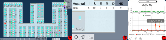 Figure 1
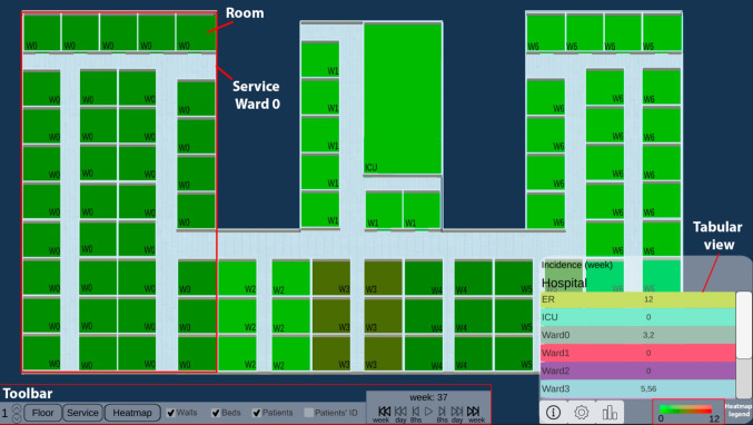 Figure 2
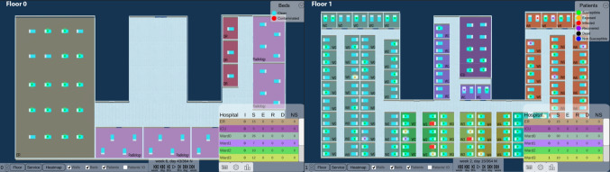 Figure 3
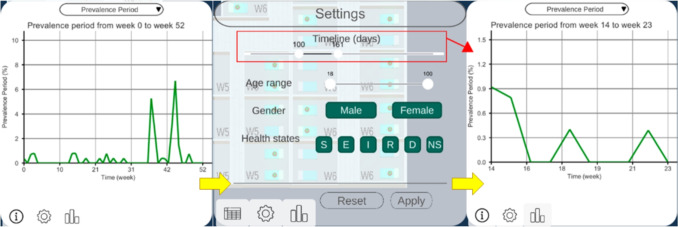 Figure 4
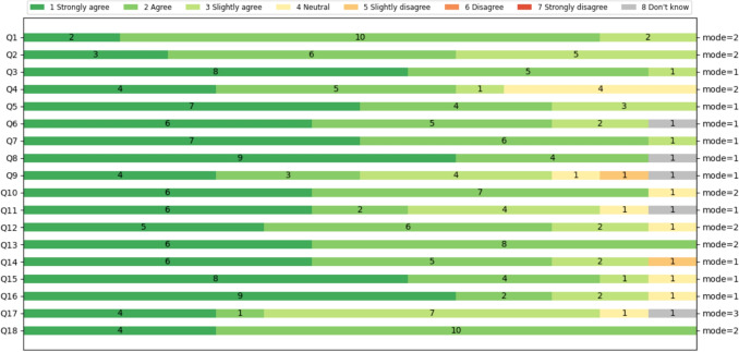 Figure 5
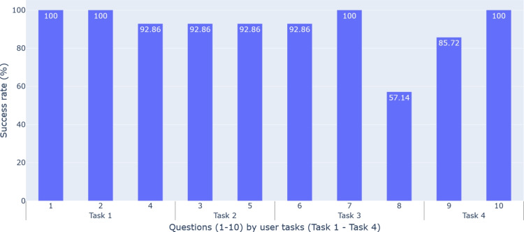 Figure 6
- —Universidad de Murcia
Peer Reviews
No public reviews on file for this paper yet. If you reviewed it on a platform where reviews are public (OpenReview, ICLR, NeurIPS, ICML), you can paste yours below so the community can read it here.
Videos
No videos yet. Explain this paper in a talk, walkthrough, or lecture? Add one.
Taxonomy
TopicsData-Driven Disease Surveillance · Health Policy Implementation Science · Data Visualization and Analytics
Introduction
Multidrug-resistant (MDR) microorganisms are those that have evolved and developed resistance to drugs used to treat them [1]. This makes their treatment complex and increases hospital stays, costs, mortality, and morbidity [2, 3]. Hospital-acquired infections (HAIs) caused by these microorganisms are especially dangerous and a growing priority for healthcare systems [4].
Controlling and preventing these infections requires monitoring in healthcare settings, where clinicians manually correlate patients’ spatial location at any time with microbiological test results. The large amount of clinical data generated daily for each patient makes this process complex, error-prone and time consuming for specialists and hospital administrators [5].
Applying interactive Information Visualization techniques in decision-support systems can mitigate this information overload [6] and improve the discovery of trends, patterns and patient clusters. However, epidemiological visualization tools typically focus on population-level disease surveillance over geographic areas [7, 8]. Few advances analyze individual-level infection spread within building interiors over time [9]. These tools would benefit epidemiologists, administrators and less experienced clinicians, and help in training for complex epidemic situations like the COVID-19 pandemic.Table 1. Decomposition and abstraction of user tasksTaskHigh LevelMedium LevelLow LevelT1: Analysis of the epidemiological situation in various places in the hospital over time using indicatorsDiscover information: generate or verify hypothesesExplore trends, characteristics in the dataCompare placesT2: Detection of sources of infection over a period of timeDiscover information: discover concentrations of casesLocate the location of concentrationsIdentify concentrations in spaceT3: Detection of patient zeroDiscover information: generate or verify hypothesesLocate index case: known target, unknown locationIdentify index caseT4: Study of possible outbreaksDiscover information: discover concentrations of casesExplore concentrations in time and spaceSummarize concentrations
In contact tracing and epidemiological studies, [10] designed multiple specialized views and a storyline visualization to analyze transmission pathways, patient contacts, and outbreak progression. Müller et al. [11] applied a recurrent neural network model to detect possible infections and transmissions, proposing a visual interface to explore the results. Sondag et al. [12] visualized time-varying infection maps with representative trees and interactive techniques for evaluating control policies.
Regarding spatial topology and space use, these approaches often involve sensors, video cameras and mobile phones. Oppermann et al. [9] introduced visual decision support tools for occupancy data in building management, visualizing trajectory-free spatial-temporal data in indoor environments. Boudreault et al. [13] proposed a situation-awareness dashboard displaying Intensive Care Unit (ICU) beds and information on staff and equipment to improve resource management and decision-making.
Our goal is to design spatial-temporal visualization techniques that facilitate the exploration of infection spreads within hospitals. For this reason, we develop an interactive visual tool, OBViz (OutBreak Visualization), to help analyze the epidemic situation of a hospital over time, allowing an understanding of the information contained in epidemiological indicators focusing on spatial and temporal dimensions.
Methods
Input Data
Monitoring an infection and its spread requires chronological information about patients’ spatial locations and microbiological test results. However, collecting these data for each individual presents challenges (eg. data quality, bias, confidentiality, and privacy protection [14]). Therefore, real publicly accessible datasets are not feasible for this purpose.
To address this, we used a highly realistic artificial dataset of hospitalized patients, generated by a simulator we developed and validated clinically [15]. It represents the spread of a Clostridioides difficile infection (CDI) in a hospital. CDI is a leading cause of infectious diarrhea in hospitalized patients, with increasing rates of resistance, mortality and hospitalizations [16]. Its incidence reached 92 per 100,000 inhabitants in North America and Europe [17], and its treatment is increasingly expensive and continues to be debated.
The synthetic data1 includes individual-level patient information from admission to discharge or death from CDI. Every 8 hours, it records the patient’s health state and bed location, enabling room-sharing tracing. Health states are based on an adaptation of the SEIRD (Susceptible, Exposed, Infected, Recovered, Deceased) model [18]. We added colonized upon admission and the Non-Susceptible status (“SEIRD-NS” model), representing patients with immunity to the disease. More information on the simulator and data in Appendix A.
User Tasks
Following Centers for Disease Control and Prevention recommendations for preventing and controlling MDR infections in healthcare settings [19], we compiled daily hospital tasks related to HAI control, focusing on spatial-temporal pathogen localization and outbreak identification. Using Munzner’s methodology [20], we abstracted these tasks to model clinical experts’ actions as visualization tasks. Each action was decomposed into three levels of detail (see Table 1).Fig. 1. The 3 views of OBViz. (A) The Hospital view shows the patients and the spread of the disease in a 3D spatial-temporal representation. (B) The Tabular view shows the values of the epidemiological indicators by place. (C) The Epi view displays the temporal evolution of the epidemiological indicators
Tools and Architecture
We developed the tool using Unity 3D (v2021.3.15f1) and C#, featuring 3D hospital visualization. Data visualization employed the E2Chart asset (v3.2) from Ice Pond Studio [21]. Through interactions with the environment and cameras, we enable both a general analysis of the hospital from different perspectives and a detailed analysis of patient interactions at a low level of abstraction, facilitating disease monitoring. We used Blender (v3.6) to model hospital elements and PostgreSQL (version 15.4) for data persistence.
User Experiment Design
To ensure the OBViz tool met users’ needs, we conducted a user-centered study with healthcare personnel to assess its usability, usefulness and interpretability. To design and validate this study, infectious disease expert performed a preliminary test to correct errors from a clinical perspective. Moreover, three collaborators with medical informatics background tested it to ensure the evaluation content was clear and to identify any necessary wording or organizational changes. The resulting study, conducted in the meeting room of the Infectology Department of the J. M. Morales Meseguer Hospital, consisted of three stages:
1. Introduction
Participants were introduced to the visual model, tool’s objectives, SEIRD-NS model, epidemiological indicators and the scenario they would work with. This scenario consists of a simulation of a year with several CD outbreaks. We conducted a tutorial on the tool to demonstrate the functionalities with a scenario different from the one they would use later. The entire explanation lasted approximately 15 minutes (transcription in Appendix B).
2. User experiment
Participants interacted individually with the tool and answered questions about the scenario while thinking out loud about what they were doing. This allowed us to understand what actions they wanted to perform at each moment, what they felt was missing, or what they would like to see instead. Each participant performed the evaluation individually using a Lenovo Legion Slim 7 and a 27” 75 Hz IPS AOC monitor. First, we let them familiarize themselves with the tool for several minutes and then the experiment began. Data such as age, gender, specialty, and experience were collected. Participants could stop at any time and ask questions, without a time limit imposed. This stage allowed us to evaluate the interpretability of the tool (questions regarding the CDI scenario in Appendix C).
3. User feedback
Participants completed a satisfaction questionnaire and provided suggestions for future developments. The questionnaire was based on the Post-Study System Usability Questionnaire (PSSUQ) v2 standard [22] and consisted of 18 questions: the first 8 referring to the usability of the system, 9 to 14 referring to the quality of the information presented, and 15 to 18 referring to the quality of the interface. The Likert scale used in this questionnaire had 7 levels, from Completely agree (1) to Completely disagree (7), or Don’t Know (8) (see Appendix D). Suggestions and feedback were collected during informal conversations with each participant after completing the evaluation [23].
Results
Tool Design
In this section, we present the interactive visual tool, which consists of three strategies to display spatial-temporal information (called views): Hospital, Tabular and Epi view (Fig. 1). We explain their implementation and the interactions between them and with the user. See Supplementary File 1 for an example of the interactions and functionalities of the tool.
Hospital View
The Hospital view shows pathogen spread, intra-hospital patient transfers, and endemic evolution across services on a 3D hospital plan (Tasks 1-3). This enables analysis of patients’ spatial distribution at each time, infection locations, contact events (when and with whom they shared a room) and areas with high patient concentrations over time.Fig. 2. Heatmap function. It aggregates the epidemiological indicator by week and service, and shows the values in the tabular view
Patients’ health states, based on the SEIRD-NS model, represent the health transitions regarding a CDI. For quick identification, they are coded with a segmented color scale, following Aigner et al. [24]: green (susceptible), yellow (exposed), red (infected), purple (recovered), black (deceased), and blue (non-susceptible). This helps identify transmissions (ie. when a susceptible patient was in contact with an infected one and became exposed), and potential future cases that could increase the spread.
Users can minimize other views to focus on the hospital and interact with the camera to move, zoom and rotate. To avoid visualization issues like occlusion and perspective distortion common in 3D representations [25], we implemented an orthographic camera, rendering objects uniformly without perspective.
Through a toolbar, users can control patient movements and infection progression animations (forward, backward, pause and resume). They can track patient locations, infection evolution, patients duration in each place, and contacts. Users can also skip time intervals (every 8 hours, day or week), instantly showing patients’ new locations at that moment. Time information (week, day, and morning/afternoon/night) is displayed above these controls. Users can switch floors of the hospital, hide non-essential visual objects (beds or walls), activate patient IDs to identify them, and group the Tabular view information by floor or service. They can enable the HeatMap functionality to see weekly-aggregated epidemiological indicators and track the evolution of each service (Fig. 2). This is useful for viewing in a controlled manner, summarized information on the status of each service (eg., to easily identify services where a given epidemiological threshold (eg. prevalence) is surpassed, locate extreme values, or compare the incidence rate between different wards).
Tabular View
The Tabular view aids infection analysis by showing epidemiological indicators by place and time (Tasks 1, 2). Users can choose the indicator at different spatial scales: hospital, floor or service level. For by-service, services are color-coded and coordinated with the Hospital view for easy map localization (Fig. 3). Clicking a service pans the Hospital view to that location. With HeatMap activated, this view displays a color legend and weekly aggregated indicator values by service (Fig. 2).Fig. 3. Epidemiological indicator aggregated by service. Both Hospital and Tabular views are color-coordinated so that each service is easily locatedFig. 4Epi view and filter menu performing semantic zooming. The user can choose a smaller range of time, and this will change the line chart temporal dimension
Epi View
The Epi view shows the temporal progression of epidemiological indicators through line charts, allowing analysis of infection evolution (Tasks 1, 4). Users can select an indicator: daily cases and point prevalence, or weekly incidence, period prevalence, mortality rate and incidence density. Daily cases follow the SEIRD-NS model, with health states color-coded to match the Hospital view. This provides an overview of the study period, with options for semantic and graphical zooming (Fig. 4), hovering over charts for specific values and filtering out information (Fig. 1C).
Filter of Patients
Besides the view-specific interactions, users can filter patients by age range, gender and health state in all views [26]. They can also zoom, as defined by Shneiderman [26], to focus on a subset of patients, selecting a time range, which automatically updates the other views accordingly (Fig. 4).
Evaluation Results
In this section, we explain the results of the evaluation regarding usability, interpretability and utility.
Participants and Data Collection
The study involved 14 health professionals (7 women, 7 men) from J. M. Morales Meseguer General University Hospital, Murcia, Spain. Participants ranged in age from 26 to 60, with different years of experience (Table 2). Data collected included responses to CDI scenario tasks, completion times, collaborators’ notes, PSSUQ questionnaire results, and participant feedback.
Usability Evaluation
The usability evaluation assessed the tool’s effectiveness, user satisfaction, and ease of use using the PSSUQ. The average response for system usefulness (Q1-Q8) was 1.79 (1 means “totally agree”), indicating high satisfaction (Fig. 5).Table 2. Summary of participants in the evaluationAge group25-34835-44245-542 \documentclass[12pt]{minimal} \usepackage{amsmath} \usepackage{wasysym} \usepackage{amsfonts} \usepackage{amssymb} \usepackage{amsbsy} \usepackage{mathrsfs} \usepackage{upgreek} \setlength{\oddsidemargin}{-69pt} \begin{document}$$\ge $$\end{document} 552GenderMasculine7Femenine7Experience (years)1-586-102 \documentclass[12pt]{minimal} \usepackage{amsmath} \usepackage{wasysym} \usepackage{amsfonts} \usepackage{amssymb} \usepackage{amsbsy} \usepackage{mathrsfs} \usepackage{upgreek} \setlength{\oddsidemargin}{-69pt} \begin{document}$$\ge $$\end{document} 204
Fig. 5PSSUQ results of OBViz. Q1-Q8 refer to usability, Q9-Q14 refer to quality of information and Q15-Q18 refer to quality of interface
Participants found the tool easy to use, especially for detecting patient contacts: the ability to see the entire hospital and individual patients to detect contacts was a significant improvement over manual analysis. They also found it intuitive, clear, and quick to learn, with an average response of 1.92 for information quality (Q9-Q14).
Several participants mentioned the interface was pleasant, particularly appreciating the color-coded services for quick location and identification of contaminated beds. For interface quality (Q15-Q18), the average was 1.85. However, some participants noted that patient monitoring was not very intuitive and suggested improvements (see Section 3.2.5).
Interpretability Evaluation
Interpretability measures how well the tool explains actions and events in a hospital setting. We evaluated its performance in solving clinical tasks (see Section 2.2) by translating them into 10 daily problems for infection specialists (Appendix C).
Figure 6 shows the percentage of correct answers per question, connected to the user task they address. Men had an 88.57% correct rate and women had a 94.29%, with no significant age difference. The lowest score (57.14%) was for patient contact (Q8, Task 3), consistent with participants’ comments on the difficulty of tracking patients.
In question Q9, regarding counting outbreaks (85.72% correct rate), the main challenge was understanding our definition of an outbreak. However, participants who regularly studied hospital outbreaks performed better than those less familiar with the task.
On average, users took 16.36 minutes to complete the questionnaire, with an average success rate of 91.43%.Fig. 6. Interpretability results. Success rate of multiple choice questions in the evaluation. Questions (1-10) are categorized by the user tasks to which they belong (Task 1-Task 4)Table 3. Improvements requestedImprovements Requested by users*“A patient ID search engine for easier location of specific patients.”“Patient tracking to trace their movements.”“Inclusion of healthcare personnel, considered important transmission vectors.”“Alerts for patient movements or discharges.”“Patient filtering by infecting microorganism.”*
Utility Evaluation
Utility reflects the interviewee’s perception of the tool’s potential to solve daily tasks.
After testing the tool, we conducted informal interviews to gather opinions, guiding the conversation with pre-established questions when necessary. Ten participants found it useful, and seven indicated they would incorporate it into their workflow. Two saw more utility within the ICU for patient monitoring, while another two expressed interest for annual infection and outbreak studies. Five noted its potential for studying other pathogens (eg., seasonal flu, respiratory viruses).
Suggestions for Improvements
During feedback, we asked for suggestions to enhance the tool’s utility. Table 3 shows the most repeated improvements requested.
Discussion
Many epidemiology tools focus on population-level analyses and geographic visualizations, often for public access. However, there is limited progress in tools designed to help hospital decision-making to control infectious diseases. OBViz combines a 3D hospital visualization, a 2D disease progression, and a tabular visualization for detailed information. This approach uses dynamic and static visualization techniques to show different data perspectives, enabling user interaction, quick analysis and detailed information on demand. The 3D representation can be leveraged with future improvements, such as aggregating information for a spatial axis (eg. aggregate several floors) or showing all the floors from other perspectives.
When developing a visual medical tool, processing real clinical data poses significant risks. Using realistic synthetic data, we avoid problems with sensitive and incomplete information. There would be no difference between simulated and real environments if data were obtained with the same precision. The current implementation provides data integration from log files and relational databases, enabling use with both simulated and real data. However, to strengthen the tool’s practical applicability and clinical relevance, further efforts are needed to address the challenges associated with integrating data from electronic health records. These systems often contain heterogeneous, incomplete, and inconsistently structured data, which can hinder tool performance and generalization. Addressing these issues through processes such as data harmonization and robust preprocessing pipelines would enhance the tool’s utility in real-world clinical settings.
Unity was chosen for its efficiency in developing 2D and 3D tools, but has limitations in data visualization, leading to a limited variety of graphics developments in the asset store.
Additionally, scalability in hospital modeling is a challenge and possible limitation of this tool. Efforts are underway to automate floor creation. The hospital model presented here was created using this method.
Validation
is crucial in developing any visualization tool. Not all visual encodings can address every task, so evaluating a visualization’s quality for specific goals is essential. OBViz’s utility, usability and interpretability were evaluated with healthcare professionals. The evaluation was carefully planned to optimize professionals’ limited time. In this process, the collaboration with an internist was especially helpful in adapting explanations to the clinicians’ perspective and making us understand it as best as possible.
User evaluation showed that the tool helps specialists perform hospital analysis tasks more efficiently, while patient-level information aids in controlling epidemics within the hospital. Users found the spatial presentation useful and easy to understand, allowing them to quickly locate areas within the hospital. Time-series visualization of disease progression assists in identifying critical periods in a glance. The ability to analyze each hospital service and control time provides flexibility in investigating disease transmission, which is not possible with plain tables or text files, as they currently use. Participants favored the ability to see the hospital overview and then delve into details compared to alternative methods or more abstract visualizations.
The tool successfully resolved 3 out of 4 tasks, except Task 3 (tracking individual patients), reflected in the interpretability results. This is due to the lack of a clearly defined approach for using the tool to find individual patients during the design phase. This has underlined the shortcomings of the tool and improvements, such as highlighting the tracked patient, adding a list of patients who had any contact with them, or indicating when a filter is currently active, so that users do not miss a potentially important group of patients because they are filtered out. Having 14 specialists evaluate the tool has been a great advantage, since they provided perspectives different from ours.
Regarding utility, OBViz has multiple applications in health and training. It helps doctors and hospital administrators make informed decisions (eg., isolation of infected patients or greater monitoring of at-risk patients’ movements). It can also be applied in the Objective Structured Clinical Examination, to evaluate medical students’ skills in simulated scenarios. However, utility can be improved by adding different symbols so that people with color vision deficiency can distinguish between patients’ health states.
Conclusion
We proposed a visual decision support tool that integrates spatial-temporal patient data with their health conditions during an MDR-bacterial infection spread.
The tool combines a 3D hospital visualization, a 2D temporal visualization of the disease, and a tabular visualization for detailed information. Interactivity and animations accurately represent patient movements and infection processes, while the use of known charts facilitates temporal understanding through epidemiological indicators.
The tool was evaluated by 14 health professionals using a PSSUQ questionnaire, with high scores for usability (1.79), information quality (1.92), and interface quality (1.85). These results indicate that the tool was well received by experts. All tasks except Task 3 were successfully completed, demonstrating the clarity and usefulness of the tool in these areas. However, user feedback highlighted areas for improvement, especially in patient tracking and scalability.
Supplementary Information
Below is the link to the electronic supplementary material.Supplementary file 1 (mp4 5428 KB)
The reference list from the paper itself. Each links out to its DOI / PubMed record.
- 1World Health Organization: Antimicrobial resistance, 2023. https://www.who.int/news-room/fact-sheets/detail/antimicrobial-resistance. Accessed 06-March-2024
- 2Jernigan, J.A., Hatfield, K.M., Wolford, H., Nelson, R.E., Olubajo, B., Reddy, S.C., Mc Carthy, N., Paul, P., Mc Donald, L.C., Kallen, A., Fiore, A., Craig, M., and Baggs, J., Multidrug-Resistant Bacterial Infections in U.S. Hospitalized Patients, 2012-2017. New Engl. J. Med. 382(14):1309–1319, 2020. 10.1056/NEJ Moa 191443310.1056/NEJ Moa 1914433 PMC 1096169932242356 · doi ↗ · pubmed ↗
- 3Rind, A., Miksch, S., Aigner, W., Turic, T., Pohl, M., Visuexplore: Gaining new medical insights from visual exploration. In: Proceedings of the 1st International Workshop on Interactive Systems in Healthcare (WISH), pp. 149–152, 2010
- 4Belay, E.D., Abrams, J., Oster, M.E., Giovanni, J., Pierce, T., Meng, L., Prezzato, E., Balachandran, N., Openshaw, J.J., Rosen, H.E., Kim, M., Richardson, G., Hand, J., Tobin-D’Angelo, M., Wilson, S., Hartley, A., Jones, C., Kolsin, J., Mohamed, H., Colles, Z., Hammett, T., Patel, P., Stierman, B., Campbell, A.P., Godfred-Cato, S., Trends in Geographic and Temporal Distribution of US Children with Multisystem Inflammatory Syndrome during the COVID-19 Pandemic. JAMA Pediat. 175(8):837–845, 2021. · doi ↗ · pubmed ↗
- 5Kissler, S.M., Gog, J.R., Viboud, C., Charu, V., Bjørnstad, O.N., Simonsen, L., Grenfell, B.T., Geographic transmission hubs of the 2009 influenza pandemic in the United States. Epidemics. 26:86–94, 2019. 10.1016/j.epidem.2018.10.00210.1016/j.epidem.2018.10.00230327253 · doi ↗ · pubmed ↗
- 6Baumgartl, T., Petzold, M., Wunderlich, M., Höhn, M., Archambault, D., Lieser, M., Dalpke, A., Scheithauer, S., Marschollek, M., Eichel, V.M., Mutters, N.T., Consortium, H., Landesberger, T., In Search of Patient Zero. IEEE Trans. Visual. Comput. Graphics. 27(2):711–721, 2021. 10.1109/TVCG.2020.303043710.1109/TVCG.2020.303043733290223 · doi ↗ · pubmed ↗
- 7Müller, M., Petzold, M., Wunderlich, M., Baumgartl, T., Höhn, M., Eichel, V., Mutters, N.T., Scheithauer, S., Marschollek, M., Landesberger, T.v., Visual Analysis for Hospital Infection Control using a RNN Model. In: Euro VA: International Workshop on Visual Analytics. The Eurographics Association, 2020. 10.2312/eurova.20201090
- 8Boudreault, L., Hebert-Lavoie, M., Ung, K., Mahmoudhi, C., Vu, Q.P., Jouvet, P., Doyon-Poulin, P., Situation Awareness-Oriented Dashboard in IC Us in Support of Resource Management in Time of Pandemics. IEEE J. Transl. Eng. Health Med. 11:151–160, 2023. 10.1109/JTEHM.2023.324121510.1109/JTEHM.2023.3241215 PMC 990445036816098 · doi ↗ · pubmed ↗