Enhancing the communication of radiation exposure data for radiological workers in Korea using data visualization techniques
Kyoungho Choi, Mohamad Syazwan Sanusi, Mohamad Syazwan Sanusi, Mohamad Syazwan Sanusi, Mohamad Syazwan Sanusi

TL;DR
This paper explores how data visualization can improve the understanding of radiation exposure data for workers in Korea.
Contribution
The study introduces novel visualization techniques to make radiation exposure data more accessible and actionable for non-experts.
Findings
Visualization methods like radar charts and box plots effectively highlight disparities in radiation exposure across professions and regions.
The study shows that visualizing data improves comprehension and decision-making for stakeholders.
Limitations include reliance on public datasets and the need for primary data collection.
Abstract
Effective communication of radiation exposure data is essential for improving safety management practices for radiological workers. However, traditional tabular formats used in reporting radiation exposure data often fail to convey critical patterns and trends, making it difficult for non-experts to interpret and act on the information. This study evaluates the application of data visualization techniques, including radar charts, box plots, sparklines, and Chernoff faces, to enhance the accessibility and comprehension of radiation exposure data. Using datasets from the “2022 Annual Report on Individual Exposure Doses of Radiological Workers” published by the KDCA, this study demonstrates how visualization can effectively highlight disparities across professions, demographic groups, and geographic regions. The findings underscore the significant potential of visualization methods in…
Genes, proteins, chemicals, diseases, species, mutations and cell lines named across the full text — each resolved to its canonical identifier and authoritative record.
Click any figure to enlarge with its caption.
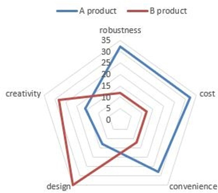 Figure 1
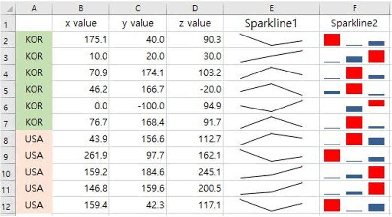 Figure 2
 Figure 3
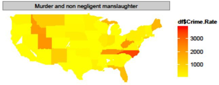 Figure 4
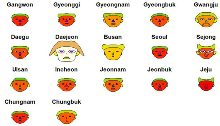 Figure 5
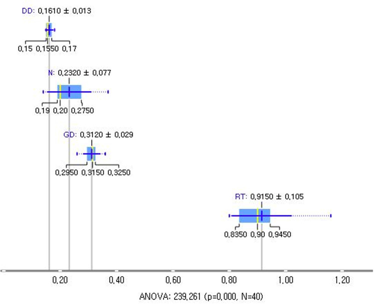 Figure 6
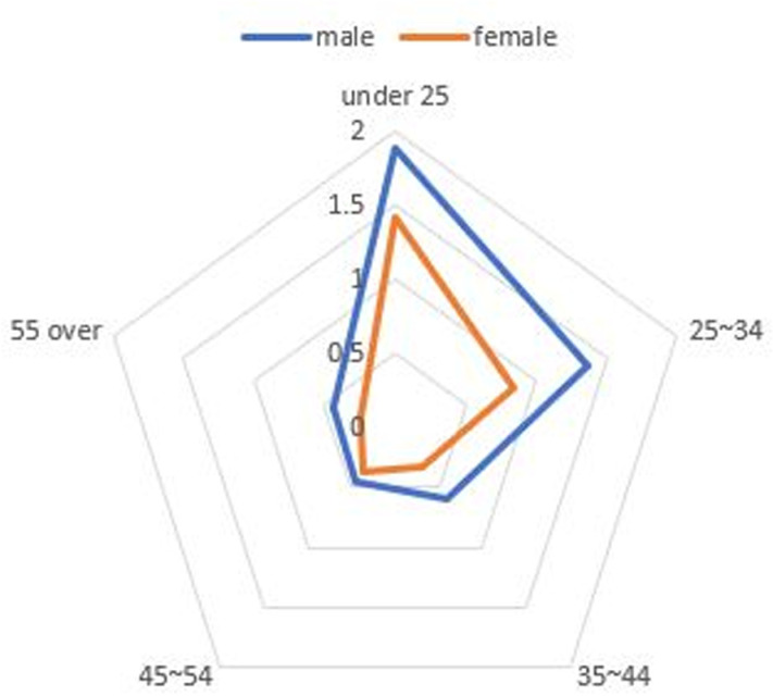 Figure 7
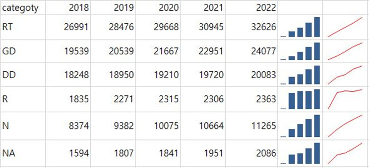 Figure 8
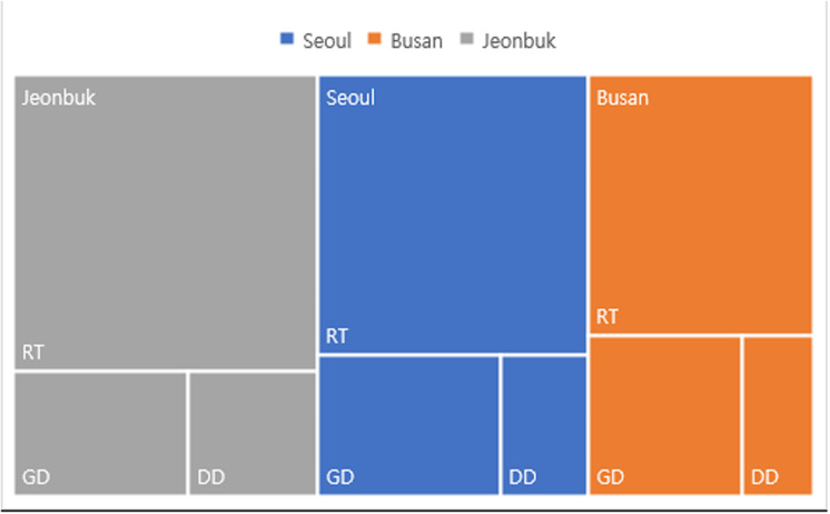 Figure 9
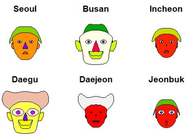 Figure 10
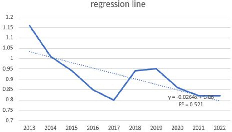 Figure 11
 Figure 12
 Figure 13
Peer Reviews
No public reviews on file for this paper yet. If you reviewed it on a platform where reviews are public (OpenReview, ICLR, NeurIPS, ICML), you can paste yours below so the community can read it here.
Videos
No videos yet. Explain this paper in a talk, walkthrough, or lecture? Add one.
Taxonomy
TopicsData Visualization and Analytics · Data-Driven Disease Surveillance · Computational and Text Analysis Methods