Response to: Local social vulnerability as a predictor for cancer-related mortality among US counties
Krista Y Chen, Amanda L Blackford, Ramy Sedhom, Arjun Gupta, S M Qasim Hussaini
Abstract
Genes, proteins, chemicals, diseases, species, mutations and cell lines named across the full text — each resolved to its canonical identifier and authoritative record.
Click any figure to enlarge with its caption.
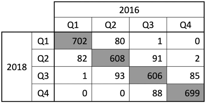 Figure 1
Peer Reviews
No public reviews on file for this paper yet. If you reviewed it on a platform where reviews are public (OpenReview, ICLR, NeurIPS, ICML), you can paste yours below so the community can read it here.
Videos
No videos yet. Explain this paper in a talk, walkthrough, or lecture? Add one.
Taxonomy
TopicsHealth disparities and outcomes · Food Security and Health in Diverse Populations · Global Health Workforce Issues
We thank Mr. Uduba and his co-authors for their thoughtful response to our report examining associations between county-level social vulnerability index (SVI) and age-adjusted cancer mortality rates (AAMRs) across the USA.^1^
One concern was the selection of SVI data for analysis, given that there are multiple SVI datasets (2014, 2016, and 2018) available within our study period of 2013-2019. The study period was chosen based on publicly available data from the Center for Disease Control Wide-ranging Online Data for Epidemiologic Research Database at the time of publication. We subsequently selected the SVI index from 2018 as it aggregates data from the American Community Survey across the 5-year period between 2014 and 2018.^2^ Each update accordingly aggregates data from the 5 years prior, such that the 2016 update includes data from 2012 to 2016 and the 2014 update includes data from 2010 to 2014.^3,4^ Although none directly correspond to our study period of 2013-2019, the 2018 update includes only years considered in our study and centers around the same midpoint of 2016. Based on the suggestion presented by Uduba et al. to use the mid-period data, the 2018 SVI update is best suited for our analysis.
To further evaluate our methodology, we also compared SVI data from 2016 and 2018. SVI is presented as a percentile, with all US counties ranked from 0 to 1 and 1 being most vulnerable. We generated a modified SVI for both years by aggregating percentile ranks for each of the SVI components except for the Minority Status and Language component, and we present the number of counties that were classified into each quartile in Figure 1. Overall, there was 83% agreement in SVI quartile. Of the 17% of counties that moved across quartiles between the 2 updates, >99% moved only 1 quartile, corresponding to a median difference in SVI between years of −0.0005. These data suggest that the results of our study are likely robust to changes based on SVI year.
An additional concern was the exclusion of minority status and the creation of a modified SVI for analysis. Our analysis compares the highest and lowest SVI quartiles of US counties across multiple sociodemographic characteristics, including ethnicity and race. SVI is comprised of multiple variables grouped into 4 themes, including Minority Status and Language in the 2018 update. We followed the methodology of Khan et al. in removing the minority theme in order to prevent it from influencing mortality estimates when comparing across race and ethnicity.^5^ We would like to clarify that we removed the entire minority theme, including both minority status and decreased English proficiency, from the analysis. We then created the modified, composite SVI by summing the relative contributions of variables from the 3 other themes and re-generating percentile rankings for overall social vulnerability. We apologize for any imprecise phrasing used in the methodology but believe that by excluding this theme, we have limited some of the potential bias in results for minority populations.
Lastly, we acknowledge the typographical error in Figure 1 and apologize for any confusion this may have caused. We have contacted the editorial team to address this mistake and ensure that Figure 1A, showing a map of SVI quartiles, and Figure 1B, showing a map of AAMR quartiles, correspond to the correct labels within the legend.
In summary, we thank Uduba et al. for highlighting these points for clarification. We believe our methodology to be consistent with their concerns and well-designed to support our conclusions—that counties with greater social vulnerability have higher cancer mortality and that these disparities are more pronounced among individuals aged 45-65, among Hispanic populations, in southern regions, and in rural counties.
The reference list from the paper itself. Each links out to its DOI / PubMed record.
- 1Uduba R , Rath D, Gillum R. Local social vulnerability as a predictor for cancer-related mortality among US counties. Oncologist.2024:oyae 251. https://doi.org/10.1093/oncolo/oyae 25139276335 · doi ↗ · pubmed ↗
- 2Center for Disease Control Agency for Toxic Substances and Disease Registry. CDC SVI 2018 Documentation. CDC/ATSDR; 2022. https://www.atsdr.cdc.gov/place-health/media/pdfs/2024/08/SVI 2018 Documentation_01192022_1.pdf
- 3Center for Disease Control Agency for Toxic Substances and Disease Registry. CDC SVI 2016 Documentation. CDC/ATSDR; 2020. https://www.atsdr.cdc.gov/place-health/media/pdfs/2024/08/SVI 2016 Documentation_01192022.pdf
- 4Center for Disease Control Agency for Toxic Substances and Disease Registry. CDC SVI 2014 Documentation. CDC/ATSDR; 2017. https://www.atsdr.cdc.gov/place-health/media/pdfs/2024/08/SVI 2014 Documentation_01192022_1.pdf
- 5Khan SU , Javed Z, Lone AN, et al Social vulnerability and premature cardiovascular mortality among US Counties, 2014 to 2018. Circulation. 2021;144:1272-1279. https://doi.org/10.1161/CIRCULATIONAHA.121.05451634662161 · doi ↗ · pubmed ↗