PerfVis: Pervasive Visualization in Immersive AugmentedReality for Performance Awareness
Leonel Merino, Mario Hess, Alexandre Bergel, Oscar Nierstrasz, Daniel, Weiskopf

TL;DR
This paper introduces PerfVis, an immersive AR visualization tool using a city metaphor to help developers monitor and analyze software performance data seamlessly within their development environment.
Contribution
It presents a novel city visualization metaphor integrated with AR technology to support continuous performance awareness in software development.
Findings
City metaphor effectively visualizes large performance data
AR visualization enhances developer awareness of performance changes
Initial feedback indicates usability and usefulness of the approach
Abstract
Developers are usually unaware of the impact of code changes to the performance of software systems. Although developers can analyze the performance of a system by executing, for instance, a performance test to compare the performance of two consecutive versions of the system, changing from a programming task to a testing task would disrupt the development flow. In this paper, we propose the use of a city visualization that dynamically provides developers with a pervasive view of the continuous performance of a system. We use an immersive augmented reality device (Microsoft HoloLens) to display our visualization and extend the integrated development environment on a computer screen to use the physical space. We report on technical details of the design and implementation of our visualization tool, and discuss early feedback that we collected of its usability. Our investigation explores…
Click any figure to enlarge with its caption.
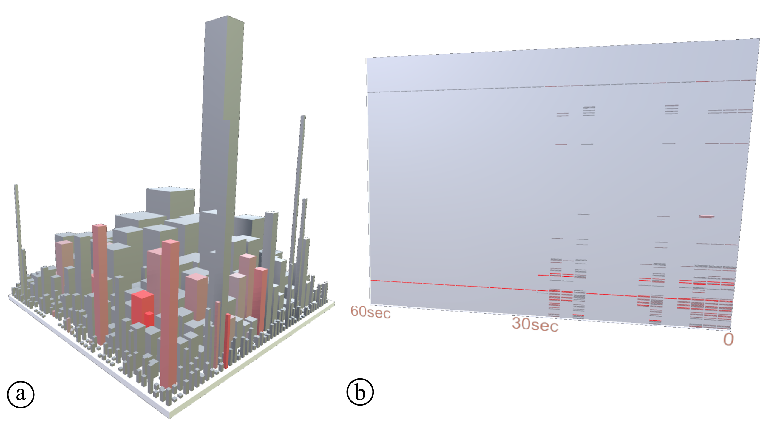 Figure 1
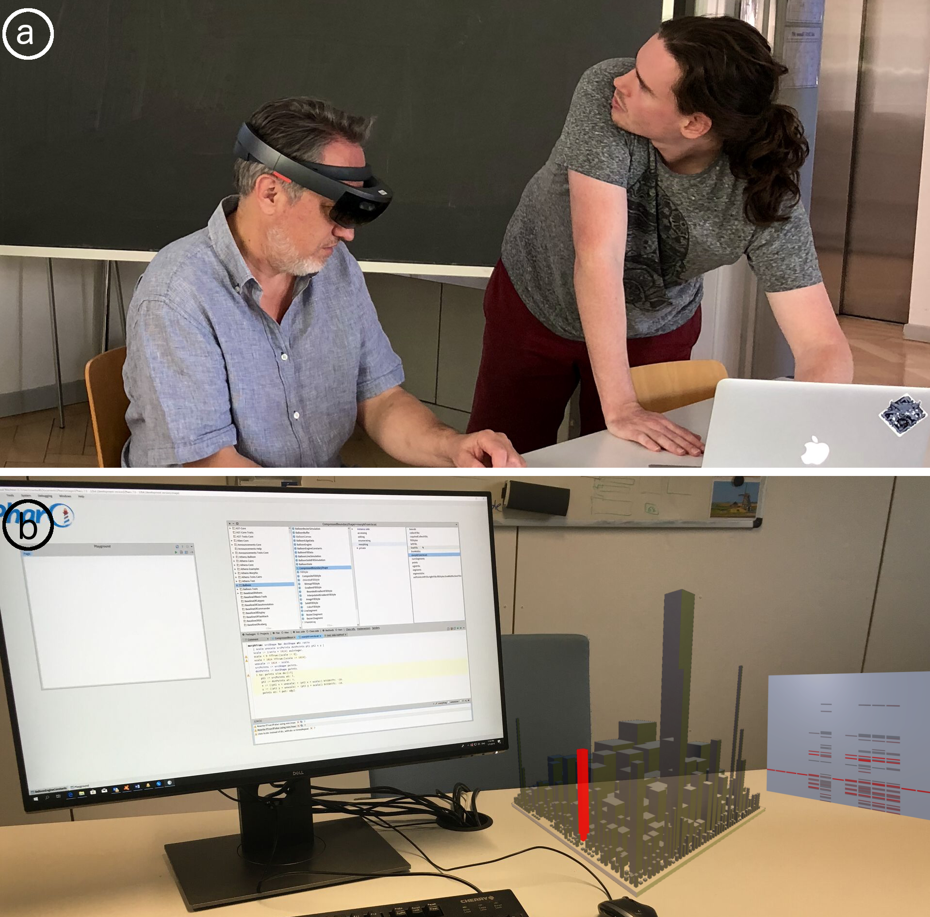 Figure 2
Peer Reviews
No public reviews on file for this paper yet. If you reviewed it on a platform where reviews are public (OpenReview, ICLR, NeurIPS, ICML), you can paste yours below so the community can read it here.
Videos
No videos yet. Explain this paper in a talk, walkthrough, or lecture? Add one.
PerfVis: Pervasive Visualization in Immersive Augmented Reality for Performance Awareness
Leonel Merino
VISUS, University of Stuttgart
,
Mario Hess
SCG, University of Bern
,
Alexandre Bergel
ISCLab, DCC, University of Chile
,
Oscar Nierstrasz
SCG, University of Bern
and
Daniel Weiskopf
VISUS, University of Stuttgart
(2019)
Abstract.
Developers are usually unaware of the impact of code changes to the performance of software systems. Although developers can analyze the performance of a system by executing, for instance, a performance test to compare the performance of two consecutive versions of the system, changing from a programming task to a testing task would disrupt the development flow. In this paper, we propose the use of a city visualization that dynamically provides developers with a pervasive view of the continuous performance of a system. We use an immersive augmented reality device (Microsoft HoloLens) to display our visualization and extend the integrated development environment on a computer screen to use the physical space. We report on technical details of the design and implementation of our visualization tool, and discuss early feedback that we collected of its usability. Our investigation explores a new visual metaphor to support the exploration and analysis of possibly very large and multidimensional performance data. Our initial result indicates that the city metaphor can be adequate to analyze dynamic performance data on a large and non-trivial software system.
††copyright: rightsretained††journalyear: 2019††copyright: acmlicensed††conference: Tenth ACM/SPEC International Conference on Performance Engineering Companion; April 7–11, 2019; Mumbai, India††booktitle: Tenth ACM/SPEC International Conference on Performance Engineering Companion (ICPE ’19 Companion), April 7–11, 2019, Mumbai, India††price: 15.00††doi: 10.1145/3302541.3313104††isbn: 978-1-4503-6286-3/19/04††ccs: General and reference Performance††ccs: Human-centered computing Visualization design and evaluation methods††ccs: Human-centered computing Mobile devices††ccs: Software and its engineering Software maintenance tools
1. Introduction
Among the many questions that arise during software development, programmers often formulate questions about the performance of software systems (LaToza and Myers, 2010; Alcocer et al., 2013). They ask, for instance, “what is the software doing when performance issues arise?” (Reiss and Renieris, 2005), and “where is most of the time being spent?” (Shah and Guyer, 2016). Since developers introduce multiple changes to the source code during the implementation of a software system, being aware of the impact of a code change task to the performance of a software system is an important concern for developers (LaToza and Myers, 2010). Tools such as profilers and performance tests allow developers to analyze the performance of only a single version of a system at a time, and force developers to change to a different task (interrupting their flow). Our intuition is that developers would benefit from analyzing the live performance of an evolving system as its source code changes. We expect that such an analysis would help them identify changes that severely decrease the performance of a system.
We conjecture that a pervasive tool, (i.e., a tool that is omnipresent at all times during the implementation of a software system) can make developers aware of important changes in the performance of a system without disrupting the implementation flow. Using a visualization approach, developers could obtain such a pervasive view of the live performance of a system, however, we observe that developers can be reluctant to sacrifice space in their integrated development environment (IDE). Consequently, we formulate the following research question:
RQ: How can visualization support developers in the analysis of the impact of source code changes to the performance of a system?
This paper presents an initial step toward answering our general research question. To increase developer awareness of the impact of changes to the source code in the performance of software systems we present PerfVis, a pervasive visualization tool displaying in immersive augmented reality. PerfVis provides an omnipresent overview of the system that takes advantage of visualization techniques to make developers aware of the impact of changes introduced to the source code in the live performance of a software system.
The main contribution of the paper is threefold:
(i) a discussion of design choices,
(ii) lessons learned from building the tool, and
(iii) insights from observing its use.
We also contribute to the reproducibility of our research by making the implementation of PerfVis publicly available111http://scg.unibe.ch/research/perfvis.
2. Related work
A number of 3D visualization tools have been proposed to support software development concerns. SeeIt 3D (Sharif et al., 2013) uses a 3D scatter plot visualization to represent software metrics collected from Java source code to support developers on software comprehension tasks. SynchroVis (Waller et al., 2013) employs a visualization based on the 3D city metaphor that displays the structure and metrics of software systems, as well as program traces and synchronization aspects (e.g., semaphores/wait) to support the analysis of the behavior of concurrent software systems. These tools display the 3D visualization on a standard computer screen and focus on performance data collected using static analysis. In contrast, we propose the visualization to be displayed in immersive augmented reality and focus on live performance data collected using dynamic analysis.
There are some visualization tools that use virtual reality to support software comprehension tasks. Code Park (Khaloo et al., 2017) proposes an immersive visualization of software metrics and source code; an evaluation showed that the visualization displayed in virtual reality excels at usability and significantly helps in code understanding. ExplorViz (Fittkau et al., 2017) introduces a visualization of software landscapes to support software comprehension tasks. CityVR (Merino et al., 2017c) gamifies software implementations using a 3D city visualization displayed in virtual reality to boost developer engagement. In contrast, we propose the use of immersive augmented reality to improve the awareness of the impact of changes on the source code to the performance of software systems. Moreover, some of these tools focus on various static software metrics, as opposed to our tool that includes the visualization of dynamic live performance data.
Several existing performance visualizations focus on the analysis of static performance data. JOVE (Reiss and Renieris, 2005) is a visualization tool for monitoring the performance of Java programs. Using the visualization, developers can obtain details on demand to identify routines and threads in which the application spends much time. Another tool (Blochinger et al., 2005) includes the visualization of the structure of parallel software systems. The visualization uses an execution graph to simplify the analysis of the complex run-time behavior. Moreta and Telea (Moreta and Telea, 2007) present a visualization of the behavior of the memory allocator in C programs to optimize functionality, decrease fragmentation, and improve response time. Another tool (Ogami et al., 2017) facilitates the visualization of software performance in real-time, using the city metaphor to show the structure and performance of a program. The buildings in the city represent the classes in the system, and the heights of the buildings represent the number of times the methods of a class are called during execution. All these tools support the analysis of various aspects of software performance through visualizations displayed on a standard computer screen. In contrast, we rely on immersive augmented reality to display our visualization.
A few software visualizations chose augmented reality as a display medium. One study (Merino et al., 2018) evaluated a city visualization displayed in immersive augmented reality to support software comprehension tasks. Another study (Souza et al., 2012) used the city metaphor in augmented reality to support the analysis of software evolution. In contrast, we propose a city-based visualization using immersive augmented reality to support software performance tasks, which is an innovative and not-yet explored approach.
3. PerfVis Overview
PerfVis is a tool to visualize software performance through immersive augmented reality. We characterize the context of PerfVis using a taxonomy proposed by Maletic et al. (Maletic et al., 2002) and Merino et al. (Merino et al., 2017b).
PerfVis provides visualization in immersive augmented reality to support the programmer audience in system performance tasks. The visualization shows static data of the structure of the system and dynamic data of the live performance of the system.
3.1. Design
Medium: Immersive Augmented Reality. Most visualizations that support performance analysis tasks are displayed on a computer screen. They require developers to either use an application outside their development environment, or use a plug-in in their environment that sacrifices some valuable screen space. Amongst the few visualizations that use a different medium most are displayed in immersive virtual reality (Merino et al., 2017a). These visualizations require that developers completely change their development environment, and isolate themselves wearing a headset. As opposed to these approaches, we argue that a medium that disrupts as little as possible the development flow can significantly increase the usability of visualizations. The medium used to display a software visualization can impact its effectiveness and efficiency (Merino, 2018). Consequently, we chose immersive augmented reality to display PerfVis, because
(i) developers can use the visualization as a complement to their usual development environment without much disruption (i.e., developers are required to wear a headset, but not to modify the rest of their environment), and
(ii) visualizations in immersive augmented reality are inherently displayed in 3D, which provides an extra dimension to encode performance data of a software system.
Apparatus: HoloLens. We choose Microsoft HoloLens to render our visualization in immersive augmented reality. HoloLens is an untethered head-mounted stereoscopic display, featuring two stereoscopic displays with 1268720 pixel resolution, 60 Hz content refresh rate, and a 30° H and 17.5° V field of view. Interaction is possible through head tracking, gesture input, and voice support.
Technique: City Visualization and Scatter plot. In a previous study (Merino et al., 2017b), we observed that most visualizations to support developers in monitoring performance used pixel-based techniques. These visualizations usually attempt to provide an overview of a significant amount of data to promote the detection of visual patterns that may signal anomalies in the performance of software systems. Instead, we adopt lightweight visualization techniques that involve less cognitive effort to make developers aware of the performance of a system. Our visualization includes two views:
(i) a city visualization that provides a pervasive overview of the structure and performance and
(ii) a scatter plot that displays the history of the performance of a software system in the past.
City visualization. We opted to represent a metric of the performance of the software system using the color of buildings. The visualization is always on and indicates the system performance collected during a short time frame. In consequence, a glimpse at the city can make developers aware of the current overall status of the performance, and a detail of the classes that are involved. Figure 2 \smalla⃝ shows a visualized software city. Each building represents a class in the software system. Buildings are grouped into districts according to their packages. Each building can be configured to represent software metrics using three properties:
(i) height,
(ii) footprint (e.g., squared base), and
(iii) color.
We consequently configured the city in the following manner: each building’s
(i) height encodes the number of methods of the represented class,
(ii) footprint (i.e., squared base) encodes the number of attributes of the represented class, and
(iii) color encodes the number of times that methods of the class are called during execution.
Scatter plot. The scatter plot helps developers analyze changes in the dynamic city visualization that might be overlooked. Figure 2 \smallb⃝ shows the scatter plot to the right of the city visualization. The -axis encodes time, and the -axis encodes the classes in the system. Each mark represents a class that was involved in the execution of the system at a point in time. The color of a mark encodes the number of times methods of a class were called. The more intense the red, the more often a class was called. Each row in the scatter plot represents the evolution of the number of times the methods of a class are called along time. Each column is a snapshot of the performance of the whole system at a point in time.
Interaction: Selection and Navigation. Developers can interact with PerfVis through:
(i) Selection. Through head movements, users can point and select elements in the visualization. When the pointer hovers over a building in the city visualization or a mark in the scatter plot, the name of the corresponding class is displayed. Users select buildings by performing an airtap gesture.222https://docs.microsoft.com/en-us/hololens/ Once a building is selected, that building and the mark that represent the same class are simultaneously highlighted with a yellow background. Similarly, when selecting a mark in the scatter plot, the building and mark that represent the same class are highlighted. Using this feature, developers relate the information they get from one visualization to the elements in the complementary visualization. (ii) Navigation. To gain an overview of the whole system, the user can move around and inspect the city from different angles. This way the user can compare metrics between different buildings.
3.2. Implementation
The landscape of the city visualization is generated using CodeCity333http://smalltalkhub.com/#!/~RichardWettel/CodeCity for Moose 5.444http://www.moosetechnology.org/ The color animation of the city and the scatter plot are implemented in Unity555Version 2017.3.0b8 (64-bit) using the MixedRealityToolkit-Unity666https://github.com/Microsoft/MixedRealityToolkit-Unity library. The performance data are collected using the Spy2777https://github.com/ObjectProfile/Spy2 profiler for Pharo Smalltalk, and streamed to the HoloLens through the network.
4. Discussion
We revisit our research question: How can visualization support developers in the analysis of the impact of source code changes to the performance of a system? We have presented a design and publicly available implementation of a visualization tool that uses immersive augmented reality to support developers in the analysis of software performance. We now discuss lessons learned during the development process, and early feedback on the usability of PerfVis.
4.1. Lessons Learned
Scale. PerfVis aims to give developers an overview of the live performance of a software system with the least disruption possible to the integrated development environment. We tested PerfVis visualizations at various scales. We observed that the visualization had to be scaled to be large enough to give an overview of the complete system, but also small enough to be used as a complement to a computer screen.
Text. We learned that the position, rotation, and scale of text can greatly impact usability when navigation is done by head movements. In an early prototype, we chose to display the names of classes on top of their corresponding building, however, we found that depending on the position of the user and the size of the building, the text on top of a building might be difficult to read, and also that text on top of a building might be occluded by neighboring buildings. We addressed these issues by positioning the text in relation to the position of the camera. Specifically, we placed the text at the top left corner of the user’s field of view. Benefits of this approach are that
(i) text is never occluded,
(ii) text always faces the user, and
(iii) no movement of the head and only little movement of the eyes is required to read the text.
History. A live visualization has the benefit that it can provide developers online feedback of the performance of the system, however, changes in the visual properties of the visualization can take a very short time. Then the city visualization can be good at making developers aware of an important change in the performance but might not be good for analyzing details of the context of the change since it provides developers too little time to react. To help developers get details on demand we included a companion lightweight visualization (i.e., scatter plot). We observed some usability issues. For instance,
(i) marks in the scatter plot can be too small and difficult to select, and
(ii) the size of the buffer presented in the scatter plot has to ensure a good performance (too many marks would slow down the visualization tool).
To address the former issue we included a type of selection that involves only head movement (marks are selected when hovering over them for one second). We also addressed the latter issue by making the definition of the size of the buffer configurable.
4.2. Early Feedback on Usability
We demonstrated the tool to a group of Computer Science students to discuss our design choices and obtain impressions. Their feedback allowed us to iterate several times on the design of the various components of the visualization tool. Certainly, the positive impressions of developers who used our visualization tool do not represent a solid proof of its benefits, however, they represent a basis to design a suitable evaluation (Merino et al., 2018).
Visualization Techniques. Developers who used PerfVis noticed that the city visualization and the scatter plot complement each other. The former, being a space-filling technique, can be scaled down to a small size, and so provide developers an omnipresent overview of the performance of the whole system; and once the attention of a developer is caught, the latter can be used to provide details on demand of the history of the performance of a system. Some developers who used early prototypes of PerfVis observed that the city visualization was too big, and so only part of it was visible through the narrow field of view of the immersive augmented reality device that we used (HoloLens). We then scaled the visualization to be visible even when the developer is looking at the computer screen.
Interactions. Interactions such as navigation and selection represent key features that promote usability. In particular, developers who used PerfVis found it difficult to stabilize their head when pointing at small elements in the visualization to select them (through airtap). Some of the developers also said that the highlighting feature of selected elements in the city and scatter plot visualizations did not have a good contrast, and it was hard to see. Several developers suggested including more interactions to the scatter plot visualization. Specifically, they said that features to pause and rewind would help them in the analysis of the performance of the system in a past time.
5. Conclusion and Future work
We introduced PerfVis, a visualization tool displayed in immersive augmented reality that supports developers in the analysis of software performance. We elaborated on design choices and discussed implementation details, lessons learned, and early impressions of developers who used prototypes of our visualization tool. In the future, we plan to conduct a thorough evaluation of PerfVis to identify strengths and improvement opportunities.
Acknowledgments
Merino and Weiskopf acknowledge funding by the Deutsche Forschungsgemeinschaft (DFG, German Research Foundation) – Projektnummer 251654672 – TRR 161. Nierstrasz thanks the Swiss National Science Foundation for its financial support of “Agile Software Analysis” (project 162352). Bergel thanks LAM Research for its financial support.
The reference list from the paper itself. Each links out to its DOI / PubMed record.
- 1(1)
- 2Alcocer et al . (2013) Juan-Pablo Sandoval Alcocer, Alexandre Bergel, Stéphane Ducasse, and Marcus Denker. 2013. Performance evolution blueprint: Understanding the impact of software evolution on performance. In Proc. of VISSOFT . IEEE, 1–9.
- 3Blochinger et al . (2005) Wolfgang Blochinger, Michael Kaufmann, and Martin Siebenhaller. 2005. Visualizing structural properties of irregular parallel computations. In Proc. of SOFTVIS . ACM, 125–134.
- 4Fittkau et al . (2017) Florian Fittkau, Alexander Krause, and Wilhelm Hasselbring. 2017. Software landscape and application visualization for system comprehension with Explor Viz. Information and Software Technology 87 (2017), 259–277.
- 5Khaloo et al . (2017) Pooya Khaloo, Mehran Maghoumi, Eugene Taranta, David Bettner, and Joseph Laviola. 2017. Code Park: A new 3D code visualization tool. In Proc. of VISSOFT . IEEE, 43–53.
- 6La Toza and Myers (2010) Thomas D. La Toza and Brad A. Myers. 2010. Hard-to-answer questions about code. In Proc of. PLATEAU . ACM, Article 8, 6 pages.
- 7Maletic et al . (2002) Jonathan I. Maletic, Andrian Marcus, and Michael Collard. 2002. A task oriented view of software visualization. In Proc. of VISSOFT . IEEE, 32–40.
- 8Merino (2018) Leonel Merino. 2018. The Medium of Visualization for Software Comprehension . Ph D thesis. University of Bern.