Prediction of employment and unemployment rates from Twitter daily rhythms in the US
Eszter Bok\'anyi, Zolt\'an L\'abszki, G\'abor Vattay

TL;DR
This study demonstrates that daily activity patterns on Twitter can be used to predict employment and unemployment rates across US counties, offering a digital approach to economic monitoring.
Contribution
The paper introduces a method to extract employment indicators from Twitter activity rhythms, linking digital footprints to macroeconomic employment data.
Findings
Activity patterns correlate with employment rates ($0.46\pm0.02$)
Patterns are inversely related to unemployment ($-0.34\pm0.02$)
Digital traces can complement traditional economic surveys
Abstract
By modeling macro-economical indicators using digital traces of human activities on mobile or social networks, we can provide important insights to processes previously assessed via paper-based surveys or polls only. We collected aggregated workday activity timelines of US counties from the normalized number of messages sent in each hour on the online social network Twitter. In this paper, we show how county employment and unemployment statistics are encoded in the daily rhythm of people by decomposing the activity timelines into a linear combination of two dominant patterns. The mixing ratio of these patterns defines a measure for each county, that correlates significantly with employment () and unemployment rates (). Thus, the two dominant activity patterns can be linked to rhythms signaling presence or lack of regular working hours of individuals. The…
Click any figure to enlarge with its caption.
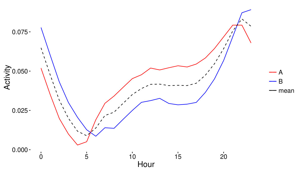 Figure 1
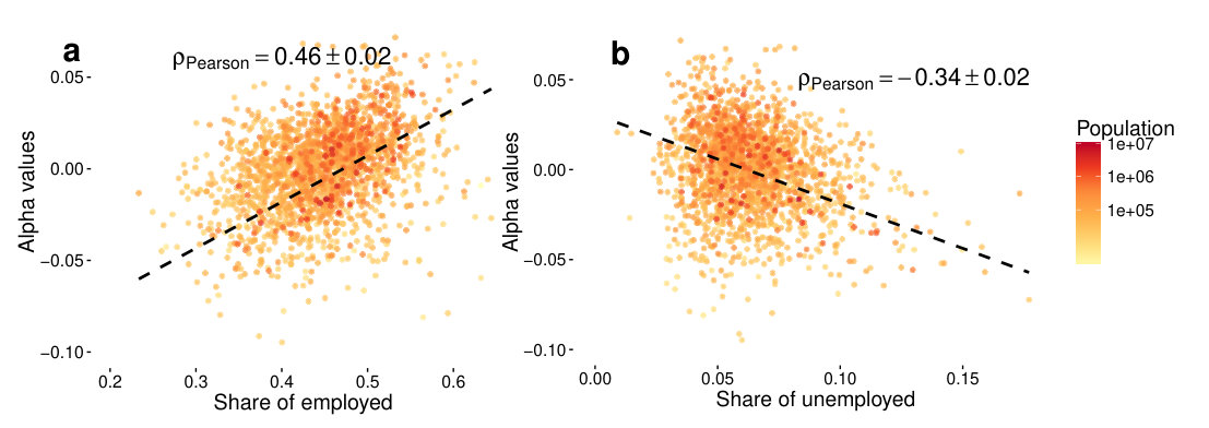 Figure 2
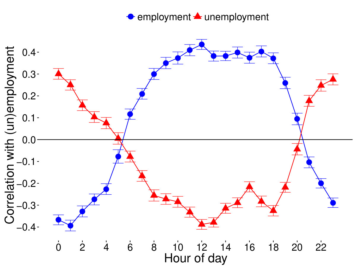 Figure 3
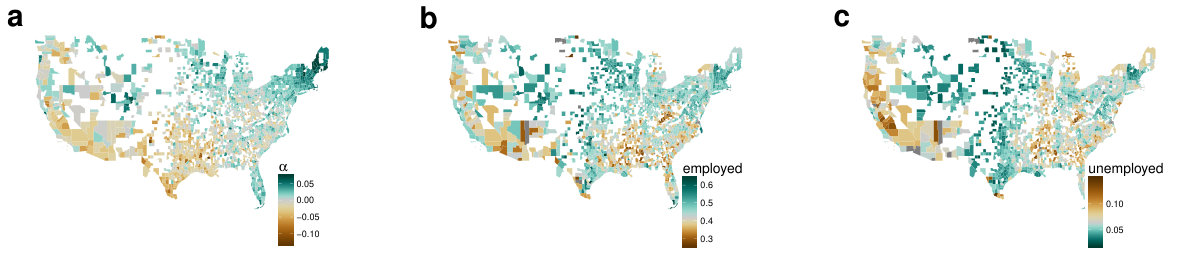 Figure 4
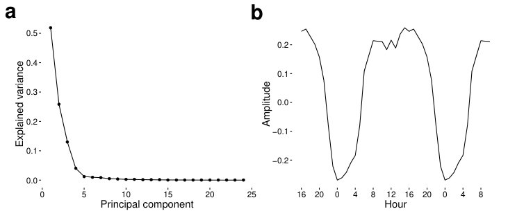 Figure 5
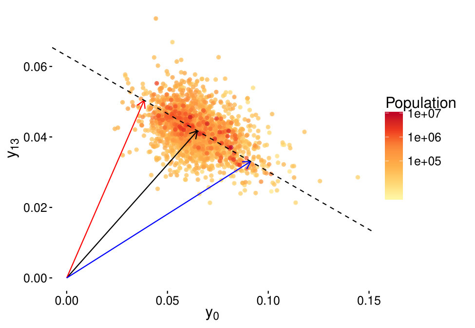 Figure 6
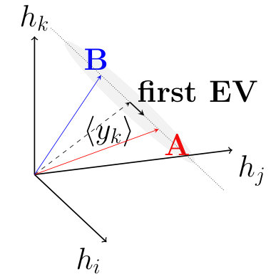 Figure 7
Peer Reviews
No public reviews on file for this paper yet. If you reviewed it on a platform where reviews are public (OpenReview, ICLR, NeurIPS, ICML), you can paste yours below so the community can read it here.
Videos
No videos yet. Explain this paper in a talk, walkthrough, or lecture? Add one.
Prediction of employment and unemployment rates from Twitter daily rhythms in the US
Eszter Bokányi, [email protected]*,
Zoltán Lábszki, [email protected],
Gábor Vattay, [email protected]
Department of Physics of Complex Systems
Pázmány Péter sétány 1/A, Eötvös Loránd University, Budapest H-1117, Hungary
- corresponding author
Keywords
unemployment prediction, Twitter, social media, activity patterns
Abstract
By modeling macro-economical indicators using digital traces of human activities on mobile or social networks, we can provide important insights to processes previously assessed via paper-based surveys or polls only. We collected aggregated workday activity timelines of US counties from the normalized number of messages sent in each hour on the online social network Twitter. In this paper, we show how county employment and unemployment statistics are encoded in the daily rhythm of people by decomposing the activity timelines into a linear combination of two dominant patterns. The mixing ratio of these patterns defines a measure for each county, that correlates significantly with employment () and unemployment rates (). Thus, the two dominant activity patterns can be linked to rhythms signaling presence or lack of regular working hours of individuals. The analysis could provide policy makers a better insight into the processes governing employment, where problems could not only be identified based on the number of officially registered unemployed, but also on the basis of the digital footprints people leave on different platforms.
Introduction
Until recently, it has been a time-consuming, costly and arduous work to collect and analyze data about individual humans at a large scale. With the advent of the digital era, there is a growing amount of data accessible online that enables the analysis and modeling of human behavior. However, our understanding of these digital data sources and the methods that connect the data to real-world outcomes is still limited.
Several aspects on the possible usage of mobile phone records and social media status updates in the estimation of official data, such as census, demographic or land use records have been discussed in recent papers. A promising approach is the analysis of the diurnal rhythm of humans. Due to the 24 hour periodicity of the Earth’s rotation, we are biologically bound to show daily periodic behavior both at the individual and at the aggregate level. This periodic cycle is governed mainly by internal biochemical processes [1, 2, 3, 4], but the impact of external factors and the environment also leaves its imprint on these daily patterns [5, 6].
As Säramaki and Moro point out in their paper [7], an interesting application is to consider the geospatial aspects of the aggregate level of daily rhythms, as it can provide insight into several different phenomena ranging from the actual land use patterns in a city [8, 9, 10, 11, 12, 13, 14, 15, 16, 17, 18] and on a campus [10], to the tracking of anomalous events [19, 18], or the estimation of population size [20], mobility patterns [21], poverty [22] or crime rates [23] in a certain area.
Because these aggregate patterns always consist of the superposition of the daily rhythms of individuals, it is worth investigating how the main features of the aggregate level form from superposition. If we can cluster individuals into more or less homogeneously behaving groups based on their daily patterns [24], then the aggregate pattern can be understood as the combination of the group patterns, and the group that has more individuals dominates the aggregate daily rhythm. The groups of individuals can form along many demographic and/or socioeconomic factors, of which being employed and going to and from work at regular hours is the most determining one with respect to the daily activity patterns. Thus, decomposing the groups from the aggregate patterns in different geographical regions may give insight into the estimation of employment statistics in that region.
Nowcasting or estimating unemployment rates using the digital traces of search engines has already been in the focus of several papers [25, 26, 27]. It has already been shown, that daily activity patterns of individuals can be linked to the regularity of their working hours [28]. Because the loss of a job has severe psychological consequences [29], the effects of a mass layoff can be detected in the unemployment rates and provide a possibility of forecasting macro-economical effects based on observation of several individuals [30]. In [31], there is a strong evidence that aggregated daily activities of certain time intervals of geographical regions can be indicative of unemployment rates.
In this paper we obtain 63 million geolocated messages from the publicly available stream of the social network Twitter from the area of the United States sent between January and October 2014. We aggregate Monday to Friday relative tweeting activity for each hour in each US county to form an average workday activity pattern. We then assume that these activity patterns form a roughly linear subspace of the 24-hour “timespace”. By finding this linear subspace, that is, by finding the line on which the county patterns lie, we are able to give a measure that is linked to the ratio of two groups of people tweeting in a county. We then show that this measure correlates significantly with county employment and unemployment rates, and that the average patterns corresponding to the two groups can be linked to lifestyles connected to regular working hours or the lack of them. We thus give a possible framework for decomposing the digital activity patterns of geographical regions and linking the decomposition to employment and unemployment rates.
Methods
Twitter dataset
We use the data stream freely provided by Twitter through their Application Program Interface, which amounts to approximately 1% of all sent messages. In this study, we focus on the part of the data stream with geolocation information. These geolocated tweets originate from users who chose to allow their mobile phones to post the GPS coordinates along with a Twitter message. The total geolocated content was found to only comprise of a small percentage of all tweets; therefore with data collection focusing only on these, a large fraction of all geo-tagged tweets can be gained [32]. Our dataset includes a total of 63 million tweets from the contiguous United States collected between January 2014 and October 2014. These are all geotagged – that is, they have GPS coordinates associated with them. We construct a geographically indexed database of these tweets, permitting the efficient analysis of regional features [33]. Using the Hierarchical Triangular Mesh scheme for practical geographic indexing [34, 35], we assigned a US county to each tweet. County borders are obtained from the GAdm database [36].
Demographic datasets
For the population-weighed linear model of the next section, we obtain county-level population statistics from the US 2010 Census [37]. We download the unemployment and labor force data for the time window of the Twitter dataset from the Local Area Unemployment Statistics page of the Bureau of Labor Statistics [38]. We take an average of the months ranging from January 2014 to October 2014 for each county.
Though unemployment levels are defined as the number of unemployed per total labor force in a county, we define the share of employed as the number of employed divided by the whole population of a county. This measure fits the model for the daily rhythm better as discussed in the Results section.
Daily activity patterns
We define a daily activity pattern with hourly resolution for each county, which are enumerated by . We take all tweets originating from a given county from the period between January 2014 and October 2014. Then we aggregate the number of tweets () in each hour (the hour range goes from ) on workdays, that is from Monday to Friday, after correcting for timezone and daylight saving time in each county. Because of the differing population and Twitter penetration rates (share of people using Twitter) in each county, we normalize the number of tweets by the total number of tweets counted. Thus, each county () is represented by a 24-dimensional vector (), where the elements of are:
[TABLE]
and obviously,
[TABLE]
To improve the quality of our dataset, we consider only those counties in which the overall tweet count during the ten month exceeded the threshold of 1800. Thus, we are left with 1884 counties for our analysis.
Linear model
We assume that the tweeting pattern of a county can be represented by the linear combination of only two universal patterns ( and ) that are mixed for each county with a proportion of , and , respectively. Thus, we identify the two universal patterns that compose the pattern of a county as corresponding to two differently behaving population groups, whose aggregate tweeting patterns form and . We have no further restriction on these values, they can be any arbitrary real numbers.
Then the predicted activity of a county in hour would be the following linear combination:
[TABLE]
Let us denote the weight of each county by , which is proportional to its population , such that . We then define the squared error of our model as
[TABLE]
We would like to minimize this error with subject to the two conditions . It can be shown (see SI), that the minimum occurs if is parallel to the eigenvector corresponding to the biggest eigenvalue of the weighed covariance matrix , and that can be chosen as the average of s. Here, an element of the covariance matrix is
[TABLE]
where
[TABLE]
In both cases, we now consider a linear representation of the data with a coordinate system where the mean sets the origin and is the direction of the line. We calculate values for each county by projecting onto this line (see SI). A positive means a county, where the majority of people are active on Twitter in correspondence with the daily rhythm dictated by , accordingly, negative is in connection with an opposite pattern.
Because the linear equation system derived from the minimization of the squared error is linearly dependent, the scale on our line is not set (see SI), as is only determined up to an arbitrary scaling factor. Thus, the values are also determined only up to a scaling factor. Let us now choose and to be two standard deviations of -s away from the origin in the two directions of our new linear coordinate system:
[TABLE]
and are both normalized to 1, where in the 2-dimensional case their components represent the selected two hours, while in the 24 dimensional case they represent the 24 hours of the day.
Results and discussion
In this section, we present the description and the discussion of the main results of this paper. First, we investigate the correlation between the activities of individual hours and employment and unemployment rates, and choose two dimensions with which employment and unemployment levels have maximum or minimum correlations. We then evaluate to what extent the linear model is a valid description of our data for these most separating dimensions (2) and then for all possible dimensions (24) of our dataset. Second, we discuss how the linear models in 2 and 24 dimensions separate the two population groups with the two distinct activity patterns, and give a possible interpretation of these patterns. Third, we connect the two groups with real-world indicators like share of employed in a county, and discuss the plausibility of the correspondence of the daily patterns of the two separate groups to employment status.
We first evaluate population-weighted Pearson correlations for each hour between activities for the 1884 counties (from which we have an adequate number of messages) and employment and unemployment levels. We calculate the errors of these correlations by bootstrapping our sample for times, the results with errorbars are shown in Fig 1. While unemployment levels are defined in the traditional way of the Bureau of Labor Statistics, we define the share of employed slightly differently, normalizing the number of employed by the entire population of a county. This definition matches the notion of population share of “active” people regarding regular working hours better.
The hours between 6am and 8pm show a significantly positive correlation with employment, and a negative one with unemployment, while during the night, between 9pm and 5am, the correlation is reversed. With respect to employment, the correlation peaks at 12am with and reaches its lowest value at 1am with . The location of the maximum and minimum of correlation with unemployment are shifted slightly to 0am and 12am, though exactly with opposite signs ( for 0am and for 12am). The signs of the correlations and the hours of their extreme values indicate that increased daytime activity is associated with higher employment levels, and higher than average nighttime activity corresponds to higher unemployment.
To check the linearity of the model described in the Methods section, we first choose the coordinate system of the hours having the extreme correlation values with employment levels. Fig 2 shows the 0am and 1pm activities of the filtered counties with the dashed line corresponding to the direction of the first eigenvector of the covariance matrix, now calculated only from these two dimensions. If we normalize the eigenvalues by their sum, we see that the first eigenvalue of the covariance matrix carries 0.99 share from all the variance in the data, thus, linearity in this two-dimensional subspace of the whole 24-hour activity space is a good assumption.
We continue by assessing the validity of the linear model in all 24 dimensions presented in Eq 6. In Fig 3a we plot eigenvalues of the covariance matrix again normalized by the sum of all eigenvalues. Only the first four eigenvalues correspond to a variance significantly greater than 0, and the first principal component stands out with a proportion of 0.52, whereas the other three significant components carry 0.25, 0.13 and 0.04 share of the variance. Thus, our dataset is mostly linear even in the 24-dimensional space, and the representation with Eq 6 remains plausible.
In the 2-dimensional case, the dashed line of Fig 2 marks the direction of the first principal vector. The difference between the two vectors (red) and (blue) representing the two universal patterns (see Methods on p. Linear model) is parallel to this component, let us denote it by . It can be seen in Fig 2 that the pattern is marked by an increased activity at 1pm, and a decreased activity at 0am, while pattern is characterized by exactly the inverse relationship.
The principal component corresponding to the largest principal value in the 24-dimensional case can be seen in Fig 3. As the coordinates represent the hours, it can be seen from Fig 3 that is positive from 5am until 8pm, and negative otherwise. Thus, the positive elements of select mainly those hours during which people are awake, and the negative elements correspond to the sleeping hours.
We then plot the elements of the 24-dimensional and from Eq 15-16 in Fig 4. By interpreting these patterns as the different average tweeting patterns of two population groups, each is proportional to the share of people in a county in one population group. Our hypothesis is that the group more active during the daytime corresponds to people who regularly go to work, school etc. on weekdays, thus their daytime is regulated by the earlier wake-up and bedtime indicated in pattern . On the other hand, pattern could correspond to a group where this regulation factor does not exist due to retirement, unemployment or any other reason, which would allow these people to be more active during nighttime and wake up later.
To confirm our hypothesis, we correlate values with labor force and unemployment estimates from the Local Area Unemployment Statistics (see Methods on p. Demographic datasets) of the investigated counties. In the 2-dimensional case, these combined values of do not correlate with employment () or unemployment () better than previous activity measures from single dimensions from Fig 1. However, by using all dimensions, we find correlations of and for employment (see scatterplot in Fig 5) and unemployment, respectively. For the employment this is an improvement to that of the single dimensional correlations, while it is not for the unemployment. A possible interpretation is that a stricter daily rhythm is imposed upon those who are employed, as such, the characteristics of their activity curves mean a stronger overall pattern than that of the unemployed. Nevertheless, the result shows that high a is significantly bound to higher employment, and lower unemployment rates, and that the overall shape of the activity timeline can give us more information than just using one feature of a whole day. The similarity of the regional distribution of , unemployment and employment rates are visualized on the three maps of Fig 6.
Our results are in line with previous research carried out for Spain in [31], where share of Twitter activity during a window of the morning hours (8-11am), afternoon hours (3-5pm) and of the night hours (0-3am) correlated significantly with unemployment rates among 25 to 44-year old inhabitants of Spanish administrative areas. High morning and low night activity indicated lower unemployment rates, which is in correspondence with our correlations. Although in Spain high afternoon activity correlated positively with unemployment levels, we cannot observe this phenomenon in the US. Due to the bias in the age of Twitter users towards younger age groups [39], our calculated county activity patterns are not representative of the whole population. We believe that our model could be improved by incorporating labor force data detailed by different age groups.
That correlation with unemployment is significantly lower than correlation with labor force share of the population can be related to the fact that the share of employed should overlap more with the population exhibiting the “working” pattern , whereas officially registered unemployed people are not distinguishable in this context from those who are on a maternal leave or are retired etc. We also believe that there are other inherent reasons for example the more flexible working hours in the creative industry that limit the power of such a simple model explaining the employment patterns of a geographical area.
Conclusions
In this paper we analyzed an extensive collection of geolocated tweets originating from the United States between January 2014 and October 2014. We assigned a county to each tweet, then aggregated daily tweeting activity patterns for a typical weekday, and investigated to what extent do hourly activities correlate with employment or unemployment levels. We then modelled daily activity patterns as being the superposition of two universal patterns, thus aiming for a simple linear approximation of our dataset. By minimizing the squared error of our estimations, we obtained that the difference of the two patterns should be parallel to the first eigenvector of the covariance matrix of the dataset and that the mean of the data should fit on our line when selecting only 2 dimensions, and when using all 24 dimensions of our data as well. The set of eigenvalues of the covariance matrix in both cases confirmed the validity of our linear model, which captured most (0.99,0.52) of the variance in the dataset. Whereas in the 2-dimensional case the first eigenvector pointed to the direction, where 1pm activity was increased, and 0am activity decreased, in the 24-dimensional case it had positive elements during the daytime hours (6am-8pm), and was negative during the most of the night (9pm-5am).
By projecting county activity patterns onto these lines with the mean as the origin, we obtained a measure for each country that indicated the extent to which the tweeting pattern of a county resembles that of the first eigenvector. This measure has been shown to correlate significantly with county labor force shares and unemployment rates, though in the 2-dimension case, these correlations could not enhance the performance of the single hourly correlations. Using all 24 dimensions, we obtained a better Pearson correlation of and for employment and unemployment, respectively. The signs of the correlations indicate a relationship where counties exhibiting a higher tweeting activity during the daytime (6am-8pm) have higher employment and lower unemployment rates, and counties with increased night activity can be related to lower employment and higher unemployment rates. These correlations show, that even though Twitter population is biased towards younger age groups, and employment data was considered for all age groups, the underlying relationship between daily activity patterns and employment data can be captured with plausible outcomes.
Our results thus showed, that by analyzing a relatively sparse publicly available geolocated dataset, a very simple model can explain to a significant extent such an important socio-economic indicator as employment/unemployment. We believe that our model can be even further improved by incorporating detailed data for different age groups or other datasets from either traditional or digital sources such as mobile traffic data. It would be worth to investigate whether dynamic changes of activity patterns over time can follow employment trends. This kind of analysis would allow policy makers a better insight into the processes connected to employment phenomena, and could form the basis of future datasets, where problems could not only be identified based on officially registered unemployed people, but also on a basis of the digital footprints people leave on different platforms.
Figures
Authors’ contributions
G.V. conceived the experiment, E.B. and Z.L. collected the data, E.B. and G.V. analyzed the results, E.B. wrote the manuscript. All authors reviewed the manuscript.
Availability of data and materials
The dataset supporting the conclusions of this article is available in the following repository: http://www.vo.elte.hu/papers/2016/unemployment/.
Competing interests
The authors declare that they have no competing interests.
Technical details for the Methods section
We define a daily activity pattern with hourly resolution for each county that are enumerated by . Thus, each county () is represented by a 24-dimensional vector (), where the elements of are aggregated normalized hourly tweeting activities.
We assume that the tweeting pattern of a county can be represented by the linear combination of only two universal patterns ( and ) that are mixed for each county with a proportion of and , respectively. We have no further restriction on these values, they can be any arbitrary real numbers. and are both 24-dimensional vectors normalized to 1, the 24 dimensions representing the 24 hours of the day.
Then the predicted activity of a county in hour would be
[TABLE]
Let us denote the weight of each county by , which is proportional to its population , such that . We then define the squared error of our model as
[TABLE]
We would like to minimize this error with subject to the two conditions , which leads to the following expression to minimize with Lagrange multipliers and :
[TABLE]
The derivatives yield the following linear equation system:
[TABLE]
Summing Eq 8 and Eq 9 for yield 0 for the Lagrange multipliers and . Thus, the problem reduces to minimizing , which actually measures the sum of squared distances from the line parametrized by , and for a county .
Since
[TABLE]
the equation system is not linearly independent. Thus, we cannot obtain all exact values for , and , they will be dependent on each other.
Expressing from our equation system yields:
[TABLE]
The line from which the summed distance of the datapoints is minimal is the line whose direction is parallel to the eigenvector () corresponding to the largest eigenvalue of the covariance matrix , where
[TABLE]
if denotes the weighted mean (, )
[TABLE]
By substituting the expression for into Eq 8)+Eq 9, and averaging over we get that the point should fit onto our line.
Thus, we get a valid solution of our error minimization problem, if we choose
[TABLE]
and calulate values according to Eq 12.
The reference list from the paper itself. Each links out to its DOI / PubMed record.
- 1[1] J. Aschoff, R. Wever, Federation proceedings 35 (12), 236 (1976)
- 2[2] A. Cagnacci, J.A. Elliott, S.S. Yen, The Journal of Clinical Endocrinology & Metabolism 75 (2), 447 (1992). URL 10.1210/jcem.75.2.1639946 . PMID: 1639946
- 3[3] R. Refinetti, M. Menaker, Physiology & Behavior 51 (3), 613 (1992). URL 10.1016/0031-9384(92)90188-8
- 4[4] C. Cajochen, K. Kräuchi, A. Wirz-Justice, Journal of Neuroendocrinology 15 (4), 432 (2003). URL 10.1046/j.1365-2826.2003.00989.x
- 5[5] J. Taillard, P. Philip, B. Bioulac, Journal of Sleep Research 8 (4), 291 (1999). URL 10.1046/j.1365-2869.1999.00176.x
- 6[6] T. Aledavood, S. Lehmann, J. Saramäki, Frontiers in Physics 3 (October), 1 (2015). URL 10.3389/fphy.2015.00073
- 7[7] J. Saramäki, E. Moro, The European Physical Journal B 88 (6), 1 (2015). URL 10.1140/epjb/e 2015-60106-6
- 8[8] J. Reades, F. Calabrese, a. Sevtsuk, C. Ratti, Pervasive computing 6 (3), 30 (2007). URL 10.1109/MPRV.2007.53