Mind the Gap: A Study in Global Development through Persistent Homology
Andrew Banman, Lori Ziegelmeier
TL;DR
This paper applies persistent homology, a topological data analysis technique, to study global development patterns using economic and health indicators, revealing hidden structures and relationships among countries.
Contribution
It introduces a novel application of persistent homology to analyze global development data, uncovering multi-scale patterns and geographic cycles.
Findings
Identification of localized development clusters
Discovery of cycles related to geographic borders
Revelation of hidden similarities among countries
Abstract
The Gapminder project set out to use statistics to dispel simplistic notions about global development. In the same spirit, we use persistent homology, a technique from computational algebraic topology, to explore the relationship between country development and geography. For each country, four indicators, gross domestic product per capita; average life expectancy; infant mortality; and gross national income per capita, were used to quantify the development. Two analyses were performed. The first considers clusters of the countries based on these indicators, and the second uncovers cycles in the data when combined with geographic border structure. Our analysis is a multi-scale approach that reveals similarities and connections among countries at a variety of levels. We discover localized development patterns that are invisible in standard statistical methods.
| Indicator | Max | Min | Median | Mean | Stand Dev | Scaled Mean |
|---|---|---|---|---|---|---|
| GDP | 148374 | 599 | 11903 | 18972 | 21523 | -0.476 |
| LE | 84.8 | 48.86 | 74.5 | 72.56 | 7.74 | 0.296 |
| IM | 96 | 1.5 | 23.89 | 15 | 21.9 | 0.528 |
| GNI | 87030 | 350 | 8360 | 13596 | 15399 | -0.431 |
| Countries (ISO2) | GDP | LE |
| \svhline Bangladesh, Kyrgyzstan, Cambodia, Mauritania, Micronesia Fed. Sts., Nepal, Syria, Gambia, Comoros, Myanmar, Sudan, Sao Tome and Principe, India, Laos, Marshall Islands, Guyana, Pakistan, Ghana, Nigeria, Yemen Rep., Djibouti, Kenya, Senegal, Tanzania, Vanuatu, Haiti, Liberia, Madagascar, Solomon Islands, Ethiopia, Rwanda, Benin, Kiribati, Burkina Faso, Burundi, Congo Dem. Rep., Niger, Papua New Guinea, Togo, Uganda, Zimbabwe, Eritrea, Mali, Malawi, Guinea, Cote d’Ivoire, Cameroon, Sierra Leone, Mozambique, Chad, Zambia, South Sudan, Guinea-Bissau, Fiji | -0.93 | -0.15 |
| Albania, Bosnia and Herzegovina, Colombia, Jordan, Sri Lanka, Tunisia, Peru, Macedonia FYR, Barbados, China, Dominican Rep., Algeria, Ecuador, Montenegro, Serbia, Thailand, Bulgaria, Brazil, Iran, Venezuela, Mauritius, Mexico, Romania, Argentina, Saint Lucia, Armenia, Jamaica, Paraguay, El Salvador, Morocco, Vietnam, Bolivia, Bhutan, Cape Verde, Georgia, Guatemala, Honduras, Moldova, Samoa, Belize, Ukraine, Indonesia, Philippines, Saint Vincent and the Grenadines, Egypt, Grenada, Tonga, Uzbekistan, Tajikistan, Korea Dem. Rep., Timor-Leste, Palestine | -0.69 | 0.44 |
| Antigua and Barbuda, Croatia, Uruguay, Cuba, Panama, Turkey, Lebanon | -0.37 | 0.63 |
| Estonia, Poland, Slovak Republic, Hungary, Latvia, Malaysia, Lithuania, Seychelles | -0.19 | 0.53 |
| Cyprus, Malta, Slovenia, Israel, Spain, Italy, Korea Rep., New Zealand, Portugal, Greece | -0.02 | 0.83 |
| Austria, Australia, Canada, Germany, Denmark, Netherlands, Sweden, Belgium, Taiwan, Finland, France, United Kingdom, Bahrain, Ireland | 0.38 | 0.80 |
| Country | GDP | LE |
|---|---|---|
| Chile | -0.29 | 0.71 |
| Peru | -0.63 | 0.72 |
| Bolivia | -0.81 | 0.37 |
| Brazil | -0.52 | 0.43 |
| Argentina | -0.45 | 0.55 |
| Country | GDP | LE | IM | GNI |
|---|---|---|---|---|
| Libya | -0.46 | 0.36 | 0.79 | -0.28 |
| Sudan | -0.89 | 0.05 | 0.02 | -0.93 |
| Chad | -0.95 | -0.49 | -0.77 | -0.96 |
| Niger | -0.99 | -0.31 | -0.18 | -0.98 |
| Birth | Death | Generating Countries |
|---|---|---|
| 0.31 | 0.52 | Hungary, Romania, Croatia, Montenegro, Serbia |
| 0.46 | 0.94 | Chile, Peru, Brazil, Argentina |
| 0.53 | 0.96 | Romania, Ukraine, Belarus, Poland, Hungary, Slovak Republic |
| 0.54 | 0.94 | Austria, Italy, Switzerland, Germany, France |
| 0.56 | 0.75 | Mali, Mauritania, Senegal, Guinea |
| 0.71 | 0.85 | Congo Dem. Rep., Zambia, Tanzania, Burundi |
| 0.71 | 0.81 | Kazakhstan, Turkmenistan, China, Kyrgyzstan, Uzbekistan |
| 0.75 | 0.85 | China, Nepal, Bhutan, India |
| 0.78 | 0.85 | Congo Dem. Rep., Uganda, Burundi, Tanzania |
| 0.84 | 1.18 | Czech Rep., Germany, Austria, Slovenia, Hungary, Slovak Republic |
| 0.90 | 1.38 | Congo Dem. Rep., Congo Rep., Central African Rep., Cameroon |
| 0.91 | 0.96 | Syria, Turkey, Iraq, Iran |
| 1.06 | 1.95 | Algeria, Mauritania, Sudan, Chad, Egypt, Niger, Mali, Libya |
| 1.18 | 1.52 | Israel, Jordan, Lebanon, Syria |
| 1.22 | 1.85 | Afghanistan, Turkmenistan, China, India, Tajikistan, Pakistan, Uzbekistan |
| 1.24 | 1.51 | Algeria, Niger, Mauritania, Mali |
| 1.26 | 1.28 | Afghanistan, Tajikistan, Turkmenistan, Uzbekistan |
| 1.30 | 1.77 | Iran, Pakistan, Afghanistan, Turkmenistan |
| 1.34 | 1.49 | Egypt, Israel, Jordan, Palestine |
|
|
|
Peer Reviews
No public reviews on file for this paper yet. If you reviewed it on a platform where reviews are public (OpenReview, ICLR, NeurIPS, ICML), you can paste yours below so the community can read it here.
Videos
No videos yet. Explain this paper in a talk, walkthrough, or lecture? Add one.
Taxonomy
TopicsTopological and Geometric Data Analysis · Complex Network Analysis Techniques
11institutetext: Andrew Banman 22institutetext: University of Minnesota, 3 Morrill Hall 100 Church St. S.E., Minneapolis, MN 55455, 22email: [email protected] 33institutetext: Lori Ziegelmeier 44institutetext: Macalester College, 1600 Grand Avenue, Saint Paul, MN 55105, 44email: [email protected]
Mind the Gap: A Study in Global Development through Persistent Homology
Andrew Banman and Lori Ziegelmeier
Abstract
The Gapminder project set out to use statistics to dispel simplistic notions about global development. In the same spirit, we use persistent homology, a technique from computational algebraic topology, to explore the relationship between country development and geography. For each country, four indicators, gross domestic product per capita; average life expectancy; infant mortality; and gross national income per capita, were used to quantify the development. Two analyses were performed. The first considers clusters of the countries based on these indicators, and the second uncovers cycles in the data when combined with geographic border structure. Our analysis is a multi-scale approach that reveals similarities and connections among countries at a variety of levels. We discover localized development patterns that are invisible in standard statistical methods.
1 Introduction
The Gapminder World GapminderWorld project provides a viewpoint of global development through a statistical lens. The first chart that loads in Gapminder plots each country’s gross domestic product (GDP) against the life expectancy of its citizens, see Fig. 1. The project equates GDP per capita with a nation’s wealth and life expectancy with its health. Countries are color-coded by their broad geographic region: the Americas, Eurasia, etc. A time lapse animation shows countries transitioning along a common trajectory towards more health and wealth, telling a common story about global development. However, it is not clear what role geography plays in this trend. While one may say that most African nations lag behind most Eurasian nations, it is difficult to draw any finer conclusions solely from these two statistics, as each region spans a large range of the development statistics. Furthermore, Gapminder’s pre-determined regions have been chosen according to a convention rather than from the data. For instance, it splits the African continent into Northern and Sub-Saharan regions, isolates India and a few of its neighbors, and joins Australia with Southern Asian countries. These regions do not necessarily align with regions of differing development.
We seek a quantifiable, fine-grained, and unbiased method to analyze development and geographic trends in this data. Persistent homology barcodes ; carlsson2009topology ; edelsbrunner2008persistent gives us tools to uncover the structure of high-dimensional, complicated data, revealing groups (connected components) and cycles (loops) in the data at multiple scales. Persistent homology has been used to understand the topological structure of data arising from applications including computer vision, biological aggregations, brain structure, among many others imagewebs ; windowsandpersistence ; hippocampalPH ; corticalsurfacePD ; visionTDA ; Swarms . In particular, the paper DBLP:journals/corr/StolzHP16 analyzes data related to the recent, so-called, “Brexit” referendum using persistent homology.
We use persistent homology to expand on Gapminder’s study of health and wealth statistics. We explore two methods (1) computing the connected components of the indicators of GDP per capita and life expectancy as well as infant mortality and gross national income per capita and (2) adding the underlying geography to the indicators by constructing a weighted graph based on country borders to observe cycles in the data. The structure of the data is uncovered at multiple scales. Our analyses reveal that there are connections among countries at a variety of levels and show subtleties with country similarities and differences, as well as loops formed by countries geographically linked. This provides a more nuanced view than simply the “first” versus “third” world paradigm, a construction that divides the world into discrete sets of developed and undeveloped countries nationsonline .
The remainder of this paper proceeds as follows. Background on the computational approach of persistent homology is discussed in Section 2. Section 3 outlines the indicators we use to quantify health and wealth of nations, and our implementation of persistent homology on these indicators. We analyze the results of these computations in Section 4. Conclusions and future work are discussed in Section 5.
2 Background on Persistent Homology
Persistent homology is a computational approach to topology that encodes a parameterized family of homological features such as connected components, loops, trapped volumes, etc of a topological space. It allows one to answer basic questions about the structure of point clouds at multiple scales. As such, it can uncover the “shape” of data. Broadly, this procedure involves (1) interpreting a point cloud as a noisy sampling of a topological space, (2) creating a global object by forming connections between proximate points based on a scale parameter, (3) determining the topological structure made by these connections, and (4) looking for structures that persist across different scales. For foundational material and overviews of computational homology in the setting of persistence, see edelsbrunner2008persistent ; Edelsbrunner10 ; barcodes ; carlsson2009topology ; computingPH .
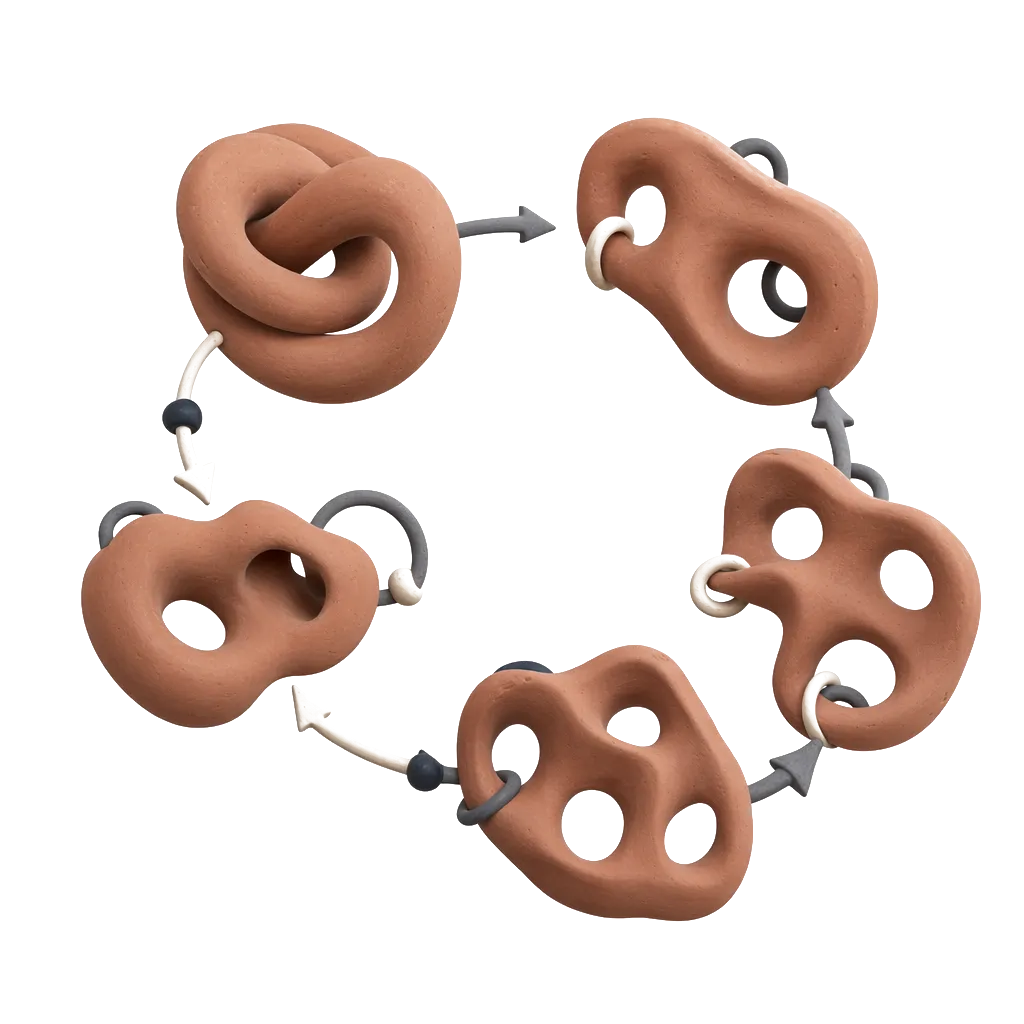
Beginning with a finite set of data points, a nested sequence of simplicial complexes indexed by a parameter may be created by taking the vertices as the data points and forming a -simplex whenever points are pairwise within distance . This procedure is known as the Vietoris-Rips (VR) complex which is often used for its computational tractability barcodes . Fixing a field , one builds a chain complex of vector spaces over for each simplicial complex. For each pair , there is a pair of simplicial complexes, and , and an inclusion map . This inclusion map induces a chain map between the associated chain complexes which further induces a linear map between the corresponding homology vector spaces. The dimension of the homology vector space is known as the Betti number and corresponds to the number of connected components, loops, trapped volumes, etc. of a simplicial complex for , respectively.
The barcode is a way of presenting Betti numbers across multiple scales barcodes . From the barcode, one can visualize the number of independent homology classes that persist across a given filtration interval as a function of the scale . See the top row of Fig. 3 for an example barcode and the bottom row of Fig. 3 for an example barcode. Each horizontal bar begins at the scale where a topological feature first appears (“is born”) and ends at the scale where the feature no longer remains (“dies”). The Betti number at any given parameter value is the number of bars that intersect the vertical line through . For in our setting, there will be a distinct bar for each data point at small values of , as the simplicial complex consists only of isolated points. At large values of , only one bar remains as all data will eventually connect into a single component.
The idea of persistence is to not only consider the homology for a single specified choice of parameter but rather, track topological features through a range of parameters. Those which persist over a large range of values are considered signals of underlying topology, while the short lived features are taken to be noise inherent in approximating a topological space with a finite sample carlsson2009topology .
3 Methods
There are many ways to quantify the health and wealth of nations. We study four development indicators: gross domestic product (GDP) per capita111Gross Domestic Product per capita by Purchasing Power Parities (in international dollars, fixed 2011 prices). The inflation and differences in the cost of living between countries has been taken into account worldbankGNI ., life expectancy222The average number of years a newborn child would live if current mortality patterns were to stay the same worldbankGDP ., rate of infant mortality333The probability that a child born in a specific year will die before reaching the age of one, if subject to current age-specific mortality rates. Expressed as a rate per 1,000 live births gbd2013 ., and gross national income (GNI) per capita444Gross national income converted to international dollars using purchasing power parity rates UNICEF .. These indicators were chosen because (1) we believe them to be broad indicators of health and wealth, and (2) recent data is available for a large set of countries in each indicator.
We consider this data in two sets: what we will call the four-dimensional () data comprising all four indicators and the two-dimensional () data comprising only GDP/capita and life expectancy. The raw data—before scaling as discussed below—generates the Gapminder chart, see Fig. 1, allowing a comparison of our results to the chart.
The frequency of reporting and currency of statistics can vary dramatically by country so any result necessarily carries the “according to available data” qualifier. We construct our data sets by taking the most recent value for each indicator corresponding to a country555Most data comes from years 2015, 2016, with others as early as 2005. See Table 8 in Appendix A.. Countries with no available data for one or more indicators in this time frame are excluded from the data set. This yields data comprising 194 countries in the set and 179 countries in . See Table 1 for statistics such as the maximum, minimum, median, mean, and standard deviation for the raw data of the indicators.
We consider the relative health and wealth of countries, and the presence of extreme outliers in GDP obscures this relationship. Rather than exclude these countries outright, we modulate their values to two standard deviations from the mean. Alternatively, we could have taken the logarithm of GDP to bring the outliers closer to the bulk. However, this option has the undesirable consequence of exaggerating the distance between countries with very low GDP and understating the distance between higher GDP countries. For our purposes, it made more sense to collect the richest countries into one group at the extreme of the spectrum and likewise for the poorest. The same attenuation was done for the GNI per capita indicator.
Each indicator is then re-scaled to . The range was chosen to give a normative representation of each indicator, in which -1 is least favorable and 1 is most favorable, e.g. the country with lowest life expectancy has -1 for that dimension and the country with lowest infant mortality has 1 in that dimension. Note that this does not imply zero is the average value for any indicator. There are many more relatively low GDP countries, even after attenuating outliers, see Table 1. This scaling is required to ensure each indicator carries equal weight in the persistent homology calculations. Otherwise GDP/capita and GNI/capita would completely obscure any features in life expectancy and infant mortality rate because they are orders of magnitude larger in conventional units.
For our calculations, we use the TDA library in R TDApackage . This library provides an API to create a filtered simplicial complex upon which to calculate the persistent homology. The final result of the computation is a list of persistence intervals , neatly displayed in a homology barcode, where each interval indicates a homological feature that is born at and dies at . In this section, we outline our procedure for computing persistent homology of our data. In the next, we analyze the results.
For our first experiment, we interpret each set of countries as a point cloud with each indicator value as a dimension. We then apply the Euclidean metric to define the distance between two countries and over a set of indicators :
[TABLE]
[TABLE]
We use TDA to construct a stream of VR complexes from these point clouds over a range of filtration values . Fig. 2 shows the zero-order and first-order barcodes of the VR streams for the two sets of indicators ( on the left and on the right).
For the second experiment, we add the geographic structure to the data by constructing a weighted graph over the countries and their borders. From country border data geonames , we define an adjacency matrix
[TABLE]
from which we arrive at the distance matrix for a set of indicators ,
[TABLE]
where, for practicality, infinity is set to be a number larger than the maximum filtration value. This maximum is chosen to be large enough to display the entire set of intervals. We then compute the persistent homology of the explicit metric space defined by .666It has been observed that, for the VR complex, the metric in question need not actually be a metric as it is not a requirement to satisfy the triangle inequality JavaPlexTutorial . The construction described here is also known as a weighted rank clique complex. For example, see DBLP:journals/corr/StolzHP16 . The zero-order and first-order persistent homology barcodes for the weighted graphs over data and data are shown in Fig. 3. In this framework incorporating geographic structure, our focus is on the first-order features.
Generally, longer intervals are construed to represent more significant homology classes while short intervals are noise in the data. Statistically significant intervals can be quantitatively determined by the methods presented in fasy2014 . However, we shall see that even relatively short intervals in the first-order barcode reveal interesting patterns in the development indicators. On the other hand, intervals in Fig. 3 that persist through the full range of the filtration are less interesting to us as they relate to the inherent border graph structure. These “infinite” intervals in the dimension-0 barcode indicate island nations that share no borders with other countries. Since their distance to all other countries is infinite, they remain distinct components in the VR complex. The infinite intervals in the dimension-1 barcodes indicate homology classes inherent to the country border graph. The three infinite intervals in Fig. 3 identify the Black, Caspian, and Mediterranean seas. Fig. 3 has two additional intervals that exist because two countries (South Sudan and Zimbabwe) were dropped from the data set as not all four indicators were present, creating holes in the graph not unlike an inland sea. That these features are identified is a good sanity check for the method.
4 Parsing the Barcodes
4.1 Clustering of Development Groups
Zero-order persistent homology can be viewed as a clustering algorithm, where the connected components of a simplicial complex represent clusters in the data. In fact, these components are equivalent to the clusters of the hierarchical method of single-linkage clustering. In Fig. 1, we see a clustering chosen by Gapminder. In this section, we describe the clusters found using zero-order persistent homology present in the barcode of Fig. 2, focusing on the first experiment which only relies on distance between indicators and does not incorporate the country border information. In Appendix B, we present clusters selected by the classic -means algorithm. Each of these methods results in different clusters. However, we observe that viewing clusters at multiple scales and adding more indicators provides additional insight into relations among countries in terms of health and wealth.
We examine the clusters found using dimension-0 persistent homology by extracting the elements in each component of the simplicial complex for a particular filtration value, see the top row of Fig. 2. One may imagine drawing a vertical slice through the dimension-0 barcode at a given to select the components. We then extract the list of countries comprising each component using a union-find algorithm. The Betti number can be viewed as a function of the filtration value, . When , each country is an isolated point, and hence, for the data and for the data. All countries in the point cloud eventually merge into a single connected component. This occurs at approximately for the data and for the data, as seen in the barcodes where only one bar remains.
Fig. 4 and Fig. 5 display the six777The choice of six is to coincide with the six clusters in the Gapminder project, see Fig. 1. components that contain the largest number of countries in the cluster at a variety of filtration scales for the and data, respectively. We further inspect these components in detail below.
First, we consider the large-scale structure of the data. For the point cloud there are 170 countries in a single connected component at , eight countries in the next largest, and the remaining countries isolated in small components. We may say this large cluster is the dominant feature of the data. The point cloud shows the same behavior. Fig. 4 and Fig. 5 show how quickly this dominant component grows at early filtration values. At no point do we observe two dominant clusters capturing a combined majority of countries.
Thus, the dimension-0 clustering shows that countries of the world may not be neatly divided into “first world” and “third world” categories with this method.888The clustering presented in Appendix B results in different clusters, which more closely align with this simplistic notion. The vast majority of countries are statistically quite similar to another country, which itself is similar to some other country, and so on. The result is a gradient in health and wealth statistics, rather than a discrete grouping. This is easily visualized in the Gapminder chart Fig. 1. One sees the countries of the world arrayed along a gradient from poorer countries with less longevity to richer, longer living countries. Persistent homology clustering captures this gradient as the resulting clusters from this method connect points to their nearest neighbors which each connect to their nearest neighbors and so on. This may result in long clusters whose elements at the ends of a cluster may be quite different from one another but are connected through their neighbors.
We also examine the small-scale structure by looking at smaller cross-sections. Fig. 4 and Fig. 5 show a sampling of clusters for early filtration values, before most countries are joined up into one dominant cluster. Consider the clusters in at , shown in Fig. 4 and detailed in Table 4.1. While most countries fall into connected components of one to four countries, there are six larger components that capture 138 countries. Because these clusters only exist at a small scale, the countries in each cluster must be quite close in the data. Hence, we may conceive of these groups as sets of very similar countries according to the indicators. This clustering makes a distinction between groups of countries with varying GDP/capita and similar life expectancy. Observe clusters 2-4 have similar life expectancy but a wide range of increasing GDP. Likewise, clusters 5, 6 have almost the same LE but a 0.4 gap in GDP. From this result we may conclude there is nuance in development among poor countries that may be obfuscated by the ”third-world” identifier.
The reference list from the paper itself. Each links out to its DOI / PubMed record.
- 1[1] The geonames geographical database. http://www.geonames.org. Accessed: 2017-01-28.
- 2[2] Henry Adams and Andrew Tausz. Javaplex tutorial. http://appliedtopology.github.io/javaplex/, 2017.
- 3[3] Gunnar Carlsson. Topology and data. Bulletin of the American Mathematical Society , 46(2):255–308, 2009.
- 4[4] Moo K. Chung, Peter Bubenik, and Peter T. Kim. Persistence diagrams of cortical surface data. In Information Processing in Medical Imaging , pages 386–397. Springer, 2009.
- 5[5] Yu Dabaghian, Facundo Memoli, Loren Frank, and Gunnar Carlsson. A topological paradigm for hippocampal spatial map formation using persistent homology. P Lo S computational biology , 8(8):e 1002581, 2012.
- 6[6] Herbert Edelsbrunner and John Harer. Persistent homology – a survey. Contemporary Mathematics , 453:257–282, 2008.
- 7[7] Herbert Edelsbrunner and John Harer. Computational topology: An introduction . American Mathematical Society, 2010.
- 8[8] Brittany T. Fasy, Jisu Kim, Fabrizio Lecci, Clement Maria, Vincent Rouvreau. The included GUDHI is authored by Clement Maria, Dionysus by Dmitriy Morozov, PHAT by Ulrich Bauer, Michael Kerber, and Jan Reininghaus. TDA: Statistical Tools for Topological Data Analysis , 2017. R package version 1.5.1.