Analyzing and Visualizing Scalar Fields on Graphs
Yang Zhang, Yusu Wang, Srinivasan Parthasarathy
TL;DR
This paper introduces a novel visualization method for scalar graphs that transforms network data into terrain maps, revealing relationships between attributes and topology, scalable to large graphs, and useful for data science insights.
Contribution
The paper presents a new terrain map-based visualization technique for scalar graphs, capturing multi-attribute relationships and scaling to large networks.
Findings
Effective visualization of scalar graphs reveals key network structures.
Method scales to graphs with millions of nodes.
Demonstrated usefulness on real-world data science tasks.
Abstract
The value proposition of a dataset often resides in the implicit interconnections or explicit relationships (patterns) among individual entities, and is often modeled as a graph. Effective visualization of such graphs can lead to key insights uncovering such value. In this article we propose a visualization method to explore graphs with numerical attributes associated with nodes (or edges) -- referred to as scalar graphs. Such numerical attributes can represent raw content information, similarities, or derived information reflecting important network measures such as triangle density and centrality. The proposed visualization strategy seeks to simultaneously uncover the relationship between attribute values and graph topology, and relies on transforming the network to generate a terrain map. A key objective here is to ensure that the terrain map reveals the overall distribution of…
Click any figure to enlarge with its caption.
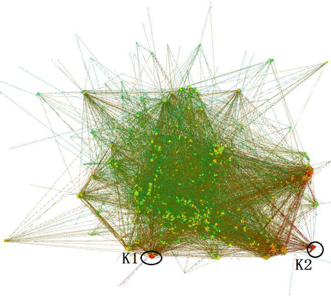 Figure 1
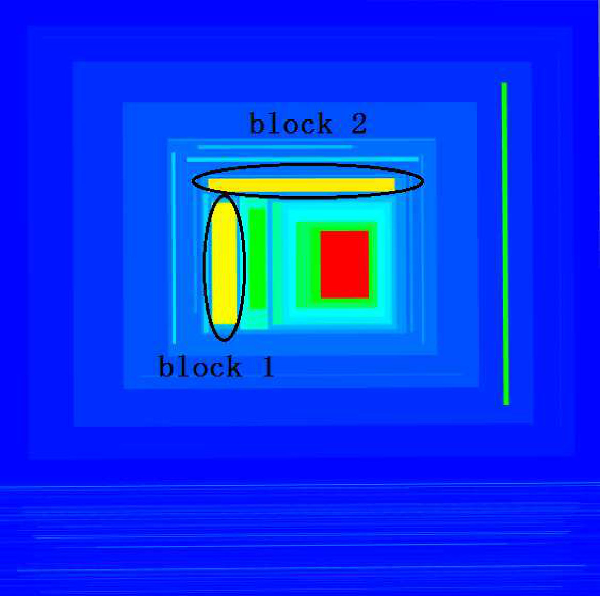 Figure 2
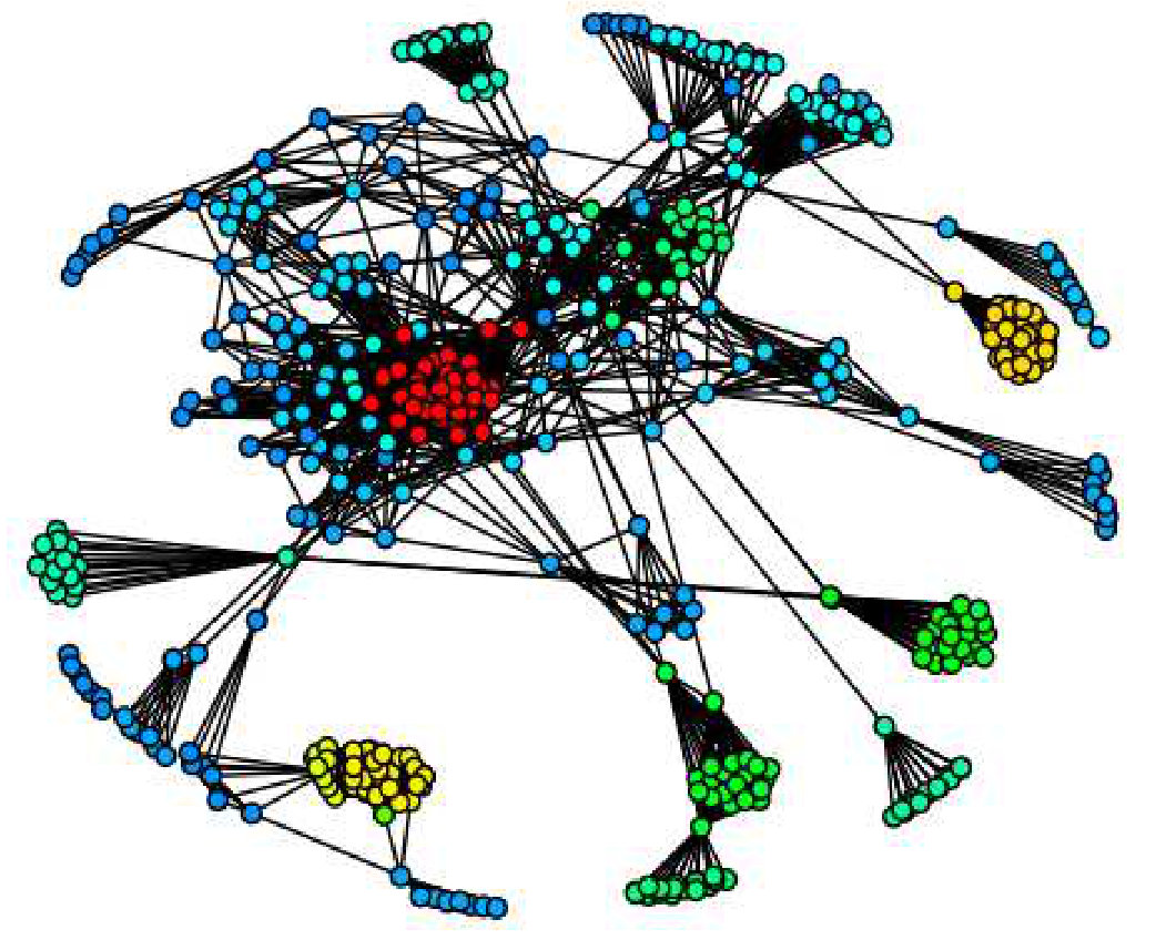 Figure 3
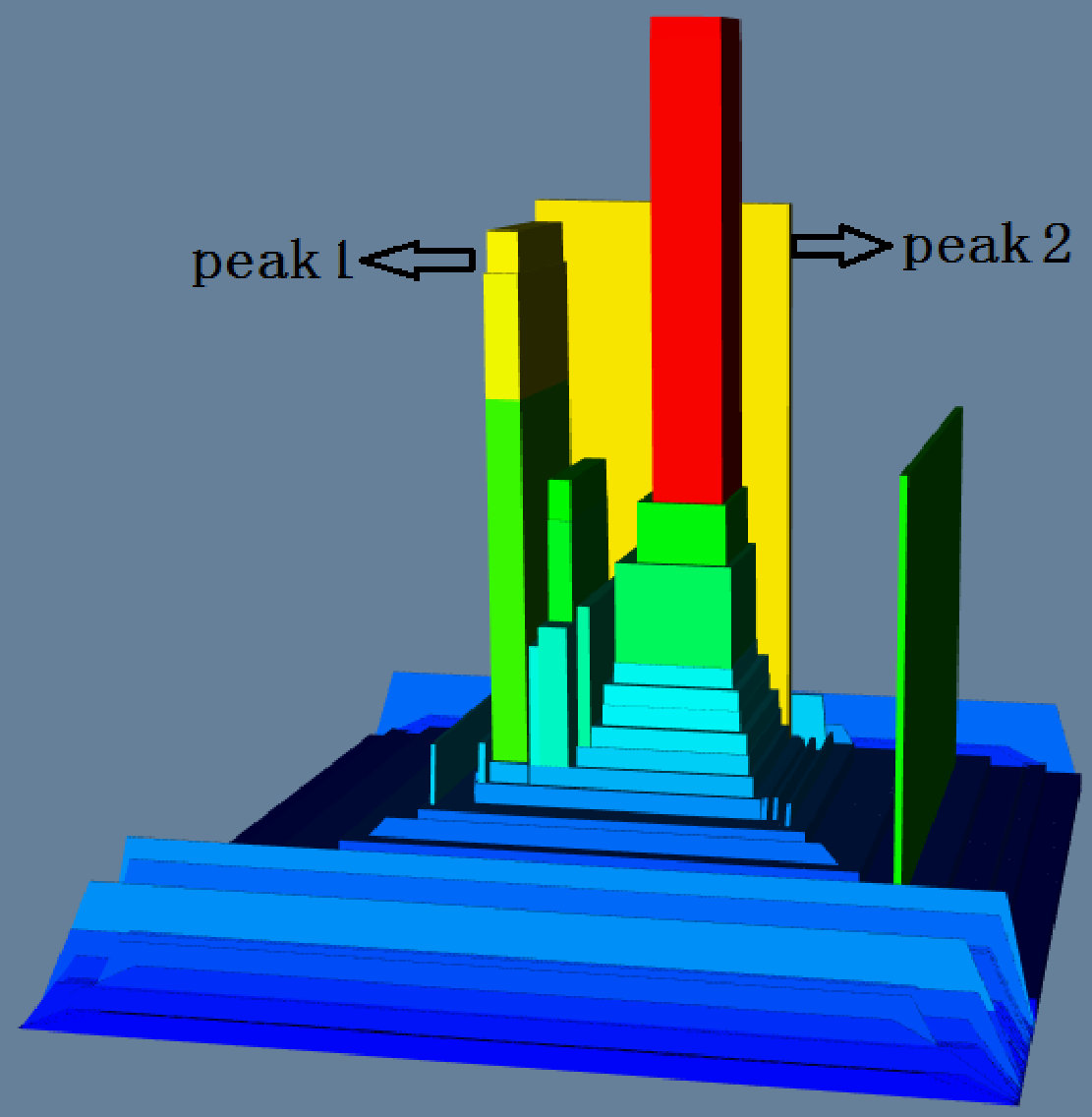 Figure 4
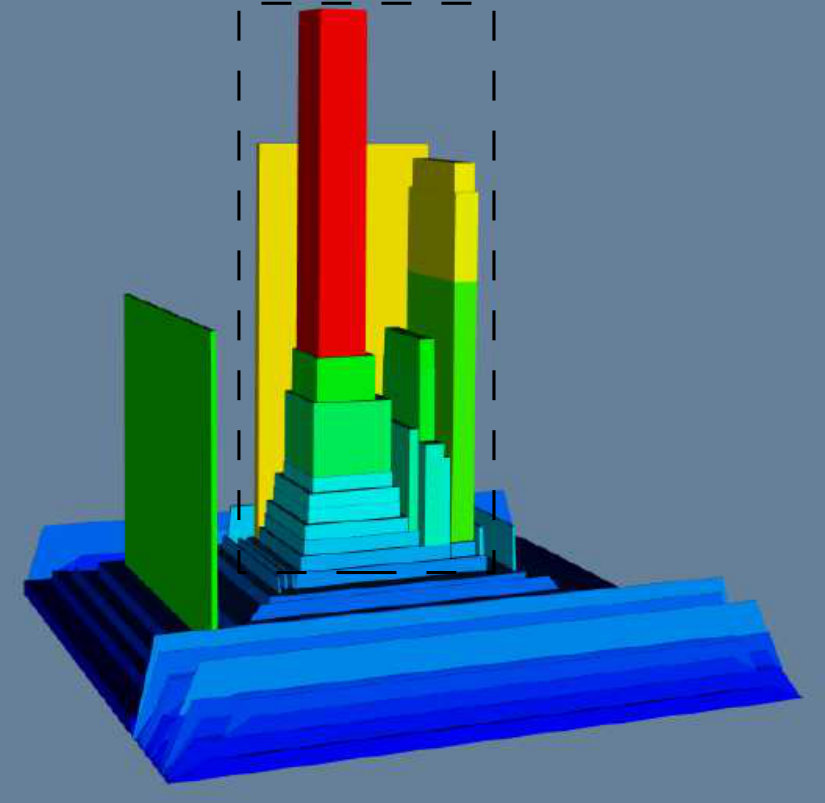 Figure 5
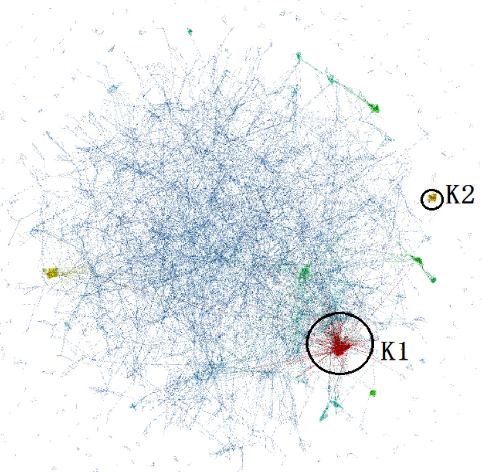 Figure 6
 Figure 7
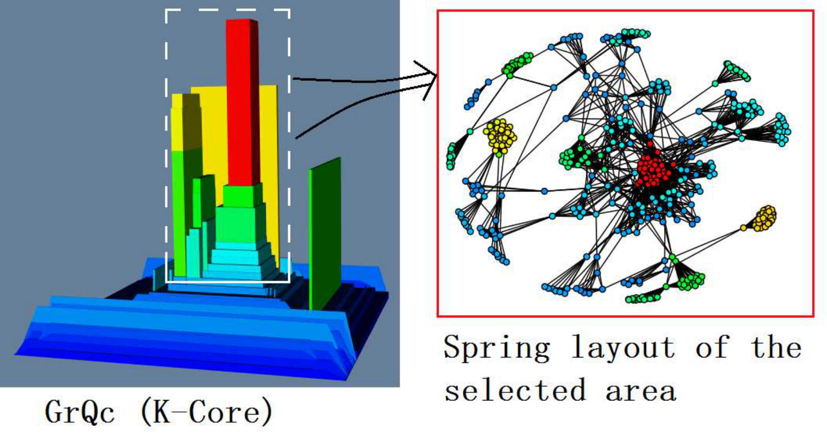 Figure 8
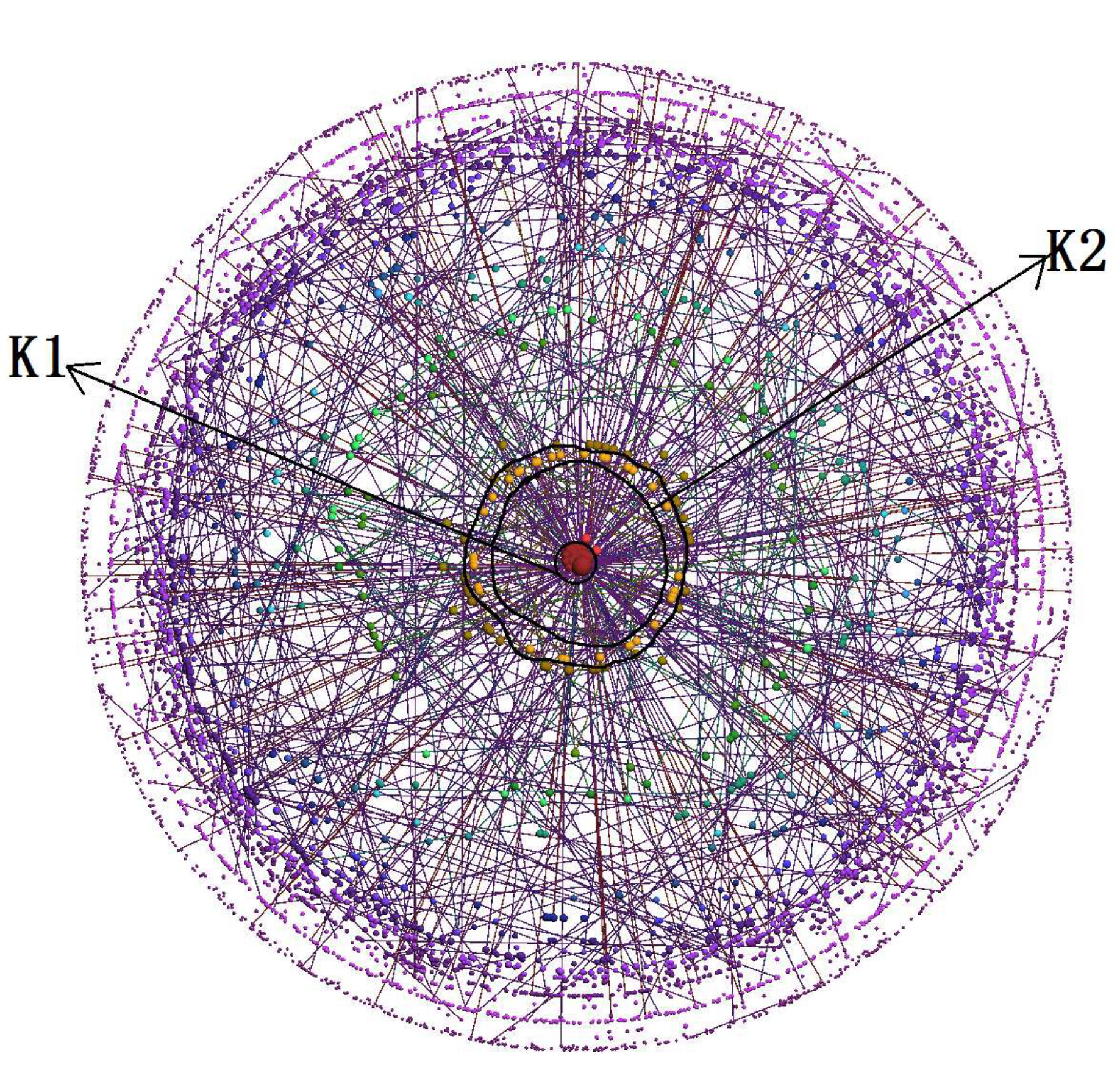 Figure 9
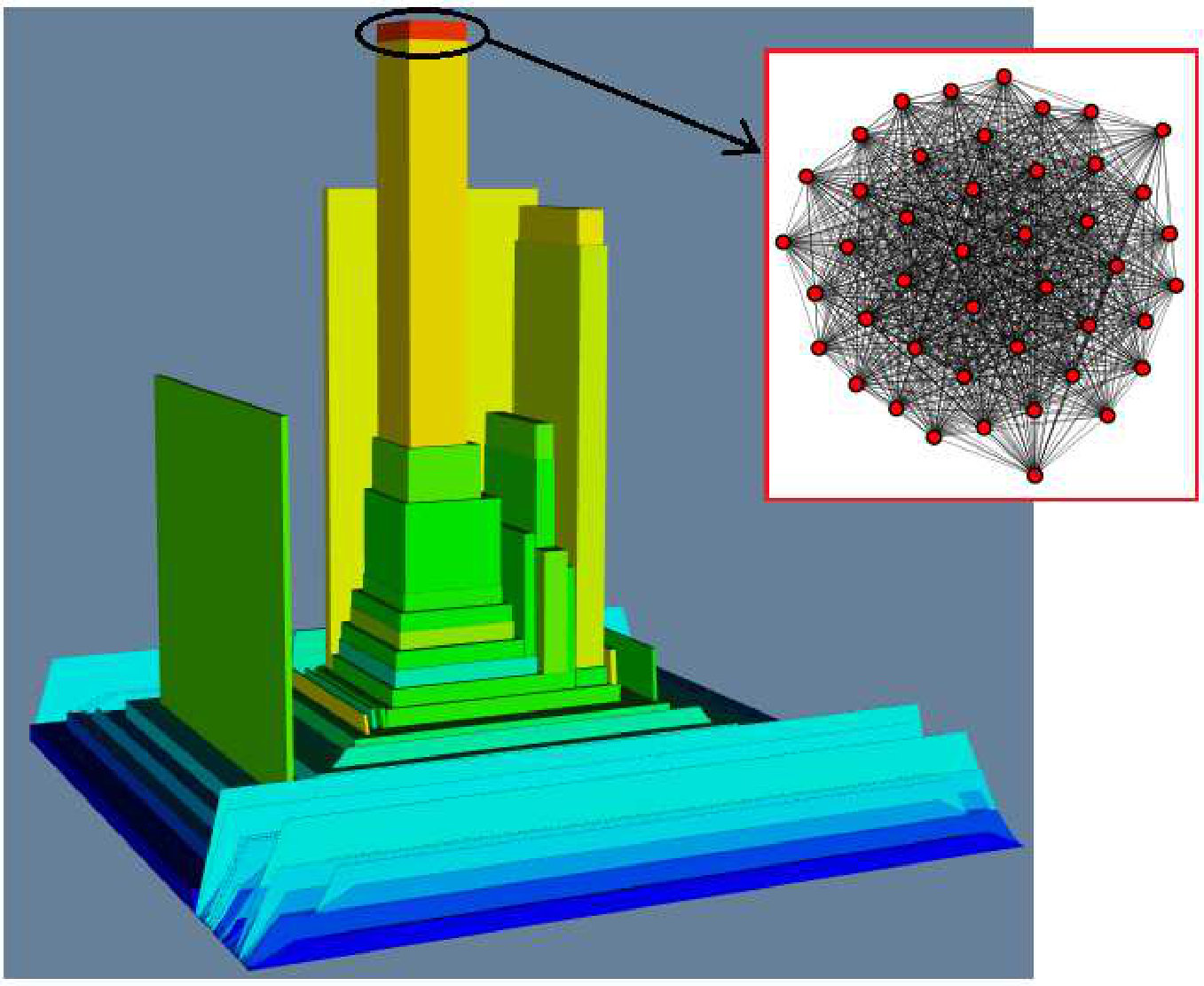 Figure 10
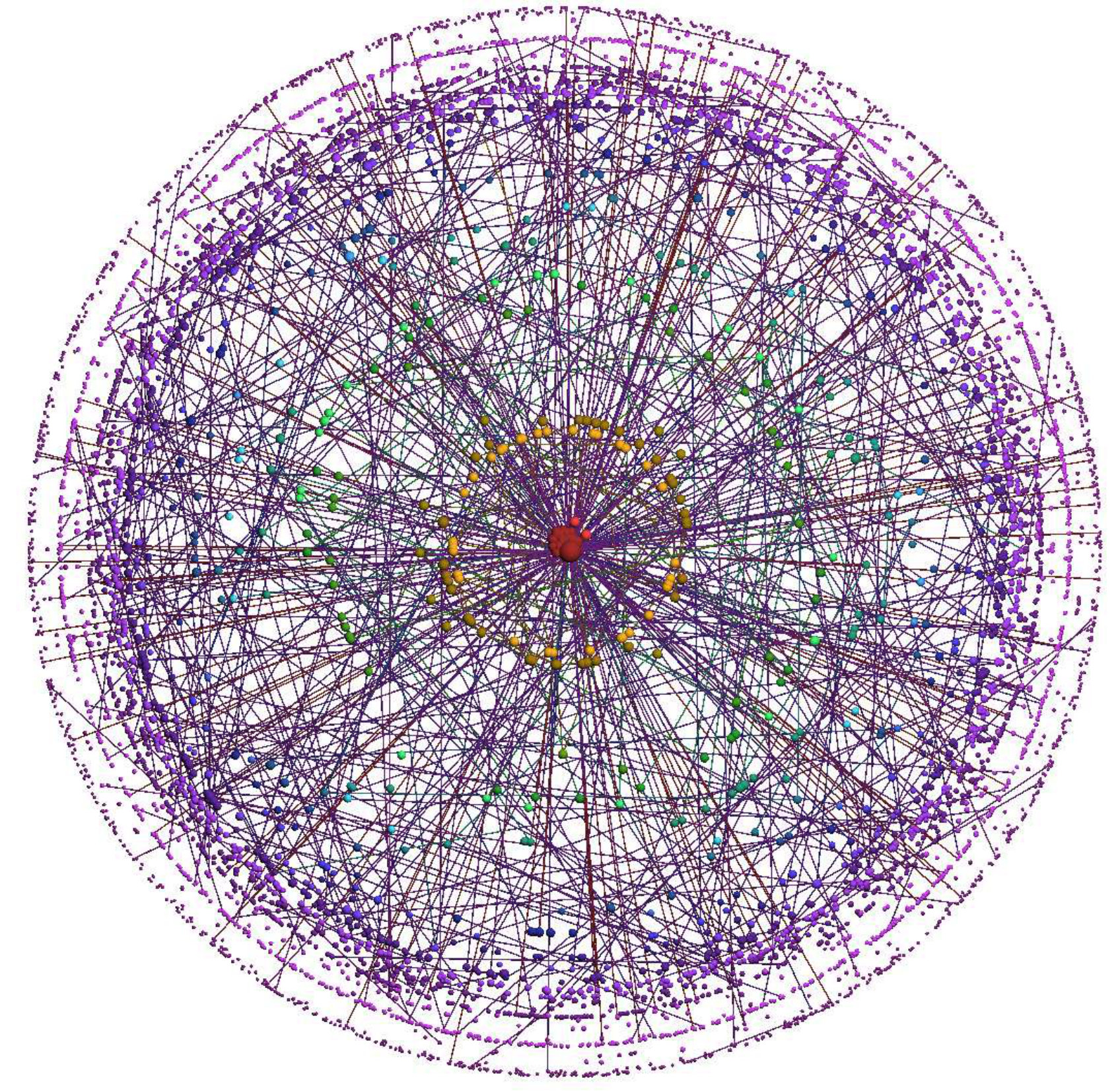 Figure 11
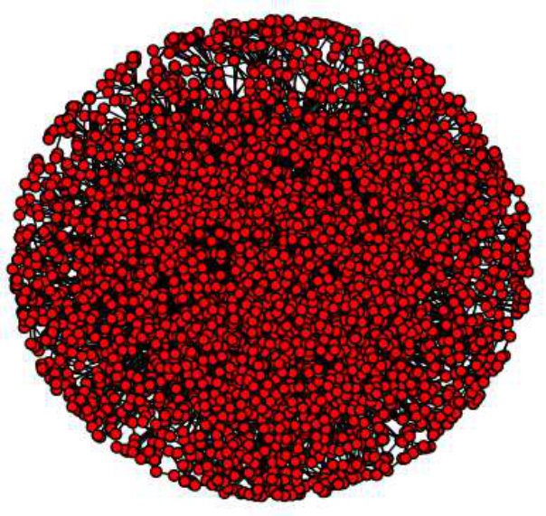 Figure 12
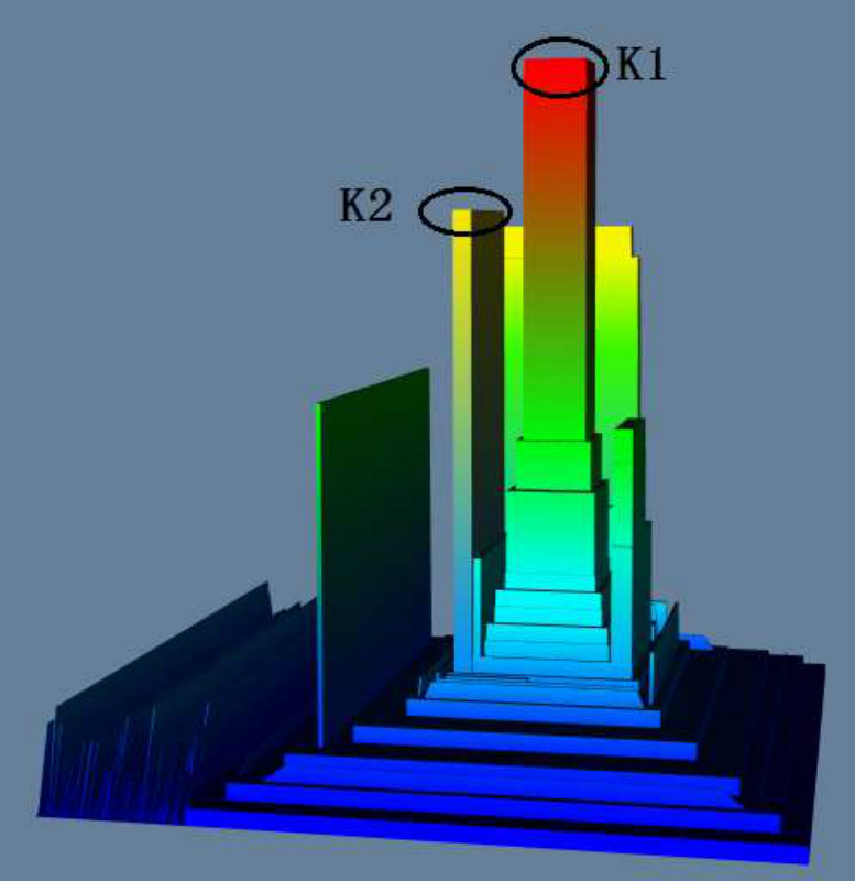 Figure 13
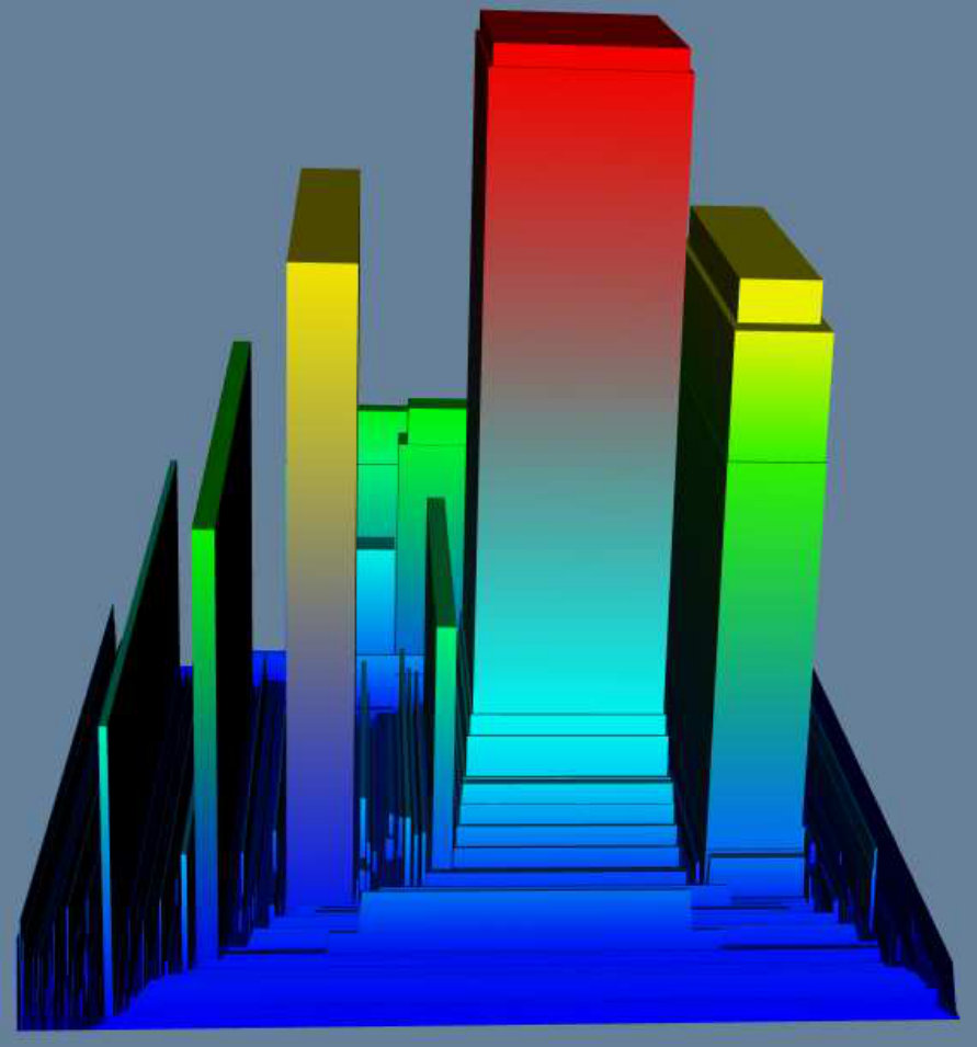 Figure 14
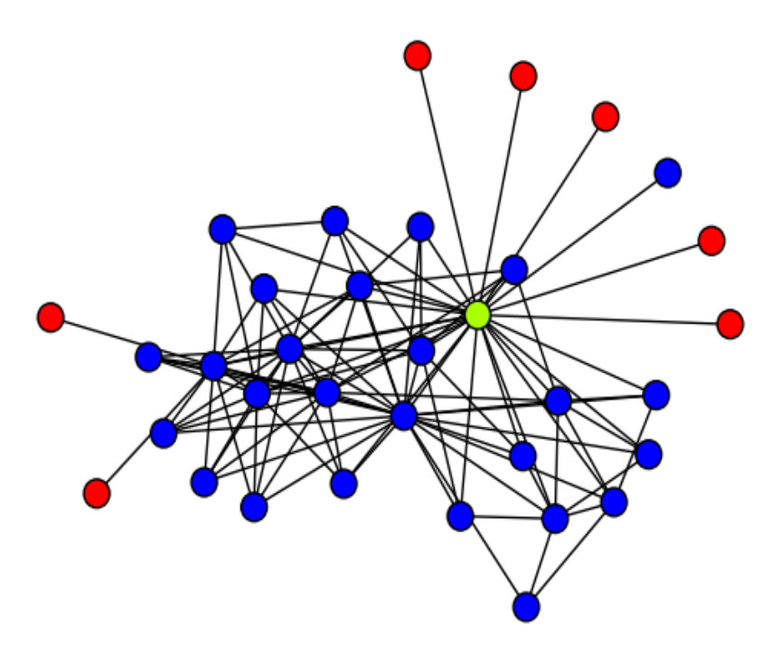 Figure 15
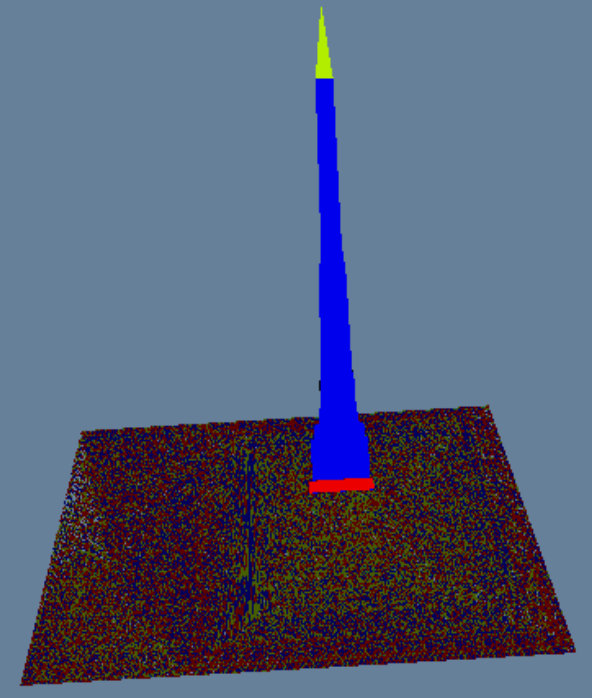 Figure 16
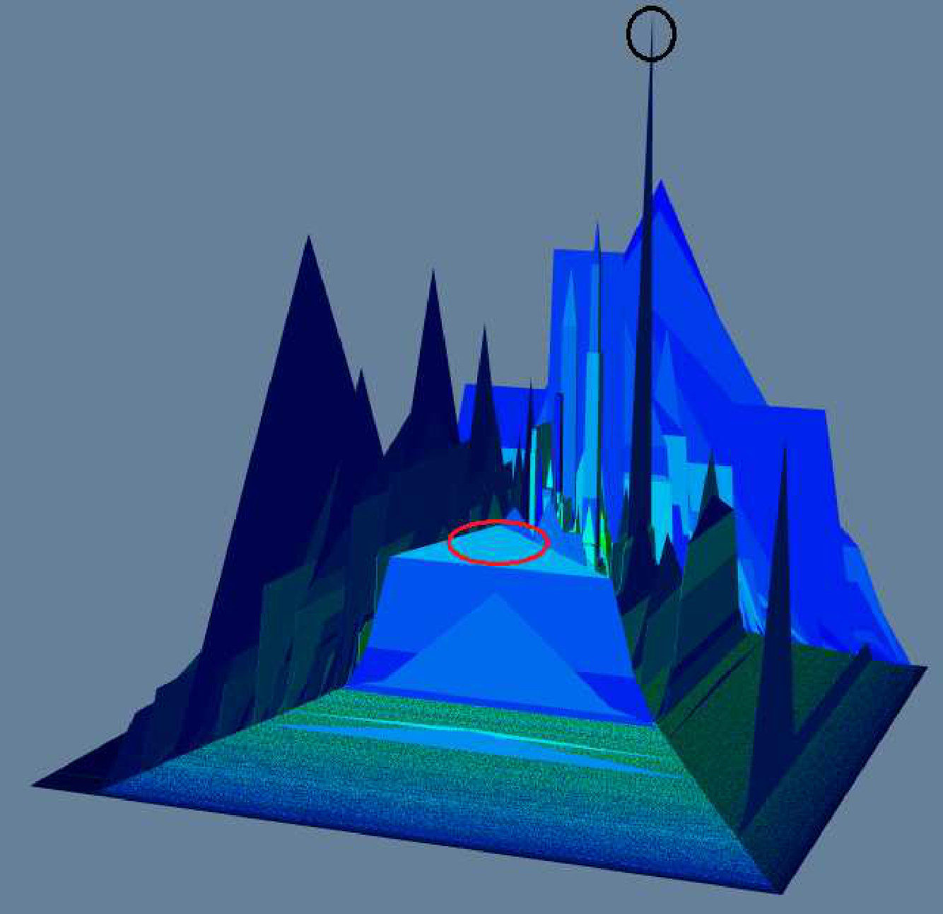 Figure 17
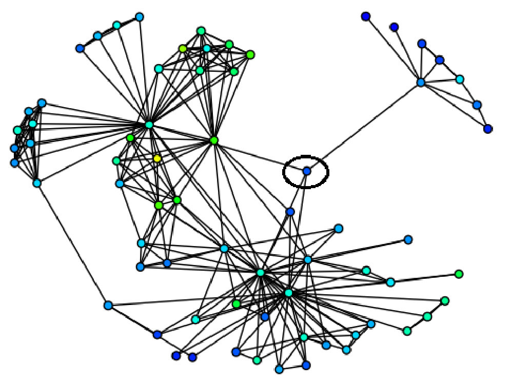 Figure 18
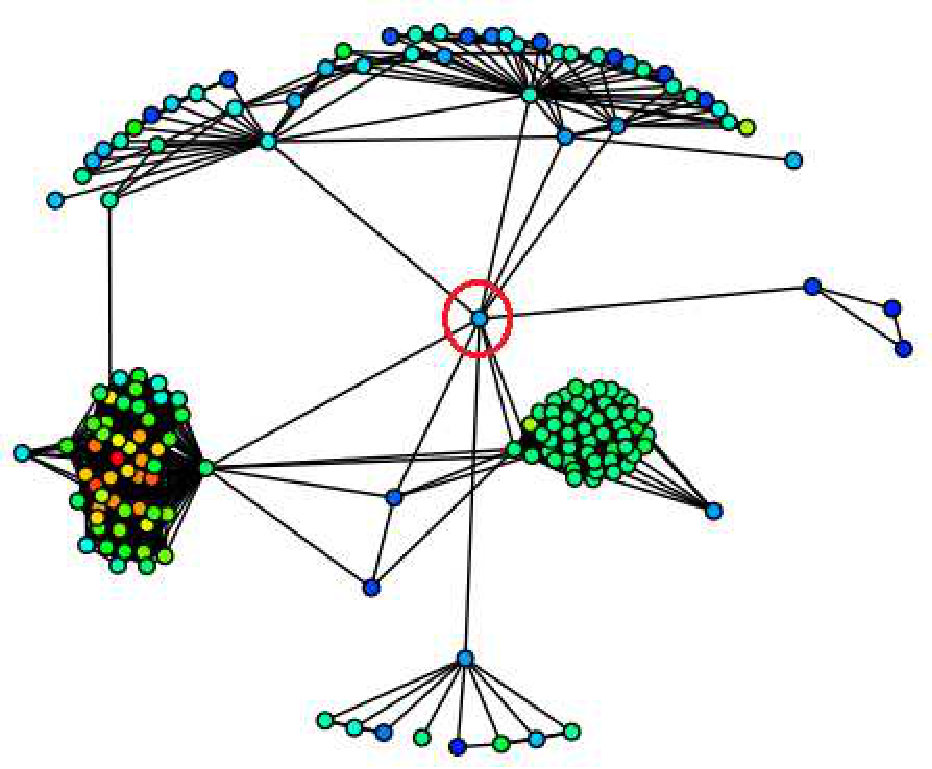 Figure 19
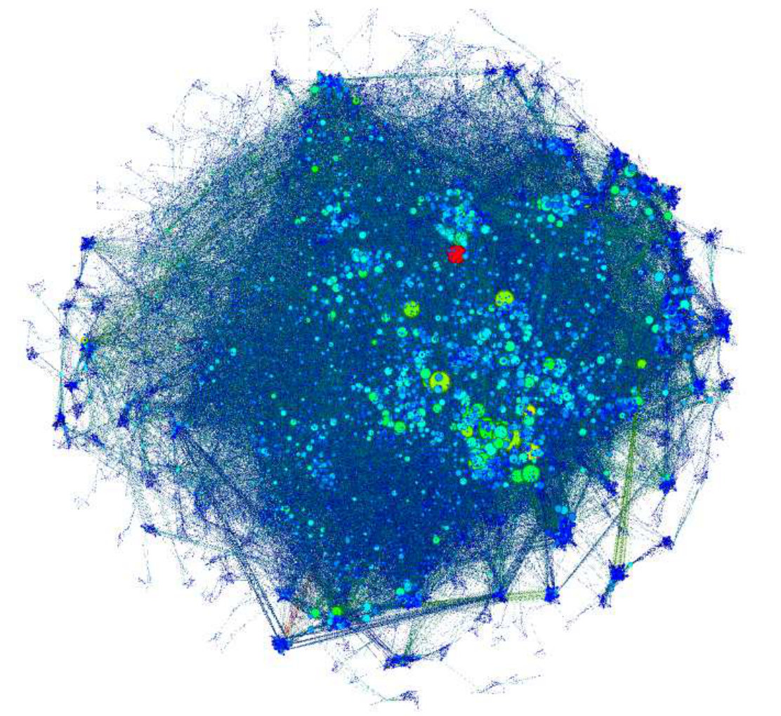 Figure 20
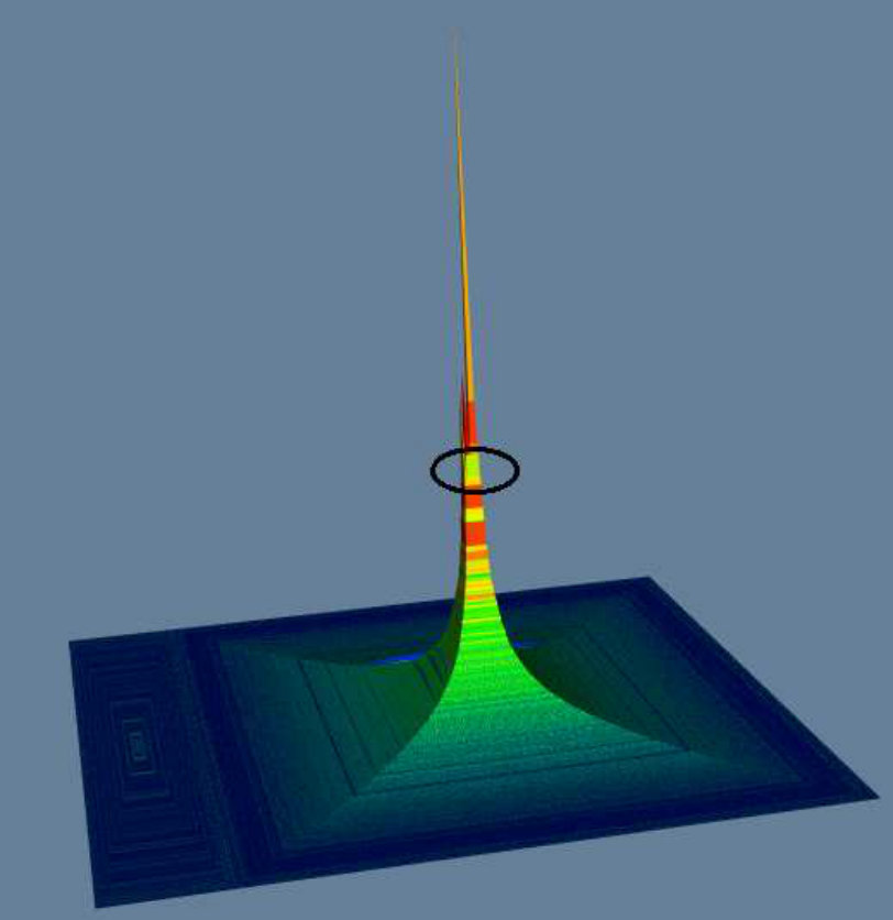 Figure 21
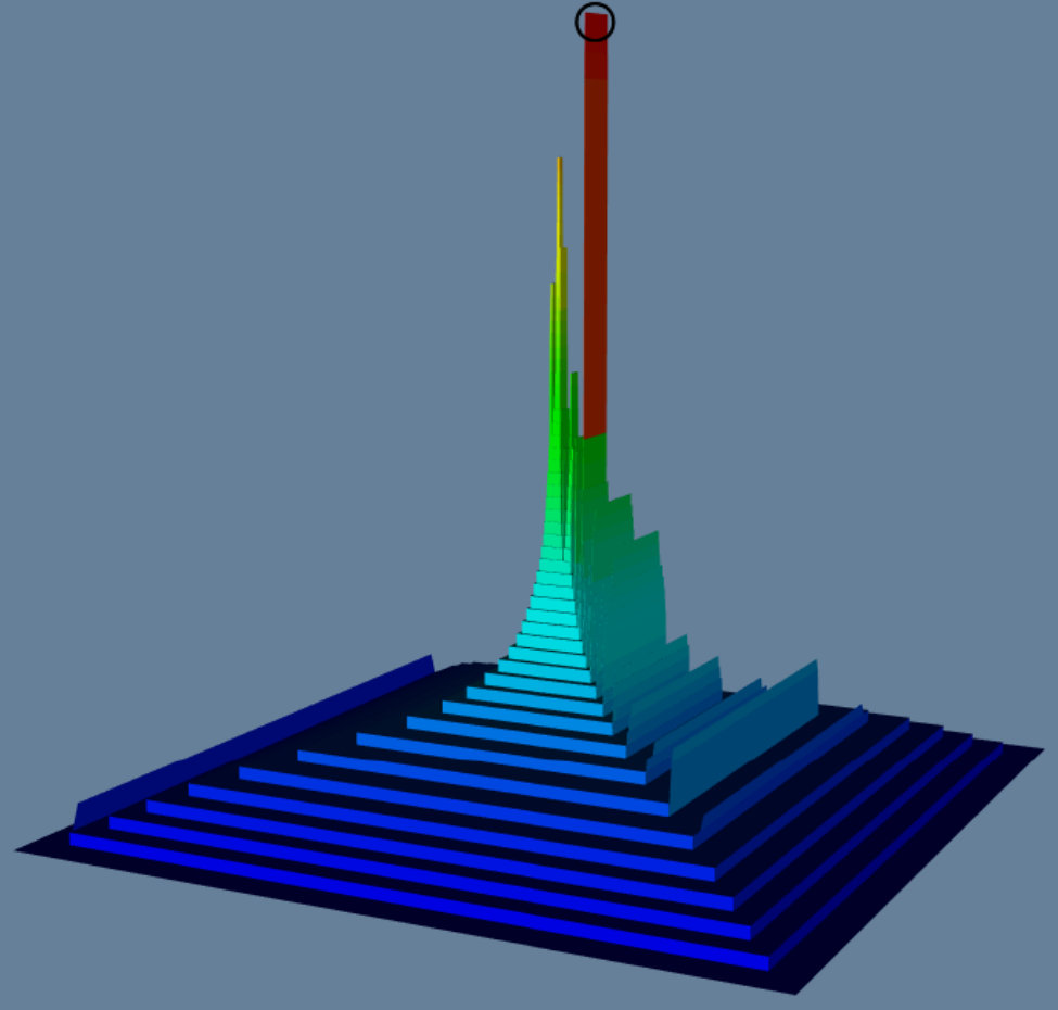 Figure 22
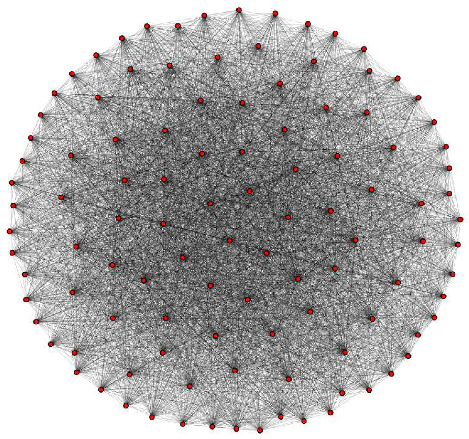 Figure 23
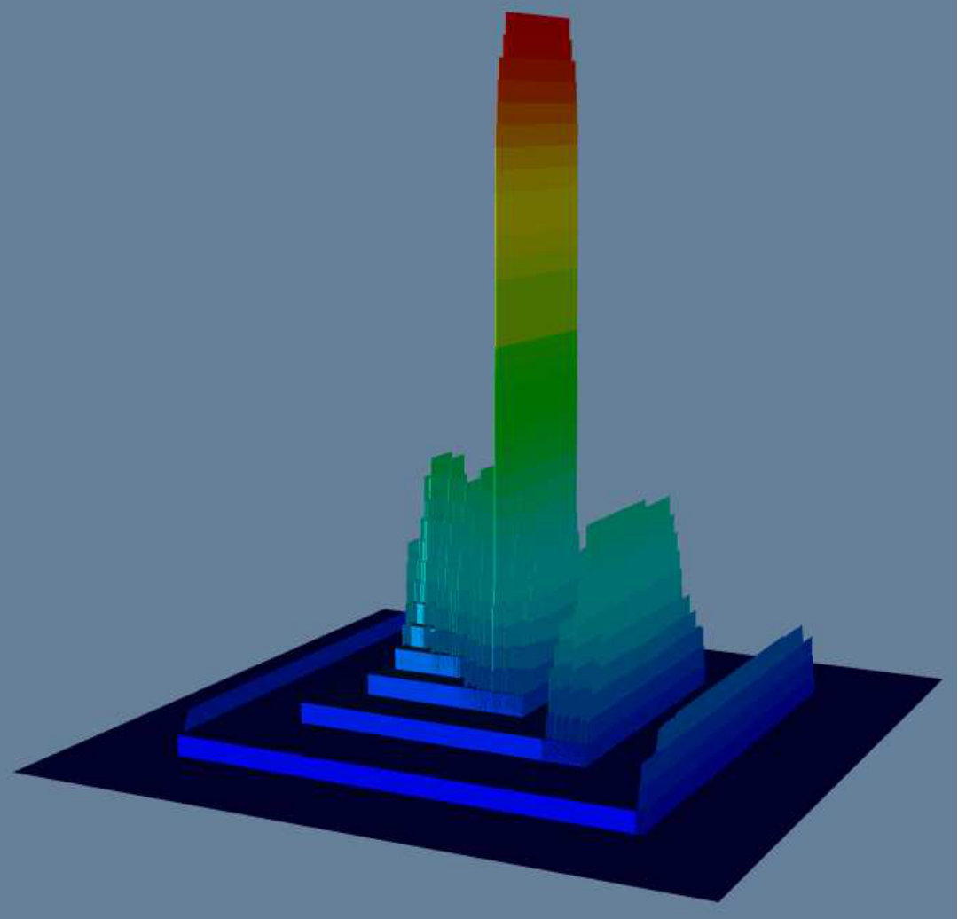 Figure 24
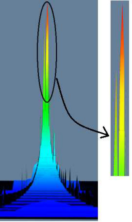 Figure 25
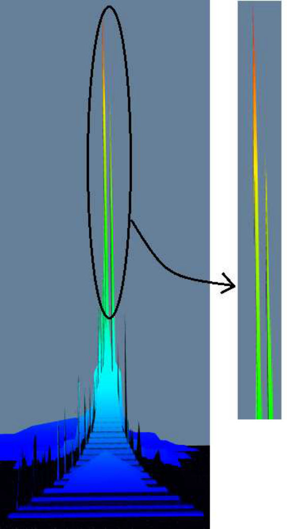 Figure 26
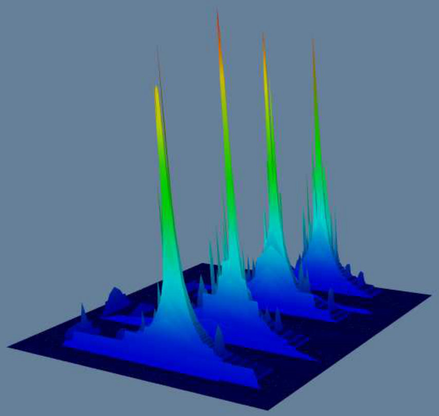 Figure 27
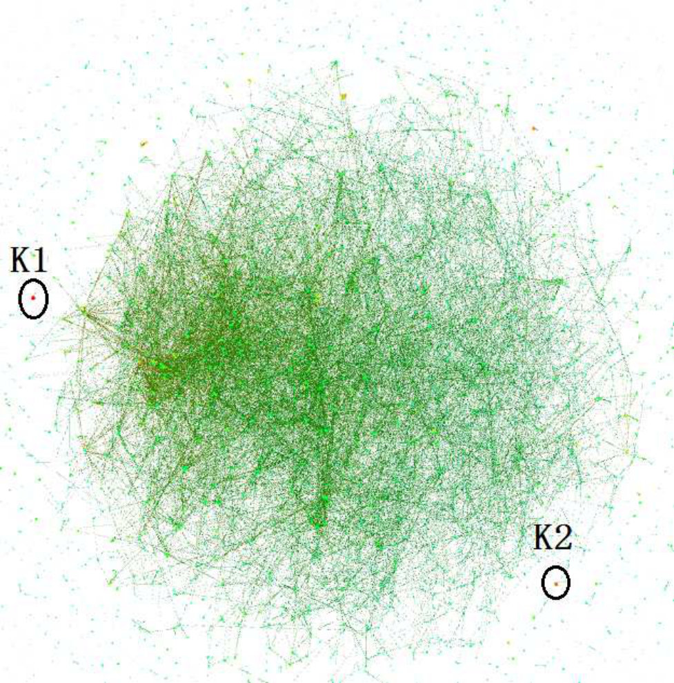 Figure 28
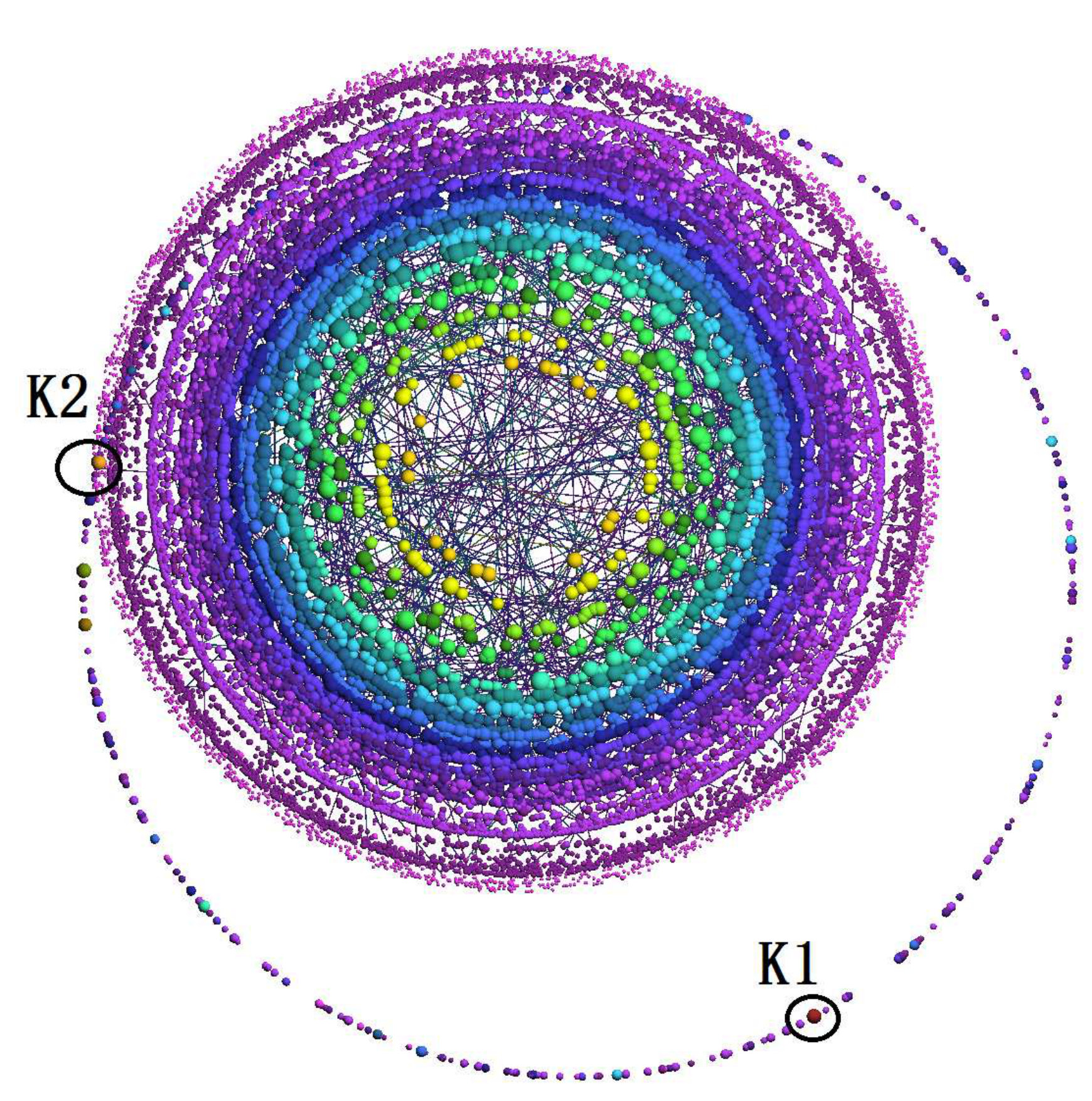 Figure 29
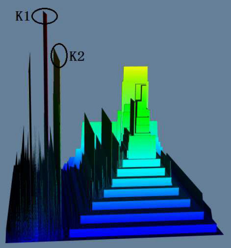 Figure 30
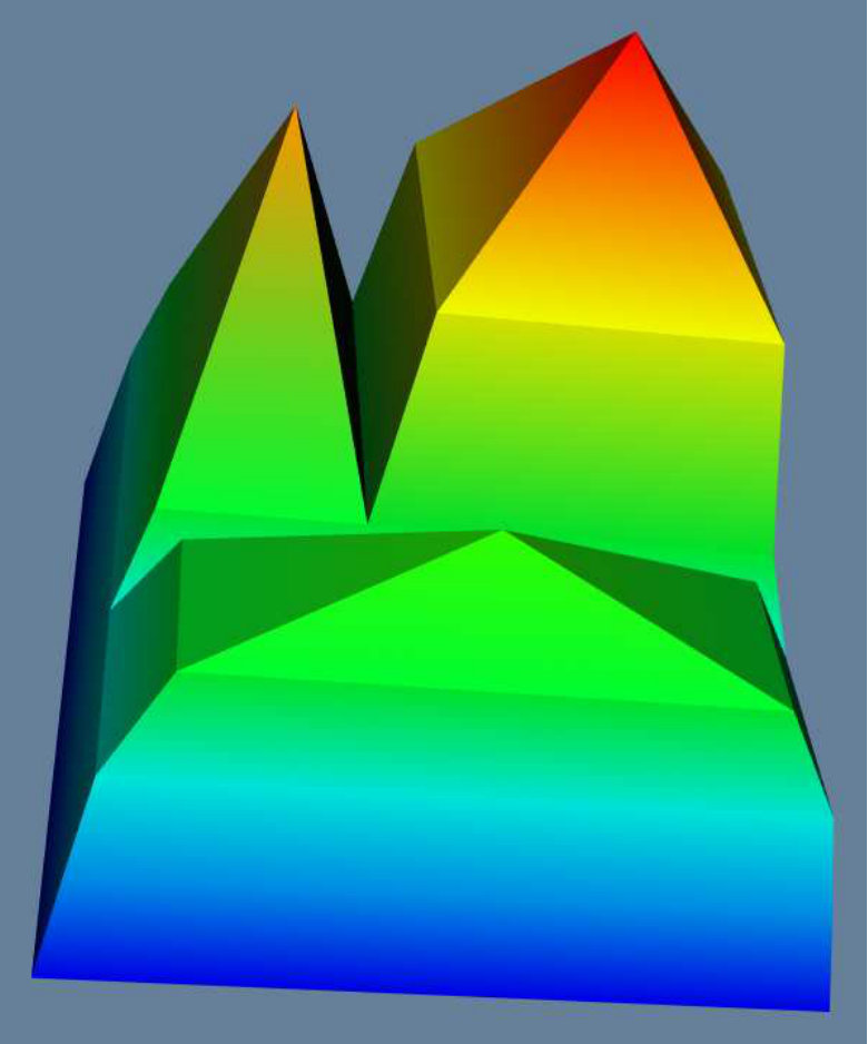 Figure 31
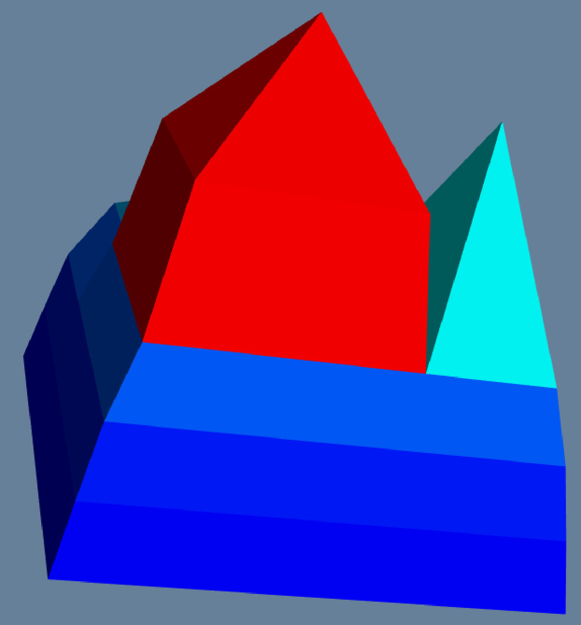 Figure 32
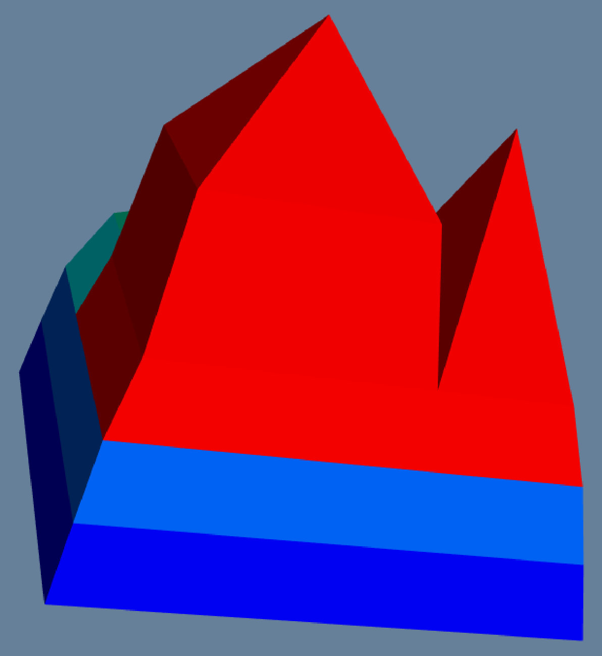 Figure 33
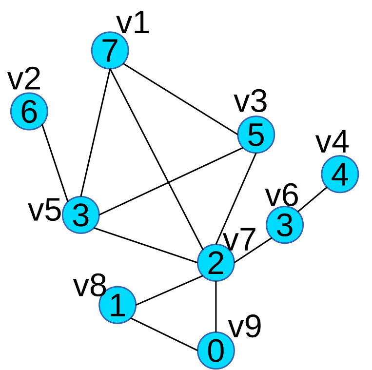 Figure 34
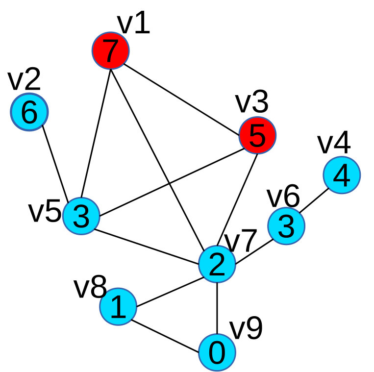 Figure 35
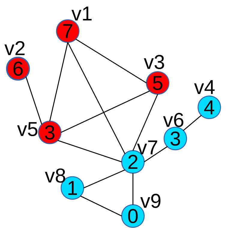 Figure 36
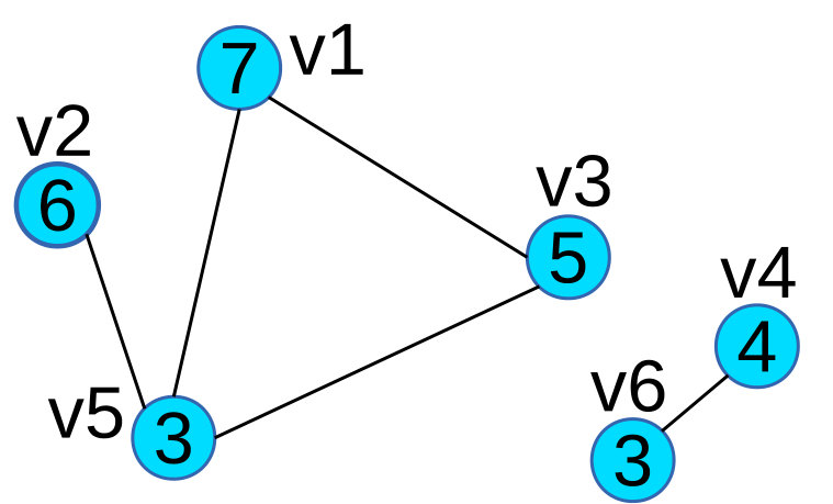 Figure 37
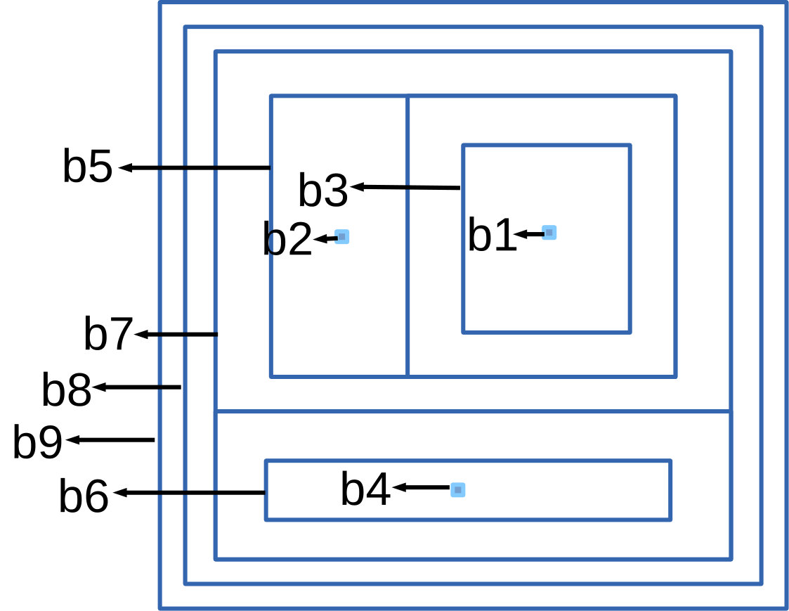 Figure 38
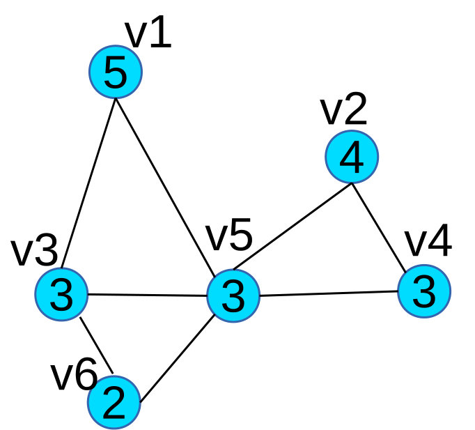 Figure 39
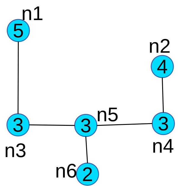 Figure 40
| Dataset | # Nodes | # Edges | Context |
| GrQc | 5242 | 14496 | \pbox16cmCoauthorship in General Relativity |
| and Quantum Cosmology | |||
| Wikivote | 7115 | 103689 | \pbox16cm Who-votes-on-whom relationship |
| between Wikipedia users | |||
| Wikipedia | 1,815,914 | 34,022,831 | \pbox16cm Links between Wikipedia pages |
| PPI | 4741 | 15147 | \pbox20cm Protein Protein Interaction network |
| Cit-Patent | 3,774,768 | 16,518,947 | \pbox16cm Citations made by patents granted |
| between 1975 and 1999 | |||
| Amazon | 334863 | 925872 | \pbox16cm Co-Purchase relationship |
| between products in Amazon | |||
| Astro | 17903 | 196972 | \pbox16cmCoauthorship between authors in |
| Astro Physics | |||
| DBLP | 27199 | 66832 | \pbox16cmCoauthorship between authors in |
| (Database, Data Mining, Machine | |||
| Learning, Information Retrieval) |
| Dataset | Scalar | \pbox20cm | |||
|---|---|---|---|---|---|
| GrQc | KC(v) | 869 | 0.0018 | 1 | |
| GrQc | KT(e) | 728 | 0.0039 | 0.0072 | 1 |
| WikiVote | KC(v) | 106 | 0.0037 | 1 | |
| WikiVote | KT(e) | 44 | 0.053 | 0.69 | 1 |
| Wikipedia | KC(v) | 230 | 6.9 | 2 | |
| Wikipedia | KT(e) | 1,903 | 49.3 | 16334 | 22 |
| Cit-Patent | KC(v) | 1,059 | 7.1 | 2 | |
| Cit-Patent | KT(e) | 110,412 | 27.7 | 65.3 | 13 |
| Role | Book Name |
|---|---|
| green | Artist’s Way, The PA |
| blue | Heart Steps: Prayers and Declarations for a Creative Life |
| blue | Inspirations: Meditations from the Artist’s Way |
| blue | Reflections on the Artist’s Way |
| blue | The Artist’s Way Creativity Kit |
| red | Writing From the Inner Self |
| red | \pbox20cmCodes of Love : How to Rethink |
| Your Family and Remake Your Life |
| Terrain | LaNet-vi | OpenOrd | ||||
| Dataset | accuracy | time | accuracy | time | accuracy | time |
| GrQc | 1 | 2.6 | 1 | 6.7 | 1 | 7.6 |
| PPI | 1 | 4.9 | 1 | 5.3 | 0.8 | 10.7 |
| DBLP | 1 | 4.6 | 0.8 | 6.6 | 1 | 10.9 |
| Terrain | LaNet-vi | OpenOrd | ||||
|---|---|---|---|---|---|---|
| Dataset | accuracy | time | accuracy | time | accuracy | time |
| GrQc | 1 | 3.6 | 0.7 | 10.3 | 0.8 | 8.2 |
| PPI | 1 | 4.1 | 0.2 | 7.7 | 0.7 | 11.6 |
| DBLP | 1 | 5.1 | 0.8 | 8.5 | 0.9 | 9.8 |
| Terrain | OpenOrd | |||
|---|---|---|---|---|
| Dataset | accuracy | time | accuracy | time |
| Astro | 0.9 | 9.1 | 0.7 | 11.9 |
Peer Reviews
No public reviews on file for this paper yet. If you reviewed it on a platform where reviews are public (OpenReview, ICLR, NeurIPS, ICML), you can paste yours below so the community can read it here.
Videos
No videos yet. Explain this paper in a talk, walkthrough, or lecture? Add one.
Taxonomy
TopicsComplex Network Analysis Techniques · Data Visualization and Analytics · Mental Health Research Topics
Analyzing and Visualizing Scalar Fields on Graphs
Yang Zhang
Department of Computer Science
and Engineering
The Ohio State University
Columbus, Ohio, USA, 43210
Email: [email protected]
Yusu Wang
Department of Computer Science
and Engineering
The Ohio State University
Columbus, Ohio, USA, 43210
Email: [email protected]
Srinivasan Parthasarathy
Department of Computer Science
and Engineering
The Ohio State University
Columbus, Ohio, USA, 43210
Email: [email protected]
Abstract
The value proposition of a dataset often resides in the implicit interconnections or explicit relationships (patterns) among individual entities, and is often modeled as a graph. Effective visualization of such graphs can lead to key insights uncovering such value. In this article we propose a visualization method to explore graphs with numerical attributes associated with nodes (or edges) – referred to as scalar graphs. Such numerical attributes can represent raw content information, similarities, or derived information reflecting important network measures such as triangle density and centrality. The proposed visualization strategy seeks to simultaneously uncover the relationship between attribute values and graph topology, and relies on transforming the network to generate a terrain map. A key objective here is to ensure that the terrain map reveals the overall distribution of components-of-interest (e.g. dense subgraphs, k-cores) and the relationships among them while being sensitive to the attribute values over the graph. We also design extensions that can capture the relationship across multiple numerical attributes (scalars). We demonstrate the efficacy of our method on several real-world data science tasks while scaling to large graphs with millions of nodes.
I Introduction
Our ability to produce and store data has far outstripped our ability to analyze and utilize this data to derive actionable insight. Many phenomena and problems from all walks of human endeavor can often be represented in graph or network form, where nodes represent entities-of-interest and edges represent interactions or relationships among them. Examples abound across the physical, biological, business, technological, sociological and health domains. A fundamental challenge is the ability to visualize such interconnections at scale while working within the pixel limits of modern displays. This in turn has led to several recent advances in the database systems [1, 2, 3, 4], network science[5, 6], geometry[7, 8, 9, 10], and information visualization [11, 12] communities.
However, the data scientist is often interested in uncovering patterns that go beyond layout and visualization designs – for instance accounting for measures or attributes defined on both nodes and edges of the graph [13, 2]. Such measures often encode information about connectivity – both locally (e.g. triangle density, clustering coefficient, K-Core, K-Truss) as well as globally (e.g. various centrality measures such as closeness, betweenness and harmonic, and also measures of importance such as PageRank and Influence). Beyond just measures from the topology, such measures may also incorporate heterogeneous information related to content (e.g. sequence information of a protein etc.). Visualizing the measure information in such graphs (where each node or edge has one or more scalar measures associated with it) further exacerbates the challenge.
In this article we propose a novel visualization method to explore graphs with numerical measures associated with nodes (or edges) – referred to as scalar graphs, and the measure values are referred to as scalar values. Each scalar value could either be a natural attribute or a derived attribute summarizing information from multiple natural attributes (e.g. triangle density, centralities, cliquishness) [4, 1]. We model the problem as a continuous function : the domain is a simplicial complex whose vertex set is the set of input graph nodes, and its topology is determined by the input graph topology. We call such a representation of a graph a graph-induced scalar field. We then leverage a powerful “terrain metaphor” idea for visualizing scalar fields [9, 10] and adapt it to our context. Our visualization model naturally encodes both topological and numerical measure information together, and is capable of handling large graphs with millions of nodes/edges. Empirically we demonstrate the use of our methodology on a range of data science tasks while providing a comparative assessment against state-of-the-art alternatives from the perspectives of efficacy, efficiency and usability.
Figure 1 previews our methodology for the tasks of: i) visualizing dense subgraphs (K-Cores, K-Trusses, etc); and ii) visualizing communities in social networks. In Figure 1(a), we use K-Core number [5] as a measure on each node and use it to visualize K-Cores in a collaboration network (a fundamental network science task), where the top part of high peaks contains dense K-Cores (Clicking on the circled part of the high peak will show the details of a dense K-Core in the red box). In Figure 1(b), we use community score [14] as a measure to visualize the four communities in a DBLP network, where each major peak is a community, and the sub-peaks in a major peak indicate sub-communities. The top part of a peak contains key members of the community. Our proposed tool can also color the terrain using a second measure, so one can analyze the correlation between two different measures on the graph and furthermore allows for various rotation/transformation operators which allow an end-user to interrogate the data from multiple perspectives. Further details of our evaluation is detailed in Section III. In summary, our contributions are:
- •
We advocate a novel visualization method to visualize a graph whose vertices/edges are associated with numerical measures. Central to our approach is to embed the graph in terrain space. The visualization method enables users to quickly capture how the numerical measure value is distributed over the graph.
- •
We propose the concept of maximal -connected component to represent various graph patterns (dense subgraphs, communities, K-Cores, K-Truss etc.), and show that our visualization method not only captures the distribution of graph patterns, but also their global relationships.
- •
Based on our visualization method, we propose methods to analyze the relation between multiple numerical measures on one graph.
- •
Finally, we empirically demonstrate that the visualization method is both general-purpose and scalable and can handle graphs with millions of nodes and edges. A key part of our evaluation strategy includes a user-study following best practices (Section IV).
II Scalar Graph Visualization
Notation: We define a vertex-based scalar graph G(V, E) as a graph comprising edges E and vertices V, where each vertex has one scalar value associated with it, denoted as v.scalar. In the following we refer to vertex-based scalar graph as a scalar graph for expository simplicity. We also assume the following notion in the rest of this section. For two subgraphs and of scalar graph G, is the same as (denoted as if and , is a subgraph of (denoted as ) if and , is connected to (denoted as ) if there is a vertex and a vertex such that is connected to .
II-A Theoretical Insights
We now describe the key insights underpinning our visualization strategy. We first define maximal -connected component as follows:
Definition 1
*A connected component of scalar graph is a maximal -connected component if it satisfies following conditions:
(1) for every vertex , .
(2) for any vertex , if is connected to and , then .
(3) for any edge , if and , then .*
Maximal -connected components are an important aspect of our visualization strategy. We note that the definition accommodates both connectivity (topology) and scalar value information. The scalar values may be inherited from the domain or derived (e.g. local density or k-core values[5])). The distribution of maximal -connected components in a graph would allow the data scientist to interrogate the distribution and inter-connectivity of such structures within the graph (e.g. distribution and relationships of K-cores).
Definition 2
For vertex , we define MCC() as the maximal -connected component containing (i.e. ).
Theorem 1
For any maximal -connected component in , there is a vertex in such that .
Proof Sketch: It is easy to show that in Theorem 1 is the vertex with minimum scalar value in . The proof trivially follows from this observation.
Theorem 2
For two vertices and , if and contains , then .
Proof Sketch: For every vertex in , we can show that in there is a path , which starts with , passes through , and ends at , and all the vertices on the path have scalar value greater than or equal to , so is in . Similarly, we can show for every vertex in , is in . Thus .
Theorem 3
For a maximal -connected component and another maximal -connected component , if then or .
Proof Sketch: Based on Theorem 1, there are two vertices and such that and . Assume (w.l.g). Since , for any vertex in , we can find a path connecting and , and all the vertices on the path have scalar value greater than or equal to , so is in . Thus .
Theorems 1 and 2 bound the number of distinct maximal -connected components that need to be processed by any algorithm (number of vertices in the graph). Theorem 3 highlights an important hierarchical relationship between different maximal -connected components which will be exploited by our visualization strategy.
II-B Vertex Scalar Tree
In this section, we describe the vertex scalar tree (scalar tree for short) to analyze a scalar graph. We note that if one views the graph as a 1-dimensional simplicial complex, the vertex scalar values induce a piecewise-linear function on this domain, then the maximal -connected components we defined previously are akin to level sets or contours for each [15, 7]. We also note that this perspective also helps us easily extend the notion of scalar tree for edge-based scalar graphs (in Section 2.3).
A scalar tree is a tree in which every node is associated with a scalar value, and the scalar tree T of scalar graph G has the following properties:
Every node in T corresponds to a vertex in G with the same scalar value, and vice versa (i.e. one-to-one correspondence). 2. 2.
Every maximal -connected component in G corresponds to a subtree in T, and vice versa (i.e. one-to-one correspondence). 3. 3.
Assume a maximal -connected component corresponds to subtree in T, and another maximal -connected component corresponds to subtree in T, then is a subgraph of if and only if is subtree of . 4. 4.
Assume a maximal -connected component corresponds to subtree in T, and another maximal -connected component corresponds to subtree in T, then and are not connected if and only if and are not connected.
Notation: In the following text, the scalar tree node corresponding to vertex v is denoted as n(v), and the vertex corresponding to scalar tree node n is denoted as v(n). The parent of tree node is denoted as . The subtree corresponding to a maximal -connected component C is denoted as ST(C). A subtree ST containing nodes is denoted as , and a connected component C containing vertices is denoted as .
Example: In Figure 2 we use an example to illustrate the properties of scalar tree. Figure 2(a) is a scalar graph G, in which every vertex’s label is its scalar value. Figure 2(b) is a correspondent scalar tree T of Figure 2(a), rooted at node . Node in Figure 2(b) corresponds to vertex in Figure 2(a) (Property 1). In Figure 2(c), we extract all the maximal 2.5-connected components of G:
and , and in Figure 2(b), their correspondent subtrees are: and , this satisfies Property 2. We notice that and are not connected, and and are not connected either, this satisfies Property 4. We also observe that is a subgraph of a maximal 2-connected component , and is a subtree of , this satisfies Property 3.
From the properties above, we can see that scalar tree captures the distribution and relationship of all maximal -connected components within a scalar graph. This allows one to analyze the scalar tree instead of the scalar graph and leverage it for our visualization strategy.
Constructing the Vertex Scalar Tree: Algorithm 1 constructs the scalar tree by leveraging the observation connecting our problem with level sets and contour trees[15, 7]. Algorithm 1 processes all the vertices in decreasing order of scalar values (line 1-3). If the current vertex is connected to a previously processed vertex , but is not in the current subtree of (line 4-5), then we connect with the root of the current subtree of (line 6). Here denotes the root node of the current subtree containing . Note that now is parent of , so becomes the new root of the current subtree containing .
The running time of line 1 is . An efficient implementation of line 5 uses the “Union Find” data structure, which compares and . The amortized time for “Union Find” (line 5) is per operation, where is inverse of Ackermann function, and is usually a small constant. So the total worst-case time cost of Algorithm 1 is
In the scalar tree T generated by Algorithm 1, every node’s scalar value is greater than or equal to its parent’s scalar value. If we layout a scalar tree T in such a way that the height of each node is the scalar value of the node, then we could get all the maximal -connected components for a particular in a simple way: draw a line with to cross T, and each of the subtrees above the line corresponds to a maximal -connected component. For example, as Figure 2(b) shows, the two subtrees above red line correspond to all the maximal -connected components. When every vertex in the input scalar graph G has a distinct scalar value, the scalar tree T generated by Algorithm 1 has the following property:
Proposition 1
For every vertex v in G, assume it corresponds to n(v) in T, then the subtree rooted at n(v) (denoted as ) in T corresponds to the MCC(v).
Proof:
Obviously corresponds to a connected component . Since is the minimum scalar value in , every vertex in has scalar value greater than or equal to . If there is a vertex that connects to a vertex in , and , then due to Algorithm 1, and will be in the same subtree , which indicates that is in . So is a maximal -connected component, and it is MCC(v). ∎
Based on Theorem 1, Theorem 3 and Proposition 1, it follows that when every vertex in the input scalar graph has a distinct value, the tree generated by Algorithm 1 has the four properties of the scalar tree. When some vertices in scalar graph have the same scalar value, Algorithm 1 may not guarantee Property 2, and we need to do some additional postprocessing, described next.
Postprocessing the Vertex Scalar Tree: If some vertices in G have the same scalar values, the scalar tree generated by Algorithm 1 may not satisfy Property 2 – a subtree may not correspond to a maximal -connected component. For example, Figure 3(a) is a scalar graph, and Figure 3(b) is the scalar tree generated by Algorithm 1, in which corresponds to in the scalar graph. The subtree rooted at is corresponds to connected component , however, is not a maximal -connected component.
To solve the problem, we use Algorithm 2 to postprocess the scalar tree T generated by Algorithm 1: we merge the ancestor node with all its descendants with the same scalar value into a super node. The correctness of the algorithm is based on the following proposition:
Proposition 2
For any tree node in T, assume it has an ancestor in T, such that , and is null or , then the subtree rooted at (denoted as ) corresponds to the MCC(v(n)).
In the example in Figure 3(b), Algorithm 2 will merge the nodes into a super node, and build a super tree (Figure 3(c)). Every subtree of the super tree will correspond to a maximal -connected component. After postprocessing, the scalar tree will still satisfy Property 2, 3, 4, but may not satisfy Property 1, because a super node may correspond to multiple vertices, however, this does not affect the further analysis.
Algorithm 2 only needs one pass of the scalar tree T, so the time complexity is , where is the number of vertices in the original scalar graph.
II-C Edge-based Scalar Graph
Here we describe a novel approach for modeling scalar values on edges. We define an edge-based scalar graph as a graph comprising edges and vertices , where each edge e has one scalar value associated with it, denoted as e.scalar. Similarly, the maximal -edge connected component is defined below:
Definition 3
*A connected component of scalar graph is a maximal -edge connected component if it satisfies following conditions:
(1) for every edge , .
(2) for any edge , if edge shares a common vertex with and , then .
(3) for any edge , we have and .*
The edge scalar tree T of edge scalar graph G has the following properties:
Every node in T corresponds to an edge in G with the same scalar value, and vice versa (i.e. one-to-one correspondence). 2. 2.
Every maximal -edge connected component in G corresponds to a subtree in T, and vice versa (i.e. one-to-one correspondence). 3. 3.
Assume a maximal -edge connected component corresponds to subtree in T, and another maximal -edge connected component corresponds to subtree in T, then is a subgraph of if and only if is subtree of . 4. 4.
Assume a maximal -edge connected component corresponds to subtree in T, and another maximal -edge connected component corresponds to subtree in T, then and are not connected if and only if and are not connected.
Naive Method: a naive way to build edge scalar tree is to first convert the edge-based scalar graph to a dual graph – where every edge in is converted to be a vertex in , and if two edges in share a common vertex, their correspondent vertices in are connected. We then apply Algorithm 1 to – the generated tree is an edge scalar tree of . The time complexity of the method is . In the dual graph , we have and , so the time complexity is actually . The time cost is high because the bottleneck could be in the worst case.
Optimized Method: We propose a novel, more efficient method (Algorithm 3) to construct edge scalar tree from the edge scalar graph, and the time complexity is reduced to be . In line 1, we sorted all the edges in descending order of scalar value. In line 2-3, we select the on vertex v that has the minimum index. In line 6-9, we process edge . Instead of checking all ’s neighbor edges (edges which share a common vertex with ) , we just need to check the s of ’s two vertices (line 6-7). This is based on Proposition 3:
Proposition 3
If edge is a neighbor edge of (), and they share the same vertex , when processing in line 6-9 of Algorithm 3, root() is the same as root().
Proof:
Since , will be processed before . When processing in line 6-9 of Algorithm 3, will be connected to root(), which means and will be in the same subtree thereafter. So when processing , root() is the same as root(). ∎
The time complexity of line 1 in Algorithm 3 is . For each edge e, line 8 is executed times, so line 8 is executed a total of times, and the total running time of line 5-9 is . The worst case running time of Algorithm 3 is . Similar to the case described in the previous section, if some edges have the same scalar value, we can use Algorithm 2 to postprocess the edge scalar tree.
II-D Relationship between maximal -(edge) connected component and Dense Subgraph
A dense subgraph is a connected subgraph in which every vertex is heavily connected to other vertices in the subgraph. K-Core [5] and K-Truss [16, 17](also called Triangle K-Core in [4], DN-graph in [3] ) are two common dense subgraph patterns that draw much attention in recent works. The definitions of K-Core and K-Truss are as follows:
Definition 4
A K-Core is a subgraph in which each vertex participates in at least K edges within the subgraph. The maximal K-Core of a vertex v is the K-Core containing v that has the maximum K value, and the K value of maximal K-Core of v is denoted as KC(v).
Definition 5
A K-Truss is a subgraph in which each edge participates in at least K triangles within the subgraph. The maximal K-Truss of an edge e is the K-Truss containing e that has the maximum K value, and the K value of maximal K-Truss of e is denoted as KT(e).
Now we prove the relationship between maximal -(edge) connected component and K-Core, K-Truss below.
Proposition 4
In a scalar graph G where for any vertex v, v.scalar = KC(v), a maximal -connected component in G is a K-Core where .
Proof:
Assume in a maximal -connected component , vertex v has the minimum scalar value. Based on the definition of K-Core, for every vertex v’ in the maximal K-Core of v, , so the maximal K-Core of v is a subgraph of C. Since v is connected to at least vertices in its maximal K-Core, v is connected to at least vertices in C. For every other vertex v’ in C, similarly we can get that v’ is also connected to at least vertices in C. So C is a K-Core where , since , C is also a K-Core where . ∎
Proposition 5
In an edge scalar graph G where for any edge e, , a maximal -edge connected component in G is a K-Truss where .
The proof is similar to the proof of Proposition 4 and is omitted in the interests of space. Note that when we define the scalar value of each vertex/edge to be KC(v)/KT(e), the (edge) scalar tree will capture the distribution and relationships among K-Cores or K-Trusses in the graph.
II-E Visualization via Terrain Metaphor
Scalar trees are usually not easy to visually interpret, especially when the size of the tree is too large. We adapt the terrain metaphor – topological landscape visualization technique defined on scalar-valued functions [10] – to visualize scalar graphs.
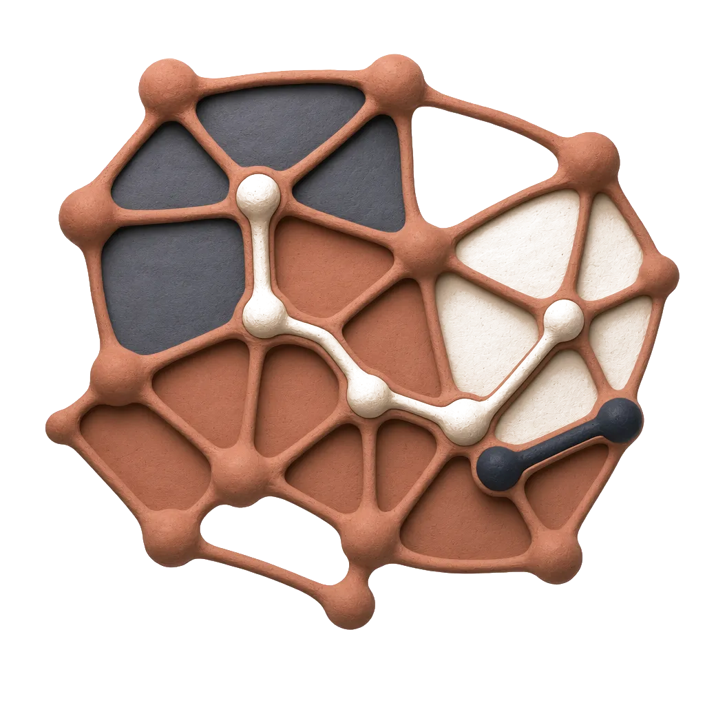
In Figure 4 we use an example to illustrate how to convert the scalar tree in Figure 4(a) to terrain visualization in Figure 4(c). In Figure 4(b) we first layout all the tree nodes of Figure 4(a) in a 2D plane, every node is represented by a boundary in the 2D plane, and the area enclosed by the boundary is proportional to the number of nodes in subtree (not including ) rooted at . To generate the 2D layout, we start traversing the tree from the root(bottom) node , draw the outermost boundary to represent it. Then we move to , and draw a boundary inside . When we reach , and draw boundary , we find there are two subtrees rooted at , so we split the area inside into 2 areas, and recursively layout each subtree in each area. When we reach leaf nodes , since the size of their subtrees is 0, their correspondent boundaries degenerate to be points.
To convert the 2D layout (Figure 4(b)) into a terrain visualization in 3D space (Figure 4(c)), we first escalate each boundary in Figure 4(b) to the height of , and then draw a “wall” between neighboring boundaries. Finally we generate a terrain in Figure 4(c). We can color the terrain by assigning each vertex a color value, and since each “wall” is confined by two boundaries and , we color the wall based on the color value of the vertex corresponding to or . 111The use of 3D rather than 2D was a conscious one. First we found that the 3D abstraction better matched users’ mental-map of the “terrain” concept as well as the hierarchical relationships amongst components-of-interest. While 3D-layouts potentially pose a problem with respect to occlusion, the ability to interactively rotate the point-of-view along with the ability to link 2D-layouts of regions-of-interest as discussed below, alleviates this issue.
To identify a subtree of the scalar tree in the terrain visualization, we locate the correspondent boundary of the subtree root , and the terrain area within the boundary corresponds to the subtree. In our paper, we define a in terrain as below:
Definition 6
A is the terrain area within a boundary whose height is .
Since each corresponds to a subtree in scalar tree, we can easily get that every corresponds to a maximal -connected component. Also, s preserve the containment/connection relationship of maximal -connected components. For example, the red peak in Figure 4(f) is a , which corresponds to the maximal 5-connected component (red nodes) in Figure 4(d), and the red peak in Figure 4(i) is a , which corresponds to the maximal 3-connected component (red nodes) in Figure 4(g). One may contain some sub-peaks, which indicates its maximal -connected component contains other maximal -connected components. For example, in Figure 4(f) is contained in in Figure 4(i), this indicates that the correspondent maximal 5-connected component in Figure 4(d) is a subgraph of the maximal 3-connected component in Figure 4(g). In a , the area of its bottom boundary indicates the number of vertices in its correspondent maximal -connected component.
To get all the maximal -connected components for a particular value, we can use a 2D plane with height = to cross the terrain in 3D space, and all the s above the plane correspond to all maximal -connected components. The benefit of using terrain visualization is, it captures the overall information of all maximal -connected components in one picture. Also, we could encode more information in the terrain by using colors to the terrain.
User Interaction: Our terrain visualization tool provides following features to help users interact with the terrain.
Rotate: the user could rotate the terrain to look at it from different angles. For example, Figure 4(c) and Figure 4(f) show the same terrain from two different viewpoints.
Zoom in/out: the user can zoom in/out to see the details/overview of the terrain. For example, in Figure 8(a), we zoom into the terrain in the left picture, and get a clear picture of the two peaks in the right picture.
**Simplification: ** When visualizing a scalar tree with too many nodes, the rendering and interaction speed might be slow, we simplify the tree to make the visualization faster as follows. We discretize the scalar values, so similar scalar values will be approximately represented by the same value, and then we can use Algorithm 2 to build an approximate super tree with far fewer tree nodes.
Linked-2D-Displays: Our tool allows the user to select any region of the terrain, and invoke a “callback” function to visualize the selected region using other visualization method. For example, in Figure 6(c), we select the region in the white dashed line box, and 2D-linked spring layout visualization method to draw the selected region in the red box beside it. Expert users optionally can use the “callback” function to integrate our terrain visualization with other customized visualization methods. We can also link a 2D treemap of the scalar graph by setting the height of all boundaries to 0 and (optionally) using colors – red/yellow/green/blue – to indicate highest/high/low/lowest value – so the red/yellow blocks in the 2D treemap indicate the subgraph areas with high scalar values (see Figure 5(a) and Figure 5(b)). The 2D visualization clearly shows how the red/yellow/green blocks are distributed over the graph while in the 3D visualization the user will need to rotate her point-of-view to get a similar map. That said, using color to encode scalar value has a drawback. For example, peak 1 and peak 2 in Figure 5(b) correspond to block 1 and block 2 in Figure 5(a), from the height we can see that the peak 2 is a little higher than the peak 1, but from the color we cannot tell the difference between block 1 and block 2. Finally, note that using height allows us to color the terrain based on a different attribute (from the one that generates the terrain), which helps to get a picture of the correlation across multiple scalars, as we shall discuss next.
II-F Handling Multiple Scalar Fields
On some graphs, multiple scalar fields can be defined, which means there are multiple scalar values defined on each vertex. For example, a vertex v has degree value and KC(v) value. Users might be interested in how the multiple scalar fields correlate with each other – are their changing trends the same or the opposite on the graph? In this section, we propose two indexes to measure the correlation of two scalar fields on a graph. Then we can use terrain visualization to analyze the relationship between two scalar fields.
Local Correlation Index: Assume we have two scalar fields, and , defined on a graph. Each vertex v has scalar values and in the two scalar fields. Some previous work [8] proposed a measure to compute the correlation of multiple scalar fields in continuous domain, we adapt their method and propose Local Correlation Index to measure the correlation of two scalar fields on local areas of a graph. Here local area is defined as k-hop neighborhood of each vertex v(denoted as N(v)), for all experiments we limit this to be 1-hop. The Local Correlation Index of and on N(v) is denoted as . For each vertex v, we compute as follows.
[TABLE]
is actually the correlation of the scalar values of and on v’s k-hop neighborhood. A positive/negative indicates the changing trends of and are consistent/inconsistent on v’s k-hop neighborhood. This method can easily be adapted to analyze edge-based scalar graphs.
Global Correlation Index: We can compute the Global Correlation Index (GCI) of scalar fields and on a graph by averaging the Local Correlation Indexes of all neighborhoods.
[TABLE]
By comparing the Global Correlation Index and Local Correlation Index, we may identify some outlier neighborhood on which the correlation of scalar fields and is different from the overall correlation.
Terrain Visualization: To visualize the local correlation between two scalar fields, we can use as a scalar field to draw the terrain. This will show us the overall distribution of over the graph, and help us identify the area of the graph where the two scalar fields are positively/negatively correlated.
We can also visually capture the global correlation of scalar fields and through coloring terrain visualization. We use one scalar field to draw the terrain visualization, and use the other scalar field to color the terrain (see Figure 1(a)). Please note that this method can also visualize the relationship between a numerical attribute and a nominal attribute of vertices, by coloring the terrain based on the value of nominal attributes.
II-G Related Context
We are now in a position to briefly place the proposed visualization strategy in the context of related work. Visualizing graph data is an important problem (See [18] for a recent survey – due to interests of space here we focus only on the most relevant). Gronemann et al. [19] (similarly Athenstadt et al. [20]) use topographic maps to visualize clustering structure within a graph – each mountain corresponds to a cluster. van Liere et al.[21] propose the GraphSplatting method to visualize a graph as a 2D splat field. Telea et al.[22] generate a concise representation of graph by clustering edges and bundling similar edges together and subsequently visualize the graph. While effective on small scale datasets for displaying overall cluster structure, these methods simply do not scale to large data with millions of edges nor do they account for attributed graphs (scalar values). Bezerianos et al. [23] and Wattenberg [24] propose interactive visual system to let users explore networks with multiple node or edge attributes. However, these methods do not consider hierarchical relationships among components-of-interest and graph attributes simultaneously.
Sariyuce et al. [25] proposed (r, s)-nucleus to denote a dense subgraph comprised by cliques, and use forest of nucleus to represent hierarchical structure of a graph. The difference is, their definition of (r, s)-nucleus focuses on density of subgraph, while our definition of maximal -connected components focuses on relation between scalar values and graph topology, and not just limited to nucleus motifs. Moreover, their effort does not consider visualization as an objective – a primary focus of our effort. Some visualization methods (such as LaNet-vi [6]) are proposed to visualize K-Cores, but they are not general enough to handle other vertex/edge attributes. Martin et al. [26] proposed OpenOrd to visualize large scale graphs in multi-level way, but do not effectively highlight components-of-interest. Both LaNet-vi and OpenOrd share some of our objectives w.r.t network visualization, and we compare and contrast with these efforts in Section IV.
In summary, a major difference between our work and prior art is that we propose to analyze the graph through the hierarchical structure (scalar tree) induced by the maximal -connected components. The benefit is that it naturally encodes the relationship between clustering structure and scalar values – it highlights how scalar values evolve from high values to low values over the graph. This is particularly useful for a data scientist who wishes to understand how a community is expanded from its core members to peripheral members(see Figure 8)[27, 28, 29]. Furthermore, based on different attributes, the maximal -connected component can represent different subgraph patterns, such as K-core, K-truss, subcommunity, which has attracted much interest within the database community [1, 5, 16], to reveal the topological relationship (containment, connection) among components of interest (e.g. K-Cores, K-Trusses, communities). We examine these issues next.
III Experimental Evaluation
We seek to evaluate the effectiveness (qualitative) and efficiency of the our interactive network visualization method in this section. We leverage a wide range of datasets from the network science community (some are from [30]) as noted in Table I. Heights in our terrain visualization represent scalar measures of input scalar graph while color represents intensity of the same measure (unless otherwise noted). The color ranges from red (most intense); yellow (intense); green (less intense); blue (least intense). All experiments are evaluated on a 3.4GHz CPU, 16G RAM Linux-based desktop.
III-A Visualizing Dense Subgraphs
Effectiveness: The visualization of dense subgraphs within graphs has been of much interest within the database and information visualization. Examples abound and include CSV plots [1], K-Core [6] and Triangle K-Core (K-Truss) [4] plots. Here we use our terrain visualization to visualize K-Cores and K-Trusses and compare with the previous methods.
We consider two datasets (GrQc, Wikivote) for this illustration. In Figure 6(a) and Figure 6(b), we use the traditional spring layout Algorithm [31] to draw both networks – it is hard to say anything about the distribution of dense subgraphs using such a plot. Following the discussion in Section 5, we use KC(v) as scalar value, and generate the terrain visualization of both networks in Figure 6(c) and Figure 6(d). Recall that if the scalar value of every vertex v is defined to be KC(v), each maximal -connected component is a K-Core where . Thus in the terrain, each is a K-Core where . The distribution of K-Cores in the two datasets is obviously different. Figure 6(d) shows that there is one single high peak, which means the network has one densest K-Core, and K-Core density gradually decreases to the neighboring vertices. Figure 6(c) shows that there are several high peaks within the GrQc network, which means there are several disconnected K-Cores with high K values (dense K-Cores).
Moreover, Figure 6(c) clearly illustrates the hierarchical relationship among K-Cores. In the selected terrain area (the terrain area in dashed line), the red peak is placed on green and blue foundation, which means the dense K-Core is contained in some less dense K-Cores. This can be verified by drawing spring layout of the selected region in the red box (with our tool, a user can select a region, and call other visualization methods to draw the selected region), the red dense K-Core is surrounded by some green and blue vertices. The visualization of hierarchy is important, as it allows an analyst to derive high level insights on the connectivity that is not immediately obvious even in state of the art K-Core plots as shown in Figure 6(f) [6] for the GrQc network. We give more detailed comparison between terrain visualization and other visualization methods in User Study section.
Also we can color the terrain using a second measure. In Figure 1(a), we color the terrain based on vertex degree (red/yellow/green/blue area indicates vertices with highest/high/low/lowest degrees), we can see that generally KC(v) is positively correlated with degree – vertices in dense K-Cores have high degrees, except a few outlier vertices that have relatively high degree but low KC(v) values (the yellow area at the bottom of the terrain). They are usually local hub nodes with sparse neighborhood.
We can illustrate the same principle when visualizing K-Trusses (used to understand triangle density) instead of K-Cores. Here each edge uses KT(e) as the scalar measure, and we use the edge-based scalar graph for visualizing the K-Trusses in GrQc dataset. The terrain visualization is in Figure 6(e) where high peaks indicate dense K-Trusses. To contrast, Figure 6(g) depicts a CSV plot, a state-of-the-art density plot leveraged within the database community [1, 4]. Again such visualization strategies do not reveal important hierarchical relationships (e.g. contains) among different K-Trusses. Also we note that our visualization method is a common and flexible framework which can render plots based on different scalar measures, and the ability to rotate, filter and extract details on demand (allowing the analyst to quickly identify regions of interest) will help users understand the graph data better.
Scalability: We next examine the efficiency of Algorithm 1, 2 and 3. Every dataset has duplicate scalar values, so the generated trees are all super trees. We test our methods on datasets of various sizes, and list the number of nodes in the final super (edge) scalar tree(), time cost to construct the tree (tc) and visualize the tree (tv) in Table II. The time cost to construct the tree (tc) includes the time cost to construct the tree ( Algorithm 1 or 3) and postprocess the tree (Algorithm 2). The time cost to visualize the tree (tv) is the time cost for the visualization software to read the scalar tree and render the terrain visualization.
Also we list the time cost of the naive method (using dual graph) to build edge-scalar tree (te) in Table II. We can see the improved method (tc) is much faster than the naive method (te), especially on the Wikipedia dataset, the improved method is more than 300 times faster than the naive method.
Additionally, in Figure 7, we show the terrain visualizations of (edge) scalar tree of wikipedia and cit-Patent datasets. The peaks in Figure 7(a) 7(b) 7(c) 7(d) indicate dense K-Cores and K-Trusses in the network, we highlight the highest peaks in Figure 7(b) and Figure 7(c), and draw the details in Figure 7(e) and Figure 7(f). They are a K-Truss with K = 86 and a K-Core with K = 64.
III-B Visualizing Communities and Roles
Visualizing Community Affiliation: We next illustrate the flexibility of the terrain visualization scheme on an important network science task – understanding community structures (see Figure 8). We use a subset of the DBLP network (DBLP(sub)) for this purpose, comprising authors who publish in the areas of Machine Learning, Data mining, Databases and Information Retrieval. We apply a state-of-the-art overlapping (soft) community detection algorithm [14] on this dataset to detect four communities. Each author in the dataset is affiliated with a community score vector indicating how much it belongs to each community. To visualize the affiliation of a particular community , we use as the corresponding scalar measure, and draw the terrain of the network. in the terrain indicates a connected component in which every vertex has .
In Figure 8(a), we visualize community 1, in which most authors are database researchers. We highlight two peaks in the circle of Figure 8(a), and zoom in to get a clear picture of the two peaks on the right. Our tool allows us to easily select authors (vertices) in each peak. We find that authors in the left peak include researchers Donald Kossmann, Divyakant Agrawal, Amr El Abbadi, Michael Stonebraker, Samuel Madden, and Joseph M. Hellerstein while authors in the right peak include Zheng Chen, Hongjun Lu, Jeffrey Xu Yu, Beng Chin Ooi, Kian-Lee Tan, Qiang Yang and Aoying Zhou. Since authors in both peaks have high community scores (), they can be seen as core members of the community although from different geographic areas. The fact that they are in two separate peaks indicates that authors in one peak do not work with authors in the other peak in the dataset. Similarly, we also observe subcommunities in another community (Figure 8(b)) largely comprising Machine Learning researchers. We also find two peaks in the terrain, and authors in the left peak are *Philip S. Yu, Christos Faloutsos, Michael I. Jordan, Stuart J. Russell, Daphne Koller, Sebastian Thrun, Wei Fan and Andrew Y. Ng, * who all work in United States, while authors in the right peak are Hang Li, Ji-Rong Wen, Tie-Yan Liu, Lei Zhang, Wei-Ying Ma, Qiang Yang and Yong Yu, who are researchers in China.
Figure 1(b) visualizes the four communities together to give an overview of them.
Visualizing Role and Community Affiliation: Moving beyond community affiliation, the ability to uncover the roles of individual nodes (e.g. bridge, hub, periphery and whisker) within a network or community has received recent interest [32, 33]. Here we examine how one may use the terrain to visualize the distribution of roles over a community. We leverage a recent idea to simultaneously detect communities and roles on large scale networks [33]. For each vertex in the network the algorithm outputs a community affinity vector () and a role affinity vector ().
As before we focus on a particular community (community ) and use the community score () of each vertex to create terrain visualization. The peak in Figure 9(a) contains the vertices affiliated with one major community in Amazon co-purchase network. Instead of re-using the intensity of community score () to color vertices we actually use the dominant role for each vertex (four roles is typical [32]) to color vertices. We assign each role a color, the “hub vertex” is green, the “dense community vertex” is blue, the “periphery vertex” is red. Then we assign the color of roles to the terrain in Figure 9(a). From the terrain visualization, we can see that the vertices in the community have 3 roles, the hub vertex has the highest community score (green top), and below it is the blue portion, which means the “hub vertex” is surrounded by some “dense community vertices” in the network. The red part of the peak indicates that there are some “peripheral vertices” attached to the community. Since the community contains a small number of vertices, we can draw the details of the community using node-link visualization in Figure 9(b).
All nodes in Figure 9(b) are books on Amazon, and we list a few of them in Table III. The green node is the book which has the highest salesrank and is focused on creativity (hub). Most of the blue nodes are books about creativity (densely connected), while the red nodes are books loosely relevant to creativity (periphery).
III-C Comparing Different Centralities
In this section we examine the use of our approach for understanding the relationship of two different measures of centrality across various nodes within a network. We will compare two centralities, degree centrality and betweenness centrality, as two scalar fields, and .
We use the Astro Physics collaboration network, in which each author is a vertex, and each edge indicates a coauthorship between two authors. We first compute the Local Correlation Index of each vertex (as described earlier), and then compute the Global Correlation Index of the network, = 0.89. This indicates that the overall correlation between degree centrality and betweenness centrality is highly positive.
In this case, we are interested in those vertices with negative LCI values, as they could be seen as outliers. We define an outlier score for each vertex as follows:
[TABLE]
the vertex with more negative LCI(v) will have higher outlier score. We use as scalar field to draw the terrain in Figure 10(a), and color the terrain using (degree centrality), where red/yellow/blue indicates high/moderate/low degree. We notice that most high peaks are blue, which indicates that the outlier vertices usually have low degree.
We drill down into the two peaks in the terrain within black and red circles, and select the vertex at the top of each peak. Our software allows us to integrate a different visualization method to inspect the selected two vertices. In this case, we use spring layout to draw the two vertices’ 2-hop neighborhoods in Figure 10(b) and Figure 10(c). We pick these two vertices specifically because one is in high peak while the other appears to be in a broader but smaller peak. In both cases the vertices picked have high outlier score, which indicates the correlation between degree centrality and betweenness centrality is negative in their neighborhood. Actually the two vertices have relatively higher betweenness and lower degree centrality when compared to many of their neighbors. From Figure 10(b) and Figure 10(c) we can see the two vertices (in the circles) are like bridge nodes connecting multiple communities.
III-D Query Result Understanding
Our terrain visualization can also be extended to visualize the results of SQL queries. Here we consider a database of plant genus curated by OSU’s Horticulture department. In the interests of space, we focus on a common query posed to this dataset, specified by a domain expert, and model the output (a 5 dimensional materialized table) as a nearest-neighbor (NN) graph (distance measure and threshold again specified by domain expert) and then visualize the graph using the terrain visualization (Figure 11). Color represents different plant genus (3 types in query output), height is a scalar value representing the values of two of the selected attributes from the query result (attributes 1 and 2). While details of the genus are omitted for expository simplicity, the query result visualization clearly conveys the following: i) the result set from the SQL query contains three plant genus (red, green and blue) of which the blue genus is well separated from the other two; ii) It is also clear that the (red) genus is closer to the (green) genus and is in some senses contained within it, i.e. more central, from a connectivity standpoint (within the NN graph); iii) finally attribute 1 demonstrates greater genus separability (variance in terrain heights across genus) on the subset of data produced by this particular query. While preliminary in nature, such visualizations can potentially allow the domain expert to better understand the coherency of the output w.r.t the selection predicates (attributes) of the query.
III-E Related Context
We are now in a position to briefly place the proposed visualization strategy in the context of related work. Visualizing graph data is an important problem (See [18] for a recent survey – due to interests of space here we focus only on the most relevant). Gronemann et al. [19] (similarly Athenstadt et al. [20]) use topographic maps to visualize clustering structure within a graph – each mountain corresponds to a cluster. van Liere et al.[21] propose the GraphSplatting method to visualize a graph as a 2D splat field. Telea et al.[22] generate a concise representation of graph by clustering edges and bundling similar edges together and subsequently visualize the graph. While effective on small scale datasets for displaying overall cluster structure, these methods simply do not scale to large data with millions of edges nor do they account for attributed graphs (scalar values). Bezerianos et al. [23] and Wattenberg [24] propose interactive visual system to let users explore networks with multiple node or edge attributes. However, these methods do not consider hierarchical relationships among components-of-interest and graph attributes simultaneously.
Sariyuce et al. [25] proposed (r, s)-nucleus to denote a dense subgraph comprised by cliques, and use forest of nucleus to represent hierarchical structure of a graph. The difference is, their definition of (r, s)-nucleus focuses on density of subgraph, while our definition of maximal -connected components focuses on relation between scalar values and graph topology, and not just limited to nucleus motifs. Moreover, their effort does not consider visualization as an objective – a primary focus of our effort. Some visualization methods (such as LaNet-vi [6]) are proposed to visualize K-Cores, but they are not general enough to handle other vertex/edge attributes. Martin et al. [26] proposed OpenOrd to visualize large scale graphs in multi-level way, but do not effectively highlight components-of-interest. Both LaNet-vi and OpenOrd share some of our objectives w.r.t network visualization, and we compare and contrast with these efforts in Section IV.
In summary, a major difference between our work and prior art is that we propose to analyze the graph through the hierarchical structure (scalar tree) induced by the maximal -connected components. The benefit is that it naturally encodes the relationship between clustering structure and scalar values – it highlights how scalar values evolve from high values to low values over the graph. This is particularly useful for a data scientist who wishes to understand how a community is expanded from its core members to peripheral members(see Figure 8)[27, 28, 29]. Furthermore, based on different attributes, the maximal -connected component can represent different subgraph patterns, such as K-core, K-truss, subcommunity, which has attracted much interest within the database community [1, 5, 16], to reveal the topological relationship (containment, connection) among components of interest (e.g. K-Cores, K-Trusses, communities). We examine these issues next.
IV User Study
In this section we briefly report on a user study which evaluates the effectiveness of our approach. Participants were recruited under OSU IRB (2015B0249) protocol, and follows recommendations of the Nielsen Norman Group (NNG). Ten participants, a sufficient number per NNG recommendations, were recruited, for each of the following tasks (no overlap). Each task was designed to require participants’ to solve a real world problem using multiple visualization platforms. Participants were recruited from across the university campus, and were largely drawn from quantitatively inclined specializations, due to the nature of the three tasks and as a representation of the domain scientists that may use such tools (e.g. Mathematical and Physical Sciences, Psychology, Engineering, Medicine, Finance). Each participant was given a training tutorial before their prescribed task and were allowed to familiarize themselves with the functionality of the three tools used in the study.
IV-A Tasks
Task 1: Identify the densest K-Core in the graph.
The users participating in the first task were asked to identify the densest K-Core in each of three graphs (GrQc, PPI, DBLP). For each graph, we pre-computed the K-Core value (KC(v)) of each vertex, allowing participants to visualize each graph using following three different visualization methods:
(1) Our terrain visualization using K-Core value as scalar value.
(2) LaNet-vi which is a K-Core visualization tool [6].
(3) OpenOrd which is a multilevel graph layout method [26] and uses vertex’s color to represent its K-Core value.
Task 1 is meaningful to data mining and network science researchers who want to explore K-Cores in a graph. The densest K-Core usually indicates a significant group of closely related nodes in the graph, such as an important community in a social network.
Task 2: Identify the second densest K-Core in the graph that are not connected to the densest K-Core.
In this task we provided participants with information on the densest K-Core in each dataset, and asked them to find the next densest K-core which is disconnected from the densest K-core. This is a slightly nuanced, and more complicated variant of Task 1. We note that when identifying the second K-Core for analysis simply choosing the second densest K-Core could be meaningless, because it might be heavily overlapped with the densest K-Core, and the two K-Cores are actually the same group of closely related nodes. It is more meaningful to identify the densest K-Core in the graph that are not connected to the previously detected one, because such a K-Core would indicate a separate module-of-interest.
Task 3: The third task was the most complicated. Participants were asked to solve a problem involving multiple scalar field visualization on a single (Astro) dataset.
For the terrain visualization method, we provided the betweenness centrality of each vertex as the first scalar value to generate the terrain, and provided the degree centrality of each vertex as the second scalar value to color the terrain (Figure 13(a)). In the visualization generated by OpenOrd, vertex color was used to indicate betweenness centrality, and vertex size to indicate degree centrality (Figure 13(b)). We ask the ten participants to determine whether the betweenness centrality and degree centrality are positively or negatively correlated in the Astro dataset. In Task 3 we do not compare with LaNet-vi, because it is specifically designed for visualizing K-Cores, and is not trivially adaptable to visualize two centralities.
IV-B Results
For Task 1 and Task 2, we list the average completion time and accuracy of all users in Table IV and Table V. All the pictures generated by the three visualization methods on the three datasets are from Figure 12(a) to Figure 12(i). In each picture we label the K-Core to be identified in Task 1/Task 2 as K1/K2.
In Table IV, we can see that all users successfully finished Task 1 by using terrain visualization. Two users failed by using LaNet-vi on DBLP dataset, and two users failed by using OpenOrd on the PPI dataset. The reason is that the densest K-Core in these two visualizations are small and not obvious, and they did not notice it or they couldn’t correctly identify the K-Core value through the color. Anecdotally we observed that although they zoomed-in the two visualizations to see a larger picture, they lost the full context and could only see portion of the picture, leading them to choose incorrect densest K-Cores.
Table V shows that all users successfully finished Task 2 by terrain visualization, while some users failed by using LaNet-vi and OpenOrd. One reason is Task 2 requires users to understand the connectivity to the densest K-Core (to avoid finding one with significant overlap), the LaNet-vi and OpenOrd both draw edges to indicate connections, and users need to check the edges carefully to determine whether two K-Cores are connected, it is time consuming and led to mistakes being made. In both tasks, we can see from Table IV and Table V that users spent least time on terrain visualization.
The results of Task 3 is presented in the Table VI, and the visualization pictures are in Figure 13(a) and Figure 13(b). The result shows that users achieved higher accuracy and spent less time on terrain visualization. In the visualization generated by OpenOrd, some nodes are blocked by other nodes, which caused users to make the incorrect decision. One participant also pointed out that it is easier to identify the outlier areas (circle in Figure 13(a)) in the terrain visualization than in the OpenOrd visualization. Anecdotally,several (more than 10) users found the ability to rotate, as well as the linked 2D-Maps, a useful feature in the Terrain Visualization strategy.
V Conclusion
In this paper, we propose a visualization method to analyze scalar graphs. We demonstrate that our visualization method can reveal important information such as the overall distribution of attribute values over a graph, while simultaneously highlighting components-of-interest (dense subgraphs, social communities, etc.). It can also be extended to analyze relationship between multiple attributes. We evaluate our system on a range of real-world data and demonstrated its effectiveness and scalability on a range of data science tasks. One interesting avenue of ongoing research is to incorporate these ideas within a database – where one can view the result of a query as an attributed graph (attributed by similarities among query result tuples). We envision that such visualizations can aid and abet users in creating more natural interfaces to interrogate and understand their data.
The reference list from the paper itself. Each links out to its DOI / PubMed record.
- 1[1] N. Wang, S. Parthasarathy, K.-L. Tan, and A. K. H. Tung, “Csv: Visualizing and mining cohesive subgraphs,” ACM SIGMOD , 2008.
- 2[2] Z. Xu, Y. Ke, Y. Wang, H. Cheng, and J. Cheng, “A model-based approach to attributed graph clustering,” ACM SIGMOD , 2012.
- 3[3] N. Wang, J. Zhang, K.-L. Tan, and A. K. H. Tung, “On triangulation-based dense neighborhood graph discovery,” VLDB , 2010.
- 4[4] Y. Zhang and S. Parthasarathy, “Extracting analyzing and visualizing triangle k-core motifs within networks,” IEEE ICDE , 2012.
- 5[5] V. Batagelj and M. Zaversnik, “An O(m) Algorithm for Cores Decomposition of Networks,” Co RR, ar Xiv.org/cs.DS/0310049 , 2003.
- 6[6] I. Alvarez-Hamelin, L. Dall’Asta, A. Barrat, and A. Vespignani, “k-core decomposition: A tool for the analysis of large scale internet graphs.” ar Xiv:cs.NI/0511007 , 2005.
- 7[7] R. Wenger, Isosurfaces: Geometry, Topology, and Algorithms . CRC Press, 2013.
- 8[8] N. Sauber, H. Theisel, and H.-P. Seidel, “Multifield-graphs: An approach to visualizing correlations in multifield scalar data,” IEEE TVCG , pp. 917–924, 2006.